
Creative Brief
World Class K9 Academy (WCK9A) is a fun project that I have had to pleasure to work on and build an identity for this youthful start-up company.
World Class K9 Academy (WCK9A) is a fun project that I have had to pleasure to work on and build an identity for this youthful start-up company.
My Role
After completing an initial round or two of concepts, to probe and see what the client was considering, I was called in for a face-to-face meeting. During the meeting, the client felt that I “hadn’t quite hit the nail on the head yet.” When I walked into the room for our meeting, I noticed that the client had a bunch of catalogs, tear sheets, and printouts of websites on their desk from the company’s competitors. The client pointed to several of the competitors’ logos and asked, “What about something like this? Or like this…?”
Being empathetic of my client, I understood that they were just trying to be helpful and move this project along. I reassured my client that there are really no shortcuts to quality design and that comparing one business' identity to another may be detrimental to the outcome.
Learning Experience
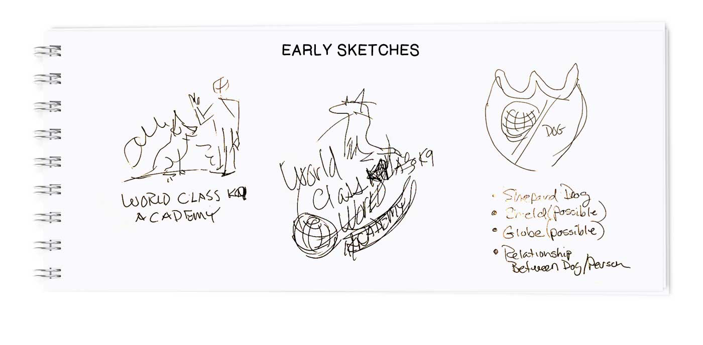
I am often amazed by how many businesses want to look like their competitors. Businesses often mistakenly believe that companies already operating within the market have a single recipe for success. My goal, as a professional designer, is to steer the client away from the competition so that they can stand out from the crowd. Most clients don’t trust new ideas, and why should they trust new ideas? After all; the success of a new idea hasn’t been proven yet, so clients are often apprehensive, making selling new and unique ideas seems like an impossible task. The key for a seasoned professional designer is to convince your client that their new business shouldn’t look like every other brand in the market. Being different is one of the best solutions that any designer can offer. This is what I proceed to do with my WCK9A client; convince to go in a unique direction. Just having a dog visual on the company identity seemed key to this client, and for the most part, I agreed as this is a dog training company and this is how I began to shape the creative brief.
I am often amazed by how many businesses want to look like their competitors. Businesses often mistakenly believe that companies already operating within the market have a single recipe for success. My goal, as a professional designer, is to steer the client away from the competition so that they can stand out from the crowd. Most clients don’t trust new ideas, and why should they trust new ideas? After all; the success of a new idea hasn’t been proven yet, so clients are often apprehensive, making selling new and unique ideas seems like an impossible task. The key for a seasoned professional designer is to convince your client that their new business shouldn’t look like every other brand in the market. Being different is one of the best solutions that any designer can offer. This is what I proceed to do with my WCK9A client; convince to go in a unique direction. Just having a dog visual on the company identity seemed key to this client, and for the most part, I agreed as this is a dog training company and this is how I began to shape the creative brief.
I’ve found that it doesn’t matter how extraordinary the idea is, as long as it answers the brief. It would be impossible to identify a new emerging brand if they were using a logo that looks similar to ones that are already

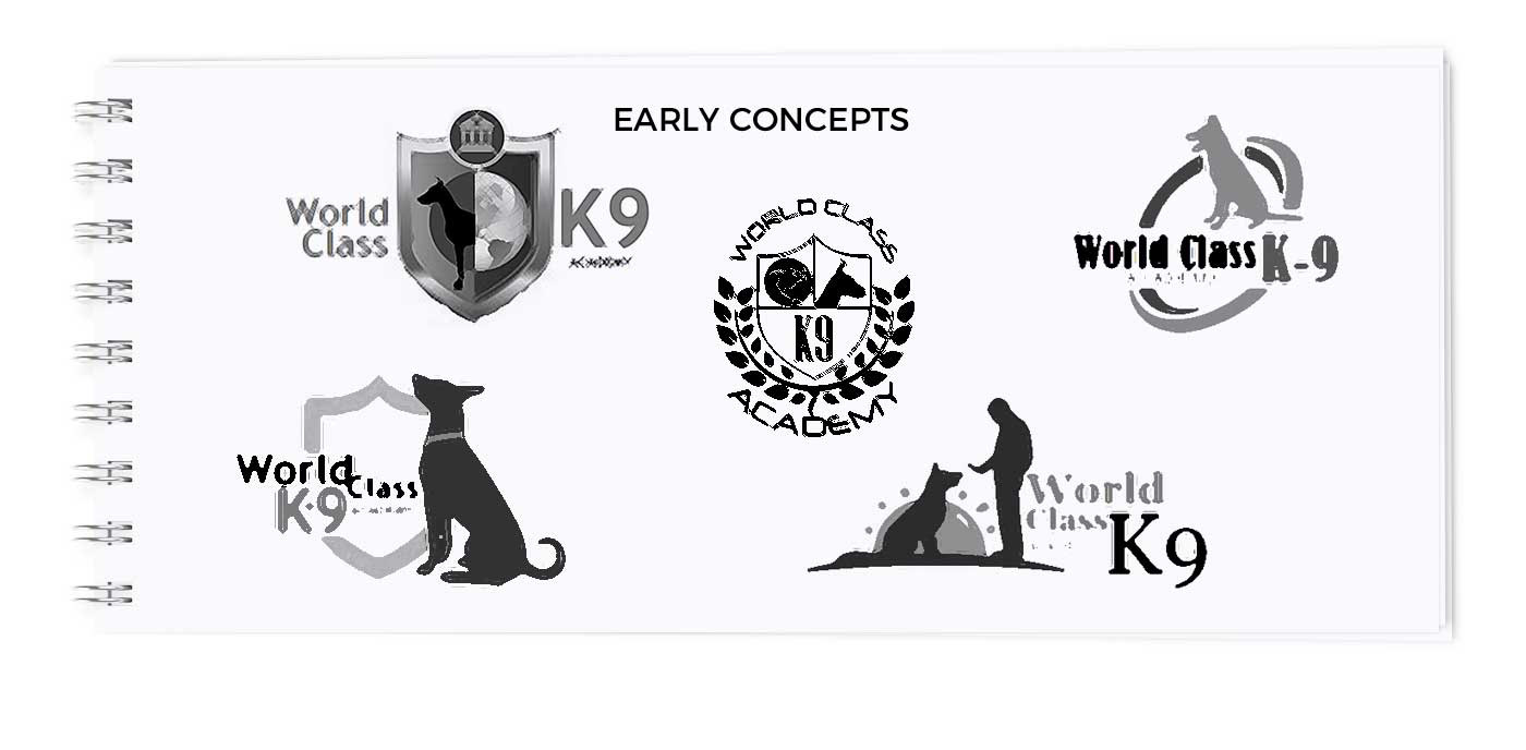
Early concepts work in black and white to focus on concept not colors
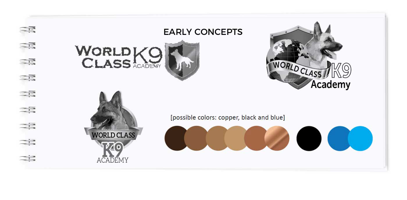
Early concepts work in black and white to focus on concept not colors, introduction of colors
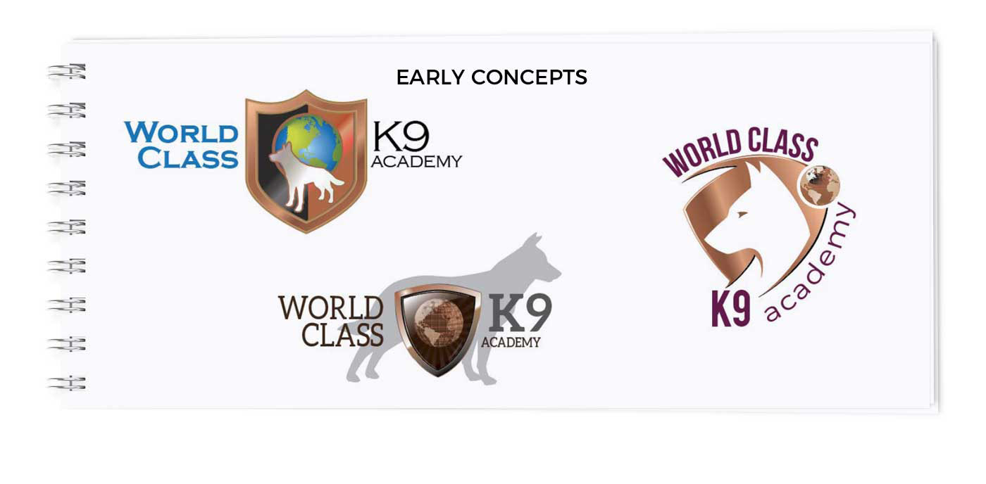
Refined concepts, color focus

Refinded concepts, close to final
Results
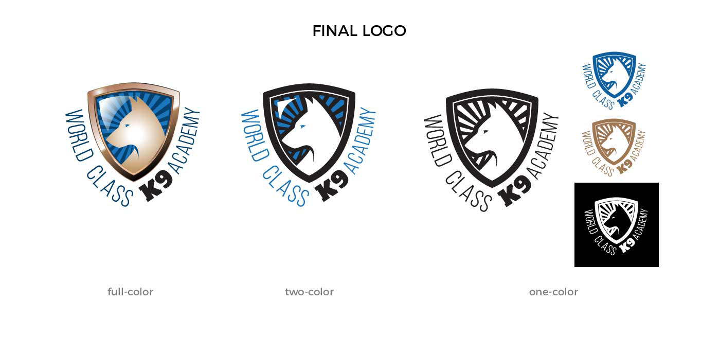
In the final version of the logo, one additional important concept that is communicated with this logo is the position of the dog to the trainer. Typically a rule of thumb in graphic design is to have things proceed left to right, as this is how we read and write in the English language and it gives a sense of a forward-moving direction when graphic elements are positioned in keeping with this rule of thumb. Positioning the stylized dog symbol to face right to left reinforces the notion that there is a relationship with the dog to the trainer since the stylized dog symbol is facing the trainer (or you the viewer) this trick is subtle, yet subliminal in nature that it just feels viscerally correct.
In the final version of the logo, one additional important concept that is communicated with this logo is the position of the dog to the trainer. Typically a rule of thumb in graphic design is to have things proceed left to right, as this is how we read and write in the English language and it gives a sense of a forward-moving direction when graphic elements are positioned in keeping with this rule of thumb. Positioning the stylized dog symbol to face right to left reinforces the notion that there is a relationship with the dog to the trainer since the stylized dog symbol is facing the trainer (or you the viewer) this trick is subtle, yet subliminal in nature that it just feels viscerally correct.

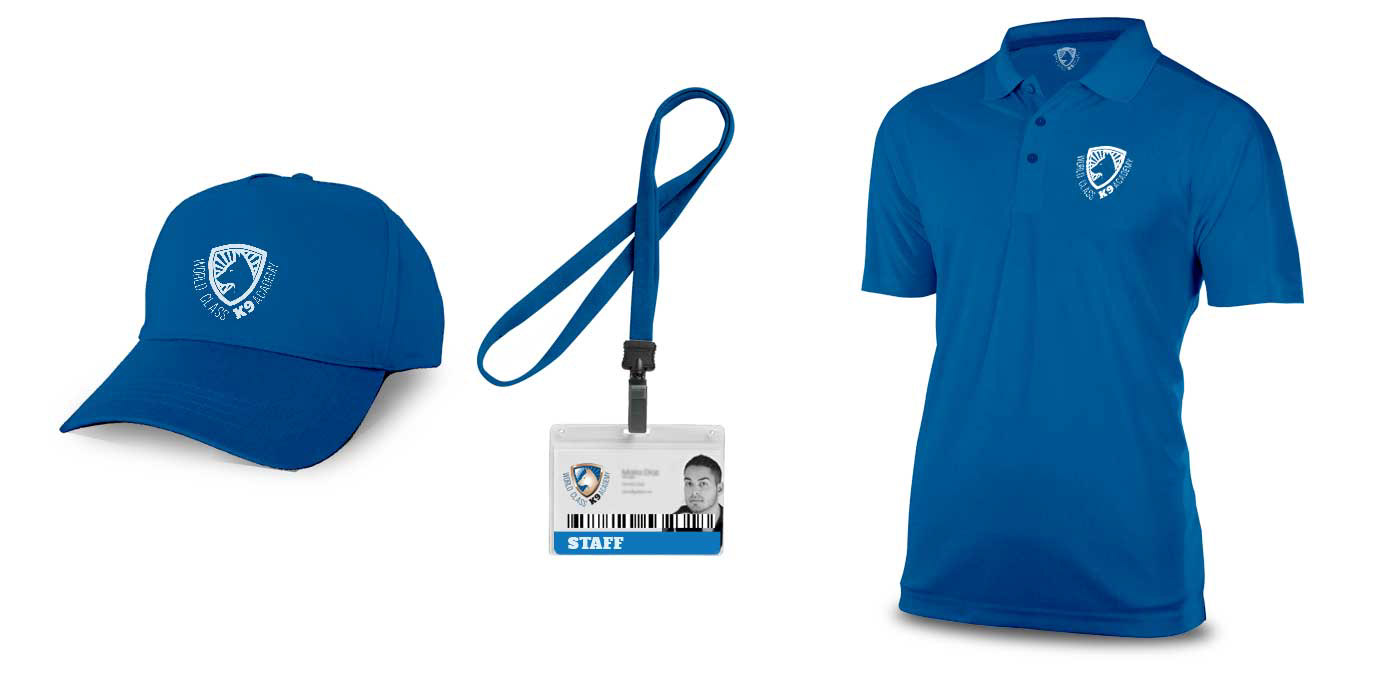
Single color logo used in promo and work uniforms

Single color logo used for promotional items