Tricore Interactive Advertisement placement within LTEN Focus on Training magazine a quarterly publication magazine. A long-standing resource for trainers in the life sciences, it offers case studies and expert commentary on trends, news, and analysis related to healthcare training and development. The magazine is mailed directly to more than 2,000 training professionals and leaders in pharmaceutical, biotech, medical device, and diagnostic companies across the world. Focus editorial is guided by an editorial board of industry experts.
Design Brief
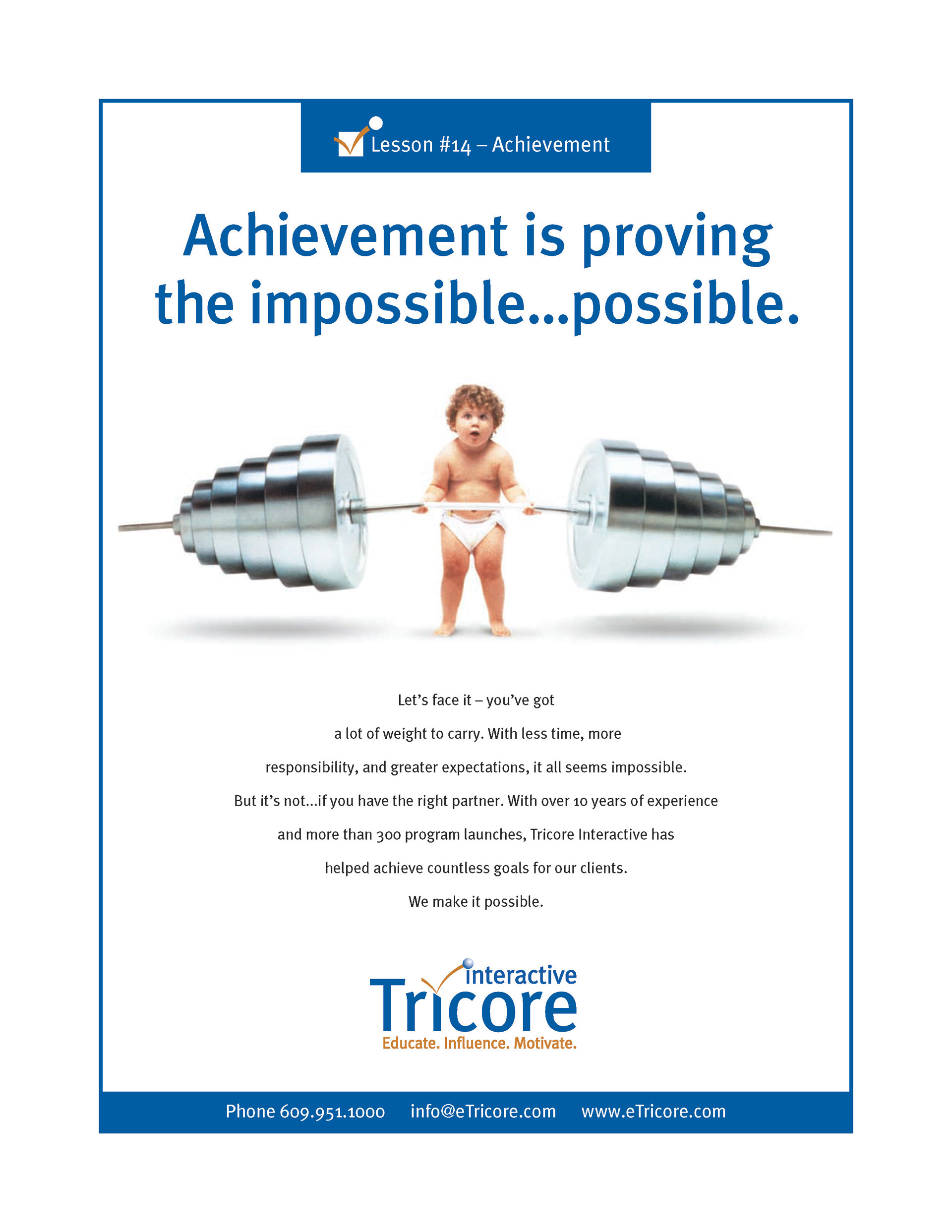
After meeting with the owners of the business to clarify the goals of the advertisement and to better identify the position of Tricore Interactive within the life sciences training industry a creative brief was defined. The basis of the creative brief we defined as equating Tricore Interactive differentiators as and imply with the copy this is what Tricore can do for you. We also choose to insert a subtle humorous approach into ideation (fun) which would be used as the eye-catchy hero visual to attract attention. We also agreed to keeping the visual look of the advertisement would be straightforward, meaning simple and quick in its visual communication style with a dominant ‘hero’ image and headline.
Challenge
Create an advertisement to differentiate the services of Tricore Interactive, a life sciences training company within the healthcare training magazine LTEN Focus on Training magazine.
Review of Competitors' Ad
The need to review competitors is not to copy, but to learn how the competitor is making themselves a differentiator. Also knowing what NOT to use so that our advertisement is unique and fresh when compared to competitor brands
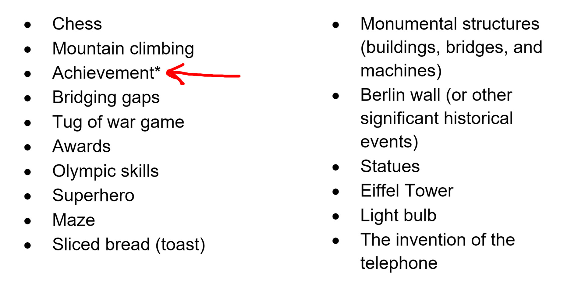
Summarize Competition
Of the competitor ads reviewed most were basic visually, functional but nothing really stood out as something that would promote sale leads and convert. To be seen as unique the stakeholders and I conceived that we really needed an interesting or absurd visual, and then use the content to draw interest and convert; this was a basic direction we formed and proceed twords.
Word Map
Thumbnails
The use of the common banner Achievement is... to bring a common branding element that will be used for all ads. Initial concepts were to use a single word that defines achievement, however after brainstorming the possible words that would be used we, as a group, could not agree on enough words to use here that was a solid description of the business.
Since we know our phrases options were limited, we then morphed this banner area to showcase randomly numbered achievements. We did not start at “1” knowing that it would appear too basic, and per the creative brief, the agency has a long history of building achievements for clients so the number was made higher than 10, and thereafter random, to give the appearance that we produce more advertisements than a sequence would imply. Knowing we can visualize with photography almost any achievement better than we could via the written word.
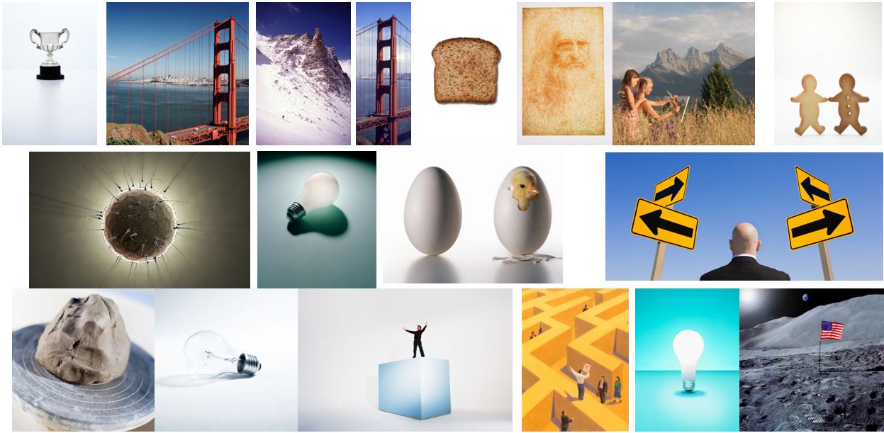
Mood Board
Possible Headlines
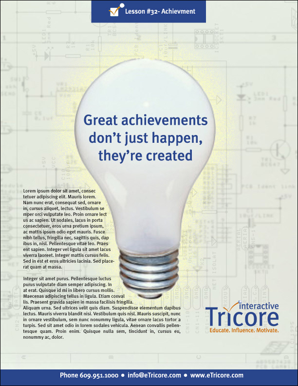
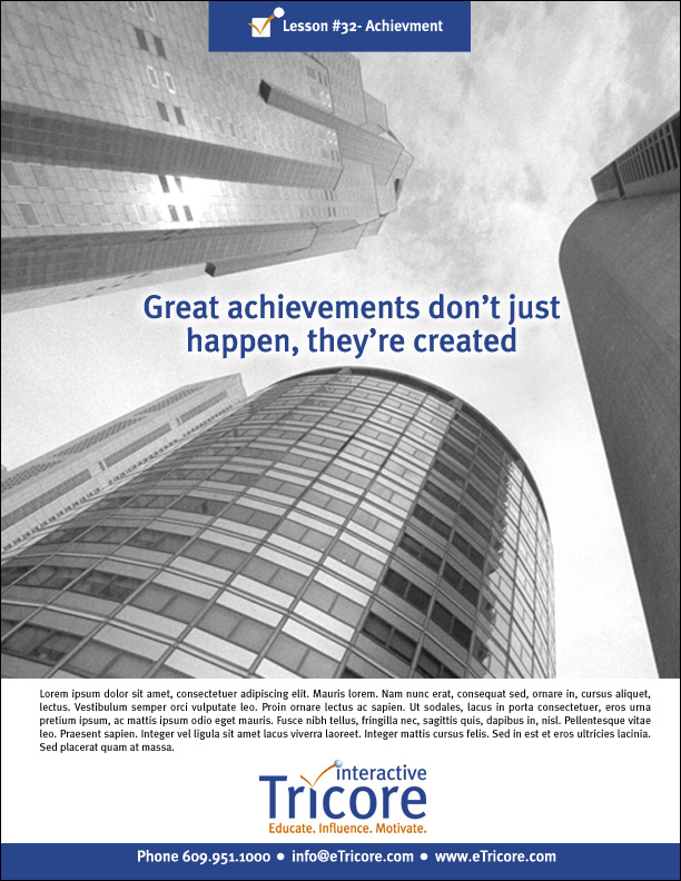
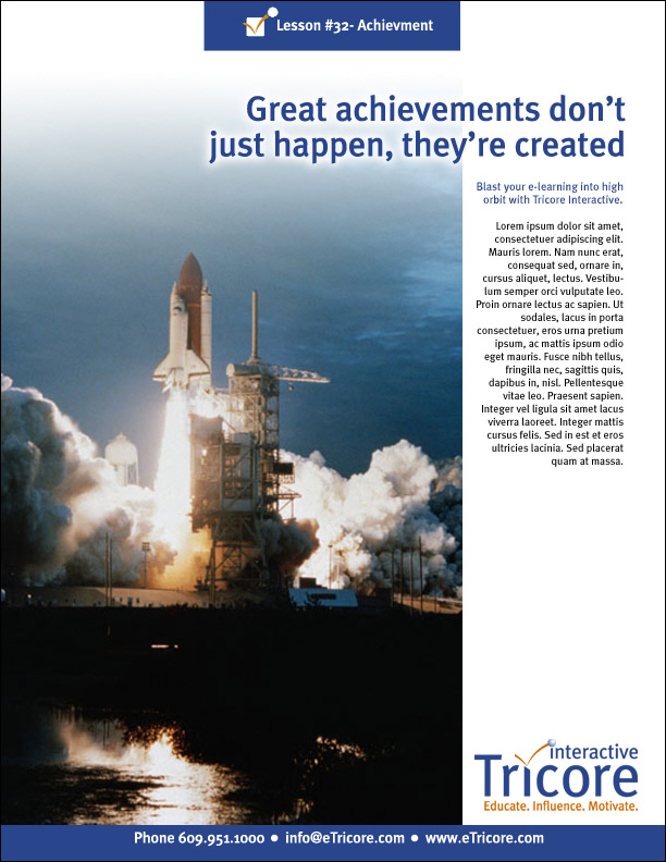
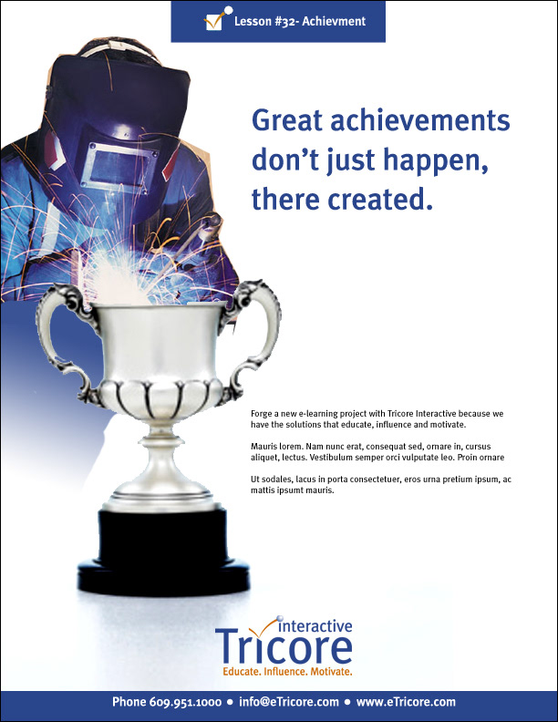
- Great Achievements don't just happen, they're created
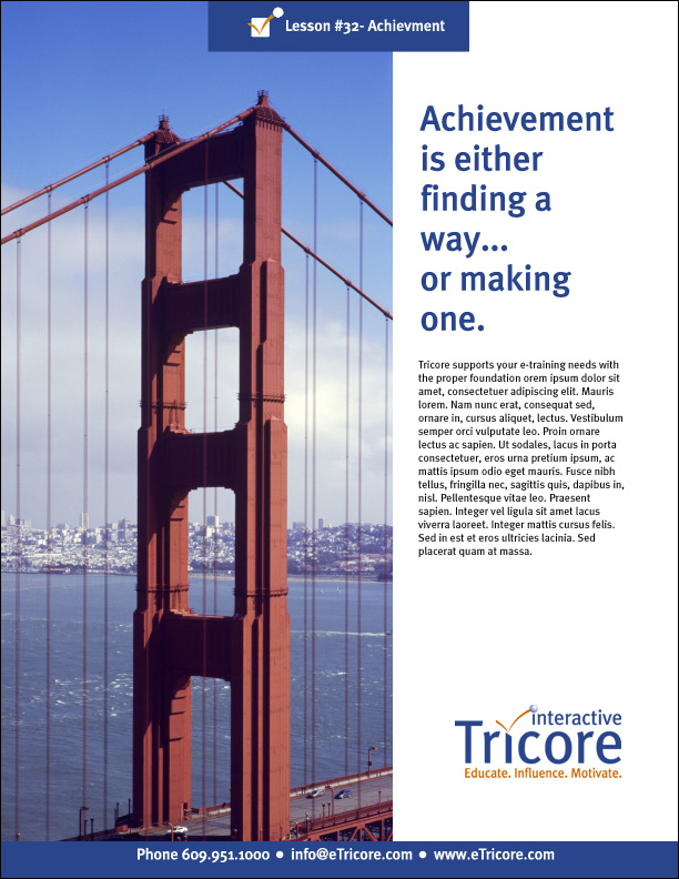
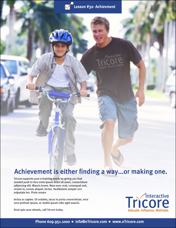
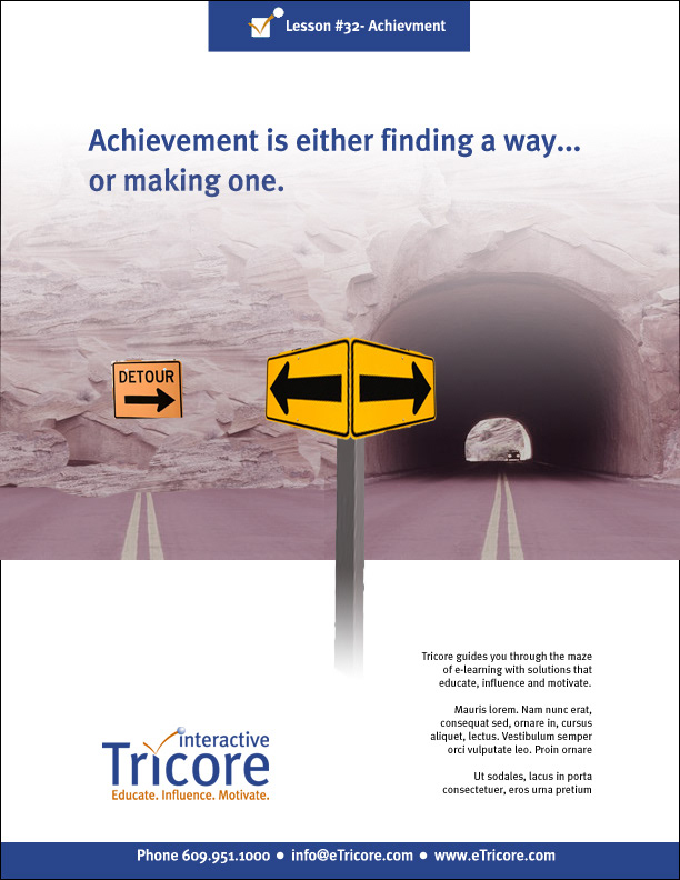
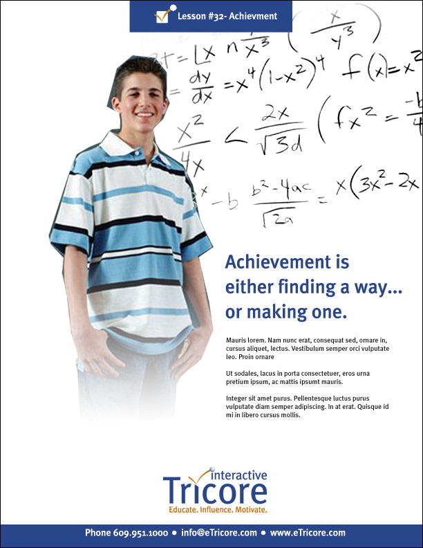
- Achievement is either finding a way or making one
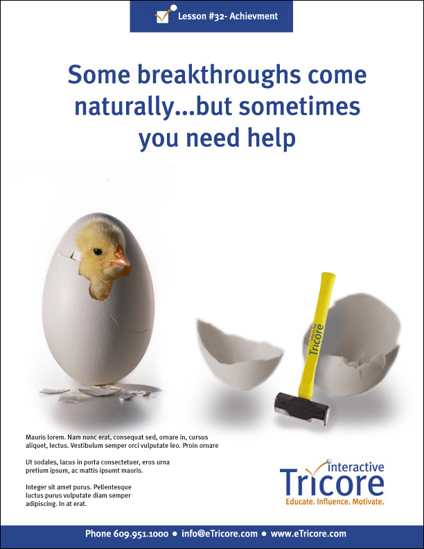
- Some breakthroughs come naturally, but sometimes you need help
- Make the impossible, possible
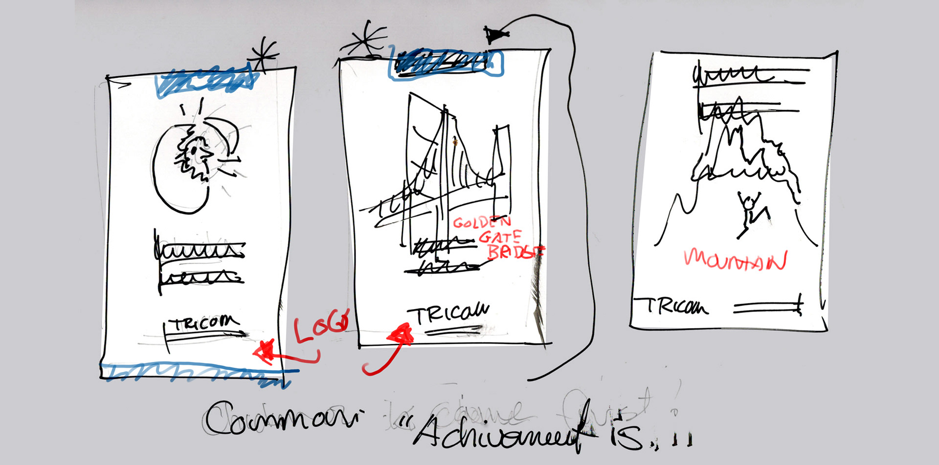
Draft Concepts
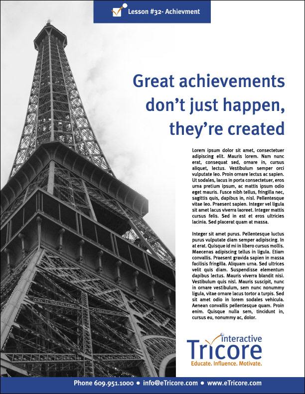
Final Advertisement Placement
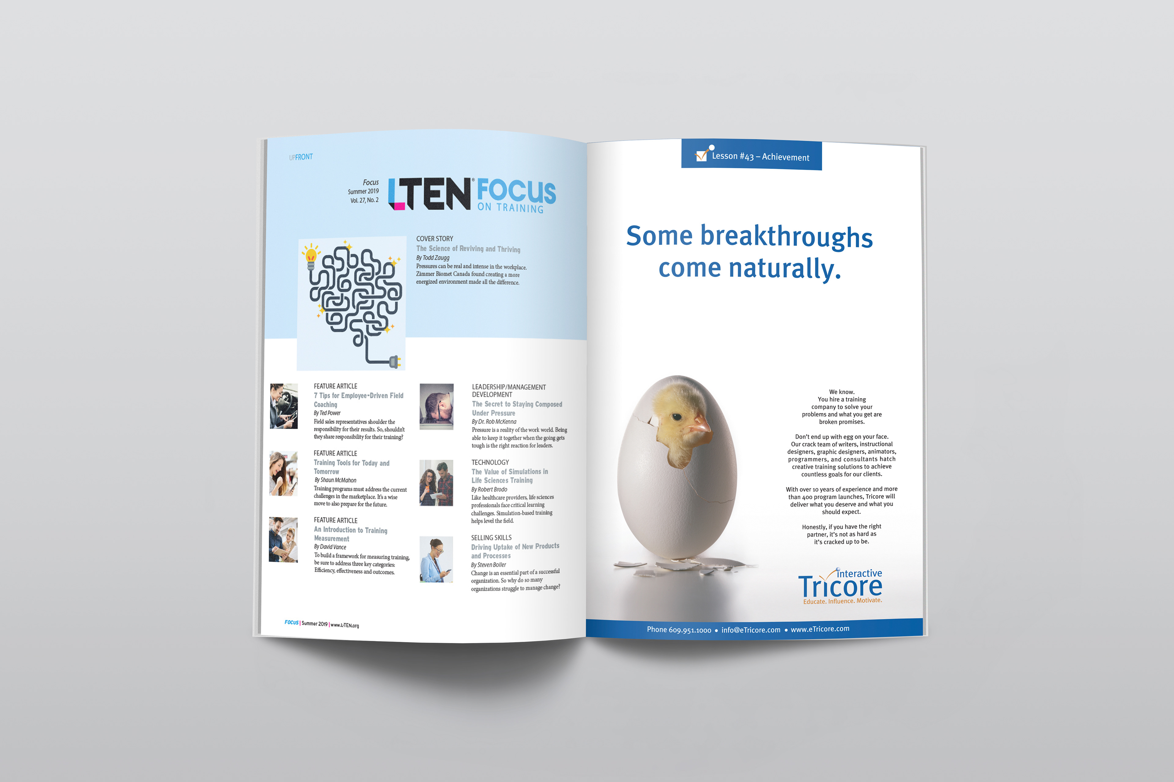
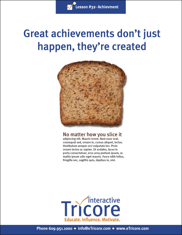
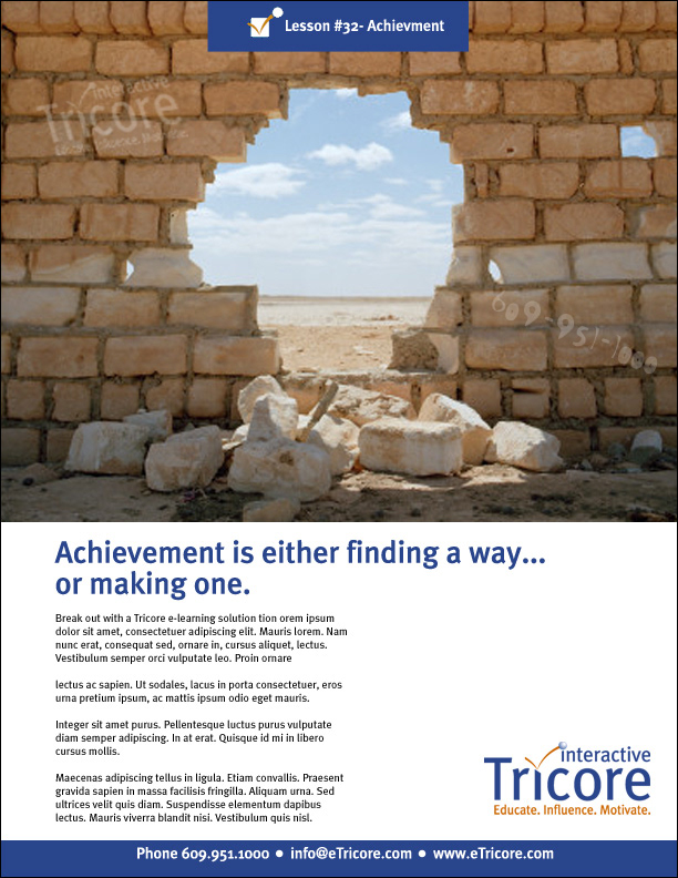
While this does not solve which came first the chicken or the egg It does clearly allow Tricore as a company to showcase their differentiator in this sales training market. The visual appeal with the text mimicking the visual stand as a unit and just looks very different from the completion, implying that Tricore as your partner you will stand apart, as “it’s not as hard as it is cracked up to be.”
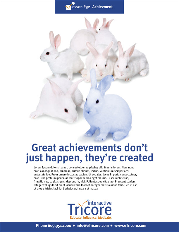
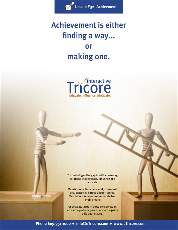
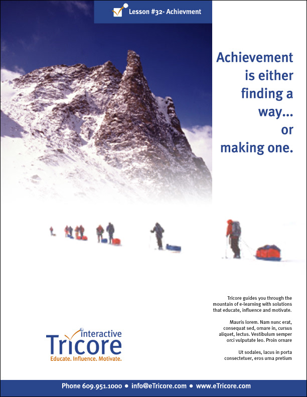
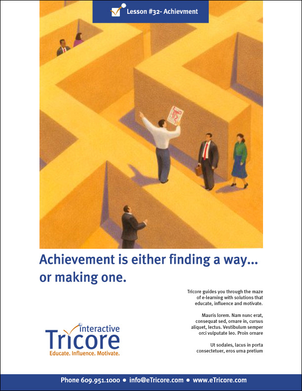
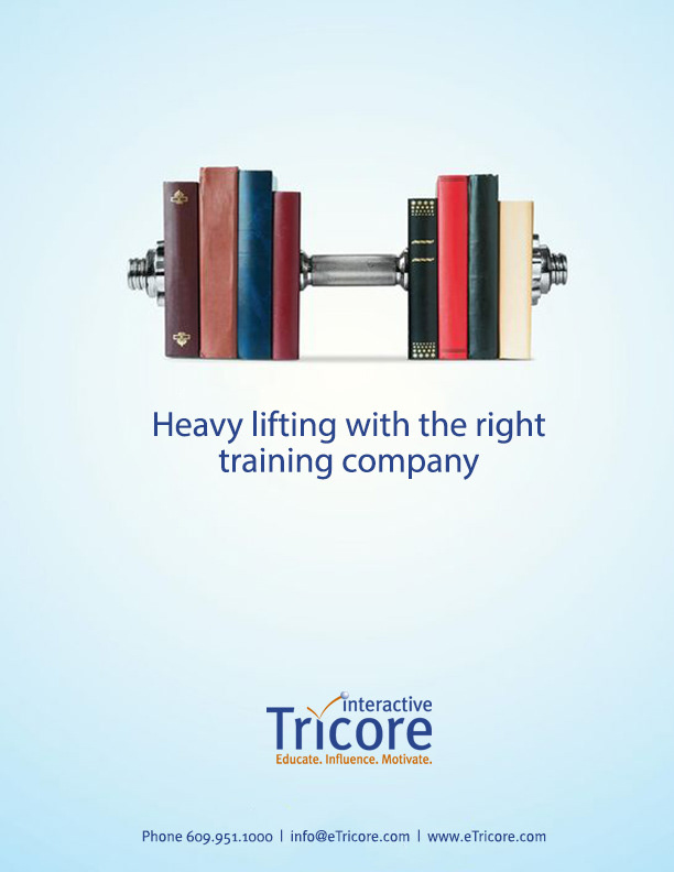
Companion ad utilizing same basic concept and theme.
Here we chose to go with an absurd image as the hero attention grabber, worked with copy writer to ideate weightlifting analogies that were appropriate to the primary messaging identified in the discover of the first concept, and applied here.