
Creating a Purpose-Driven In-room Branding with a Social Impact
Printer Belmark, De Pere, WI
Coffee Roaster Cooper Moon Coffee, Lafayette, IN
Disciplines Used
- Branding
- Design/Visual Communication
- Team Collaboration
- Time Management
- Vendor Management
- Creative Direction
- Stakeholder Collaboration
- Design/Visual Communication
- Team Collaboration
- Time Management
- Vendor Management
- Creative Direction
- Stakeholder Collaboration
Project Summary
This project involved developing a premium coffee packaging system for flexible mylar pouches, transforming initial creative concepts into production-ready artwork for large-scale rotogravure printing. Working directly from the print vendor's dieline template, I adapted and refined all visual elements to meet strict prepress specifications, including bleed requirements, safe zones, registration tolerances, and panel alignment. Special attention was given to color reproduction, typography, and image placement to ensure accurate printing on metallized film substrates while maintaining brand integrity and visual impact. The final artwork was engineered to deliver consistent, high-fidelity reproduction through the rotogravure process, resulting in packaging that balanced creative storytelling with manufacturing precision.
01. Overview
Capital Vacations sought to elevate the in-room coffee experience across its portfolio of resort destinations by introducing a branded coffee packaging program tied to a meaningful social impact initiative. The project centered on developing a cohesive package design system for coffee products distributed throughout Capital Vacations resorts, while highlighting the company's partnership with Christel House, a nonprofit organization dedicated to breaking the cycle of poverty through education, healthcare, and workforce development.
The packaging needed to deliver a premium hospitality experience, reinforce the Capital Vacations brand promise, and communicate the positive impact guests help support with every cup enjoyed during their stay. Capital Vacations serves more than one million travelers annually across its resort network, making the coffee program an ideal touchpoint for both brand engagement and charitable storytelling.
02. Audience
The primary audience consisted of the following
- Capital Vacations resort guests and vacation club members
- Prospective owners participating in resort tours and presentations
- Families, couples, and leisure travelers seeking elevated hospitality experiences
- Guests who value socially responsible brands and purpose-driven purchasing
- Prospective owners participating in resort tours and presentations
- Families, couples, and leisure travelers seeking elevated hospitality experiences
- Guests who value socially responsible brands and purpose-driven purchasing
Because the coffee would be available company-wide, the packaging needed to appeal to a broad demographic while creating a consistent brand experience across multiple resort destinations and geographic markets. Simply meaning that the packaging placed in a Hawaii resort will work the same as in Cape Cod (two distinctly different brand markets).
03. Project Objectives
- Create a premium coffee packaging system that reflects the quality and hospitality standards of Capital Vacations.
- Flexible packaging to reduce costs
- Artwork from Christel House children on the facade of the packaging, changeable year
- Establish a recognizable visual identity that could be deployed consistently across all resort properties.
-Communicate the partnership with Christel House in an authentic and meaningful way.-- ----- Increase guest awareness of Capital Vacations' community impact initiatives.
- Transform an everyday in-room amenity into a memorable brand experience.
- Develop scalable packaging assets that could accommodate future coffee blends and promotional programs.
- Flexible packaging to reduce costs
- Artwork from Christel House children on the facade of the packaging, changeable year
- Establish a recognizable visual identity that could be deployed consistently across all resort properties.
-Communicate the partnership with Christel House in an authentic and meaningful way.-- ----- Increase guest awareness of Capital Vacations' community impact initiatives.
- Transform an everyday in-room amenity into a memorable brand experience.
- Develop scalable packaging assets that could accommodate future coffee blends and promotional programs.
04. My Role
Senior Brand Designer / Creative Lead, leading the creative development of the packaging program from concept through final production. My responsibilities included:
- Brand strategy and visual direction
- Packaging concept development
- Graphic design and typography
- Structural packaging recommendations
- Production-ready artwork preparation
- Collaboration with marketing, operations, and vendor partners.
- Development of messaging that balanced brand promotion with charitable storytelling.
- Packaging concept development
- Graphic design and typography
- Structural packaging recommendations
- Production-ready artwork preparation
- Collaboration with marketing, operations, and vendor partners.
- Development of messaging that balanced brand promotion with charitable storytelling.
I ensured the final design aligned with Capital Vacations' brand standards while creating a distinctive product that stood apart from traditional hospitality coffee packaging.
05. The Challenges
Several challenges emerged throughout the project.
- Creating a package design that felt premium while remaining cost-effective for large-scale deployment.
- Balancing two important narratives: the Capital Vacations guest experience and the Christel House charitable mission.
- Consulted with print vendors to accurately develop designs that conform to the needs of the project based on the selected template design.
- Ensured the packaging communicated social impact without appearing overly promotional or corporate.
- Created shelf-worthy packaging that could function equally well in guest rooms, resort retail spaces, and promotional gift programs.
- Per the template from the vendor, this flexible packaging contained a seam on the back-side, which required a special way to break up the content and artwork for equal visual weighting of the artwork.
- Rotating artwork, frequency, and who is responsible for updating
- Balancing two important narratives: the Capital Vacations guest experience and the Christel House charitable mission.
- Consulted with print vendors to accurately develop designs that conform to the needs of the project based on the selected template design.
- Ensured the packaging communicated social impact without appearing overly promotional or corporate.
- Created shelf-worthy packaging that could function equally well in guest rooms, resort retail spaces, and promotional gift programs.
- Per the template from the vendor, this flexible packaging contained a seam on the back-side, which required a special way to break up the content and artwork for equal visual weighting of the artwork.
- Rotating artwork, frequency, and who is responsible for updating
06. Solution
Mood Board
Mood Board
Brainstorm Ideation
Christel House Partnership
- Purpose-driven
- Impactful
- Empowering
- Hopeful
- Transformative
- Compassionate
- Community-focused
- Giving back
- Meaningful
- Inspiring
- Educational
- Opportunity
- Supportive
- Uplifting
- Mission-based
- Positive change
- Global impact
- Human-centered
- Caring
- Responsible
- Impactful
- Empowering
- Hopeful
- Transformative
- Compassionate
- Community-focused
- Giving back
- Meaningful
- Inspiring
- Educational
- Opportunity
- Supportive
- Uplifting
- Mission-based
- Positive change
- Global impact
- Human-centered
- Caring
- Responsible
Coffee and Artisan Quality
- Roasted
- Crafted
- Small-batch
- Hand-selected
- Rich
- Smooth
- Bold
- Aromatic
- Distinctive
- Balanced
- Flavorful
- Signature
- Fresh
- Robust
- Sustainable
- Ethical
- Specialty
- Premium blend
- Heritage
- Genuine
- Roasted
- Crafted
- Small-batch
- Hand-selected
- Rich
- Smooth
- Bold
- Aromatic
- Distinctive
- Balanced
- Flavorful
- Signature
- Fresh
- Robust
- Sustainable
- Ethical
- Specialty
- Premium blend
- Heritage
- Genuine
Understanding Flexible Packaging
Flexible packaging has become one of the fastest-growing segments of the packaging industry due to its versatility, sustainability, and cost-effectiveness. Unlike rigid containers, flexible packaging is produced from materials such as plastic films, foil laminates, and paper composites that can be formed into a variety of package styles while using less material and reducing shipping costs. For this project, we evaluated several packaging formats—stand-up pouches, flat pouches, side-gusset bags, and quad-seal bags—each offering unique opportunities for branding, in-room presence, and consumer convenience. Understanding the capabilities and production requirements of each format was essential in selecting the most appropriate solution, ensuring the final design balanced visual impact, manufacturing efficiency, and an elevated hospitality experience.
Elements Needed To Be Included
After discussion with all stakeholders, the following was determined to be required as part of the design concepts
- Christel House (CH) logo, color preferred
- Capital Vacation (CV) logo and an indication of CV’s support
- Coffee type (regular and decaf)
- Christel House requested their name be in the coffee blend, such as CH Regular, CH Decaf; a bit of ideation was needed here
- Accreditation to student artwork
- Cooper Mountain Roasters were to be mentioned on the packaging, as part of their agreement with CH
- CH mission statement summary
- CH contact information
- Children's artwork: two or more per package
- Children's artwork updated biannually
- A workflow to update the collection would need to be devised, and who would be responsible for these updates.
- Christel House (CH) logo, color preferred
- Capital Vacation (CV) logo and an indication of CV’s support
- Coffee type (regular and decaf)
- Christel House requested their name be in the coffee blend, such as CH Regular, CH Decaf; a bit of ideation was needed here
- Accreditation to student artwork
- Cooper Mountain Roasters were to be mentioned on the packaging, as part of their agreement with CH
- CH mission statement summary
- CH contact information
- Children's artwork: two or more per package
- Children's artwork updated biannually
- A workflow to update the collection would need to be devised, and who would be responsible for these updates.
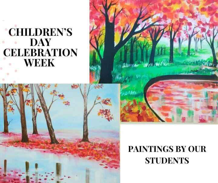
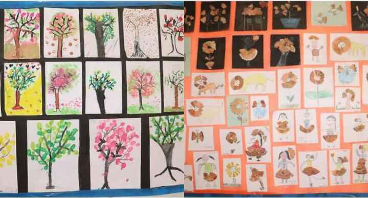
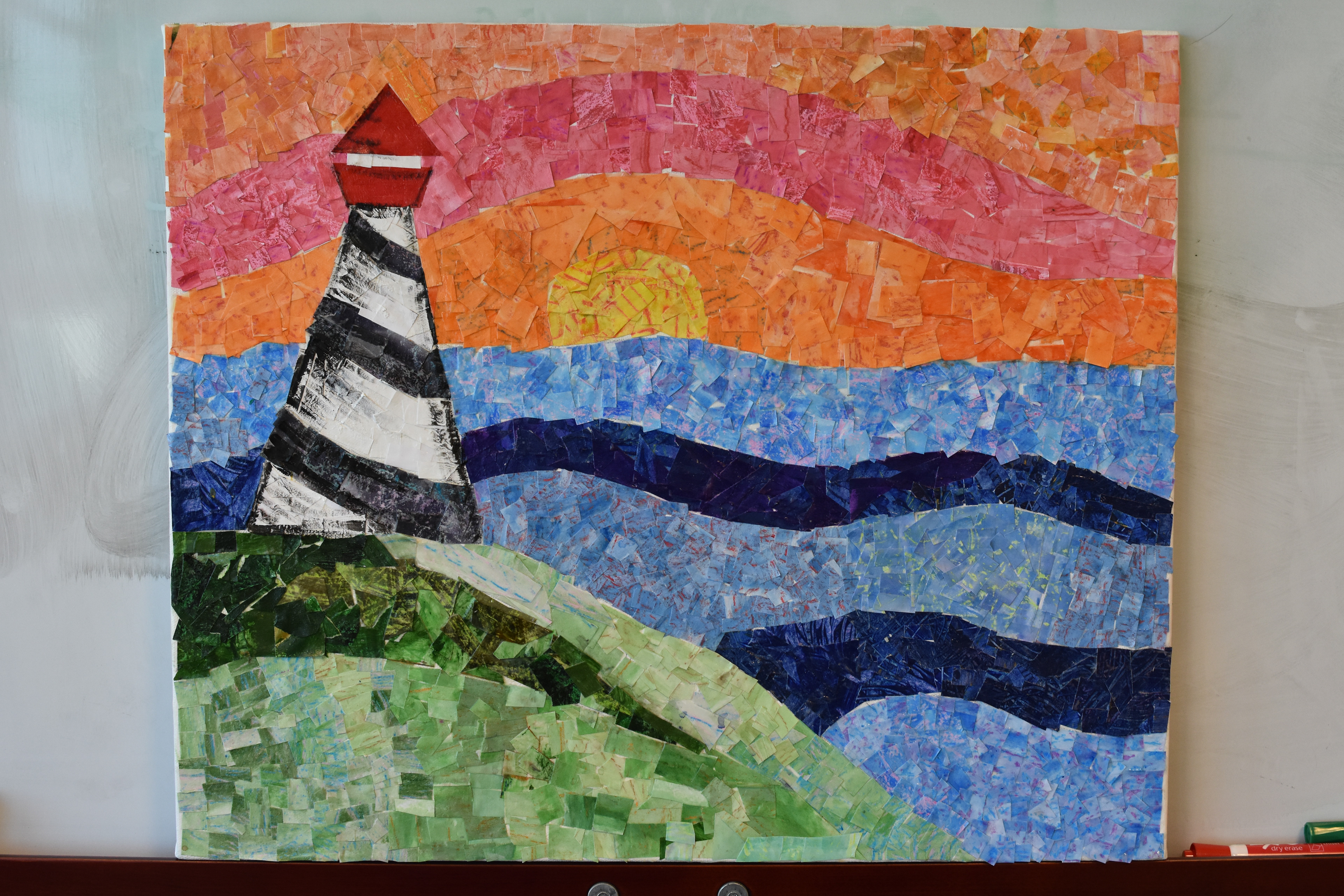
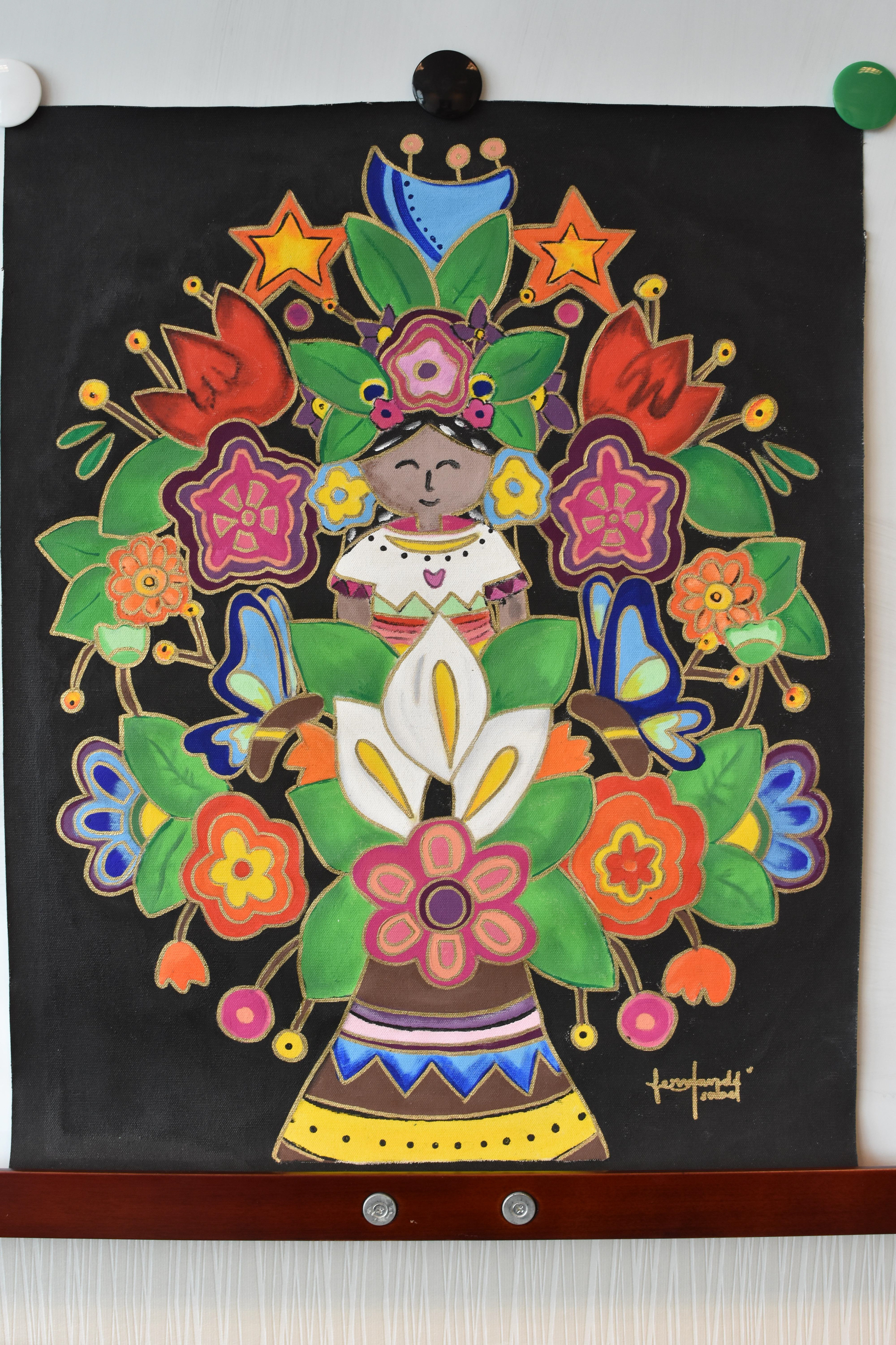
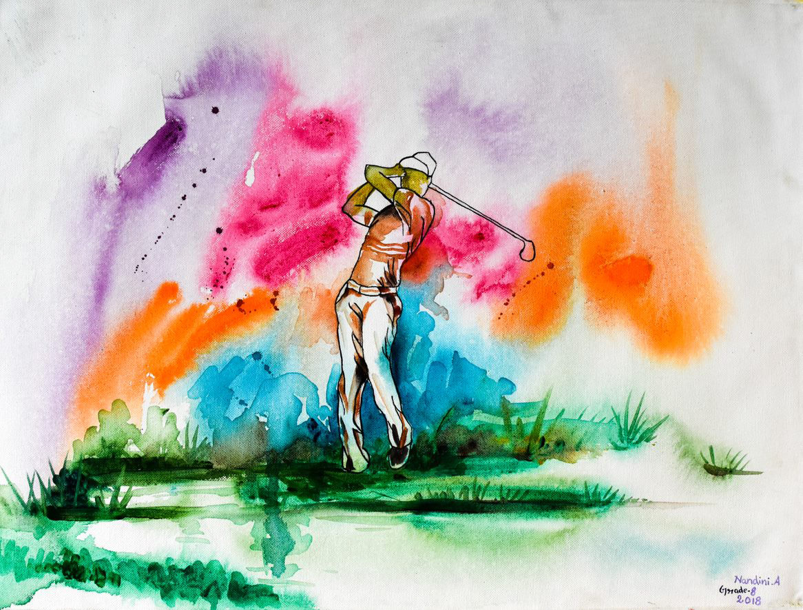
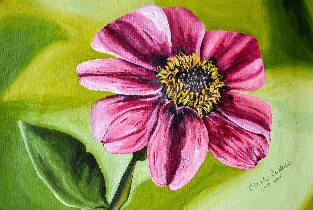
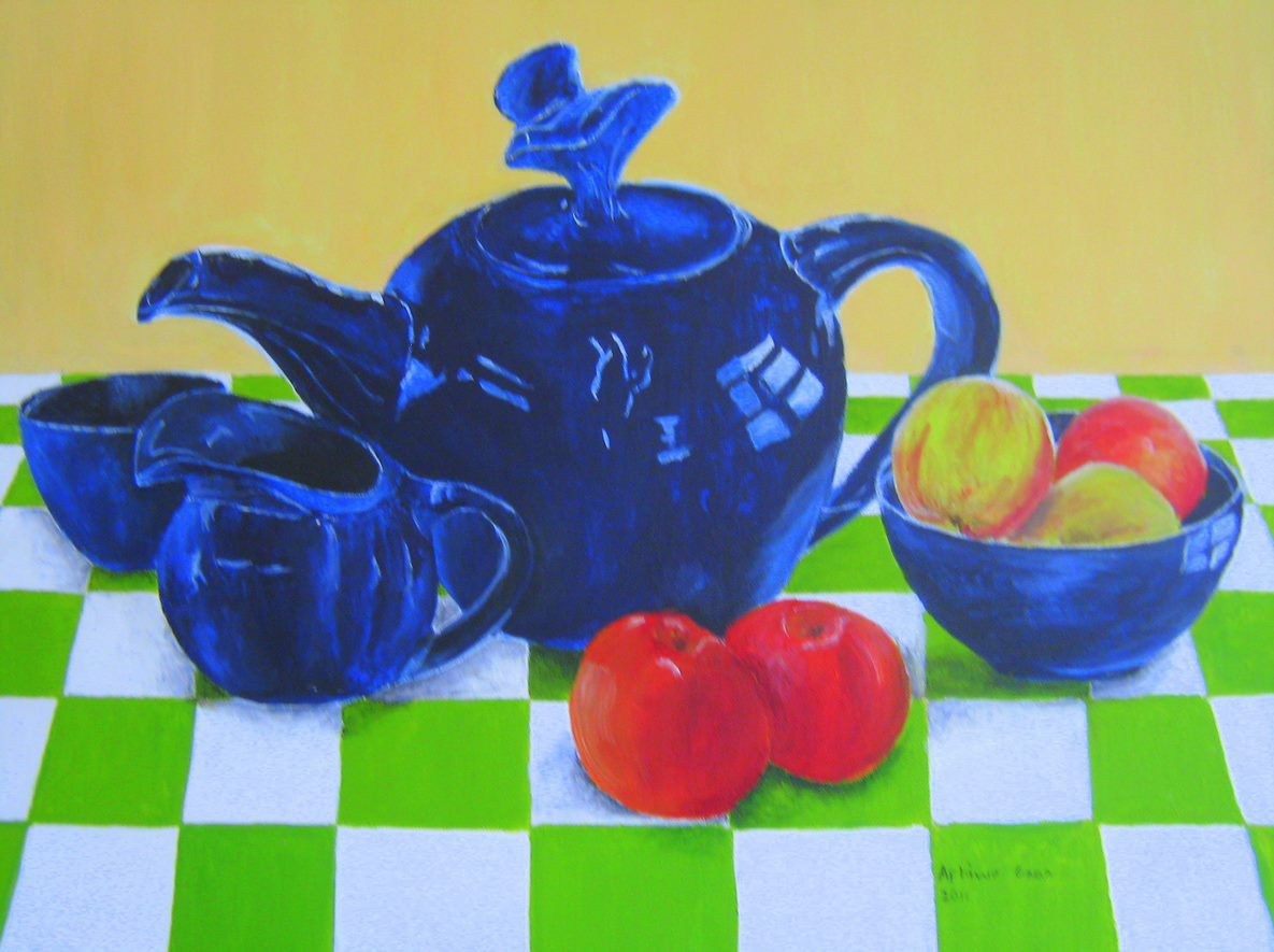
Children Artwork Collection
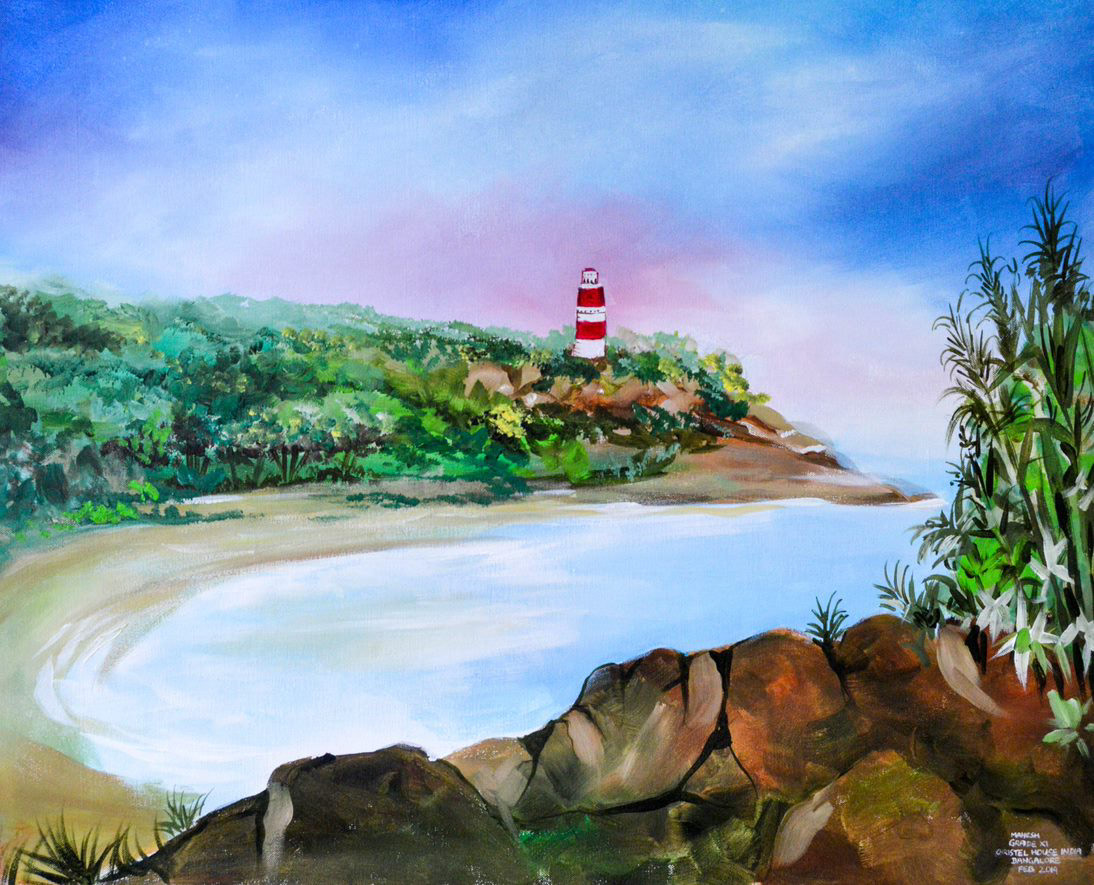
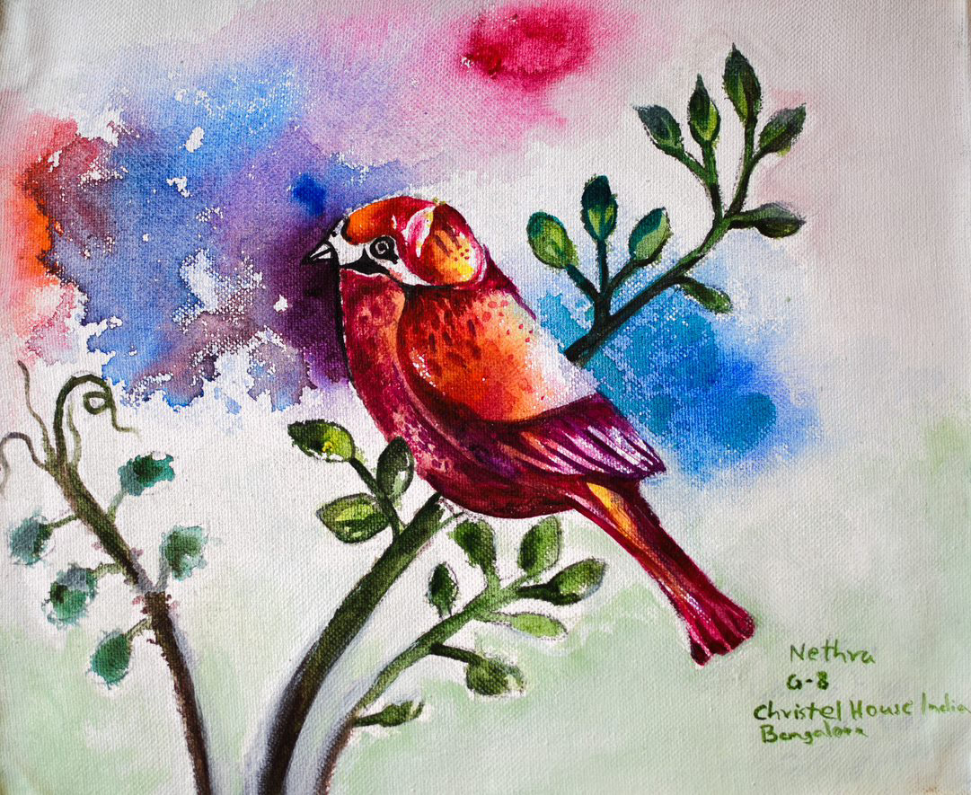
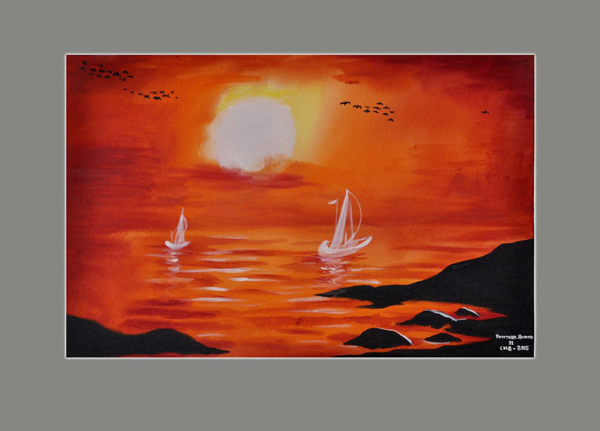
Christel House kindly took on gathering and collating artwork of children to our agency, so that future packaging could be updated biannually.
Print vendors would be using my files as templates for these repeated updates.
https://kenruizhome.picflow.com/pf98i5Bg4E8eTEde
https://kenruizhome.picflow.com/pf98i5Bg4E8eTEde

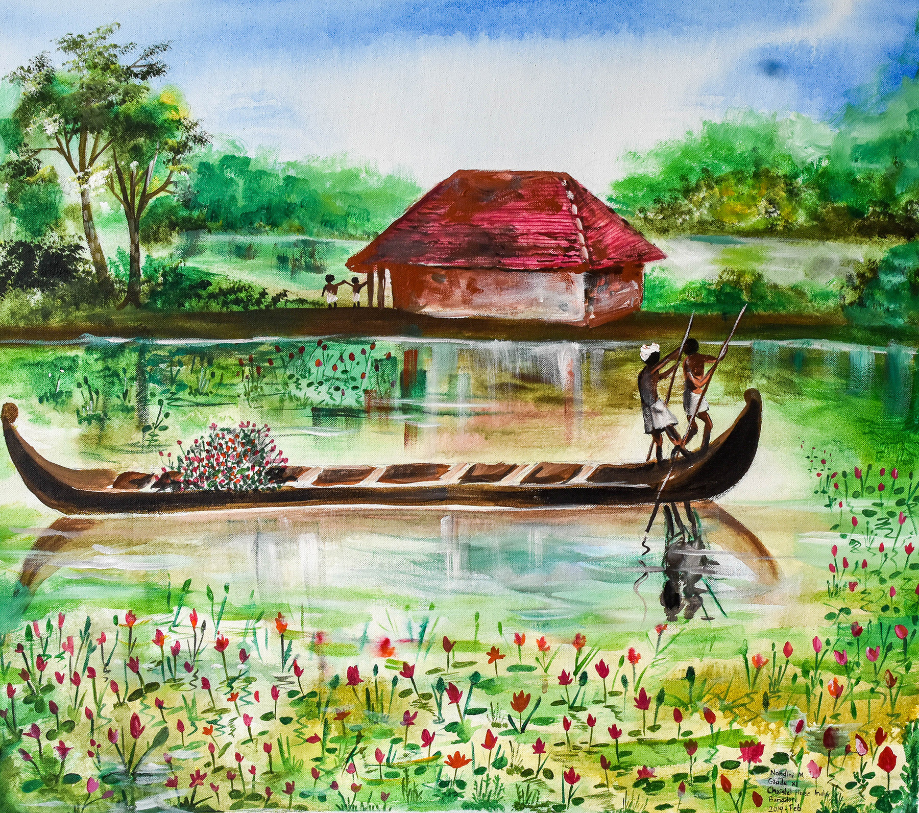
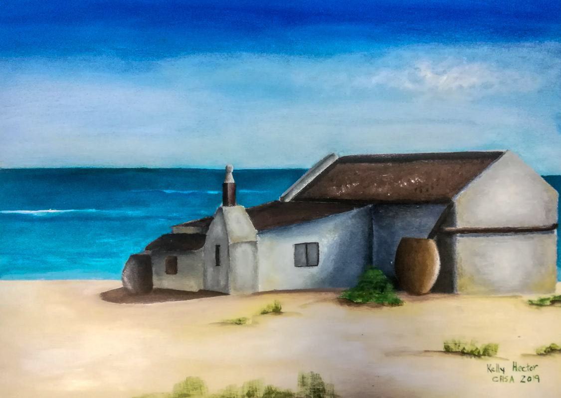
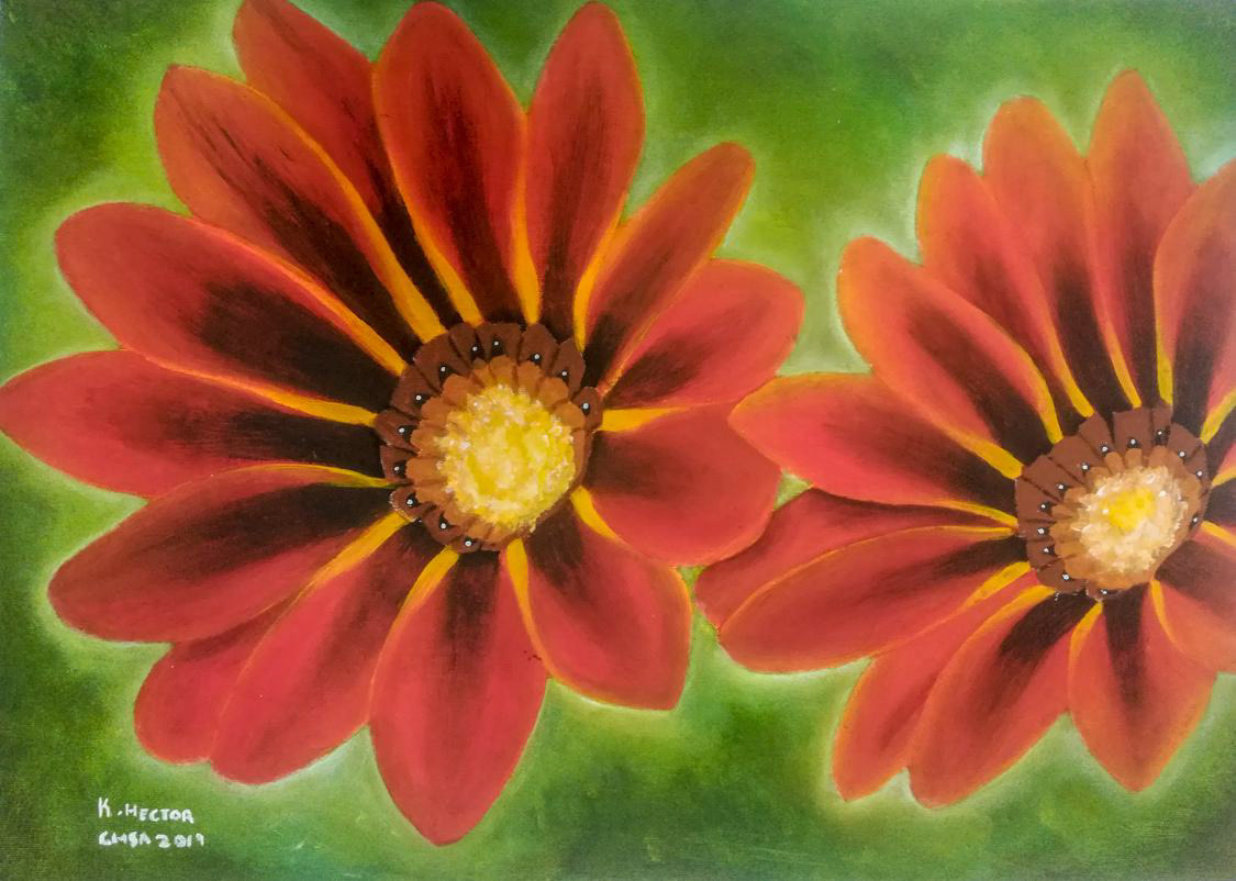
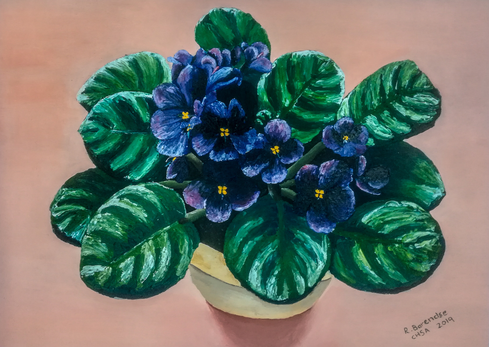

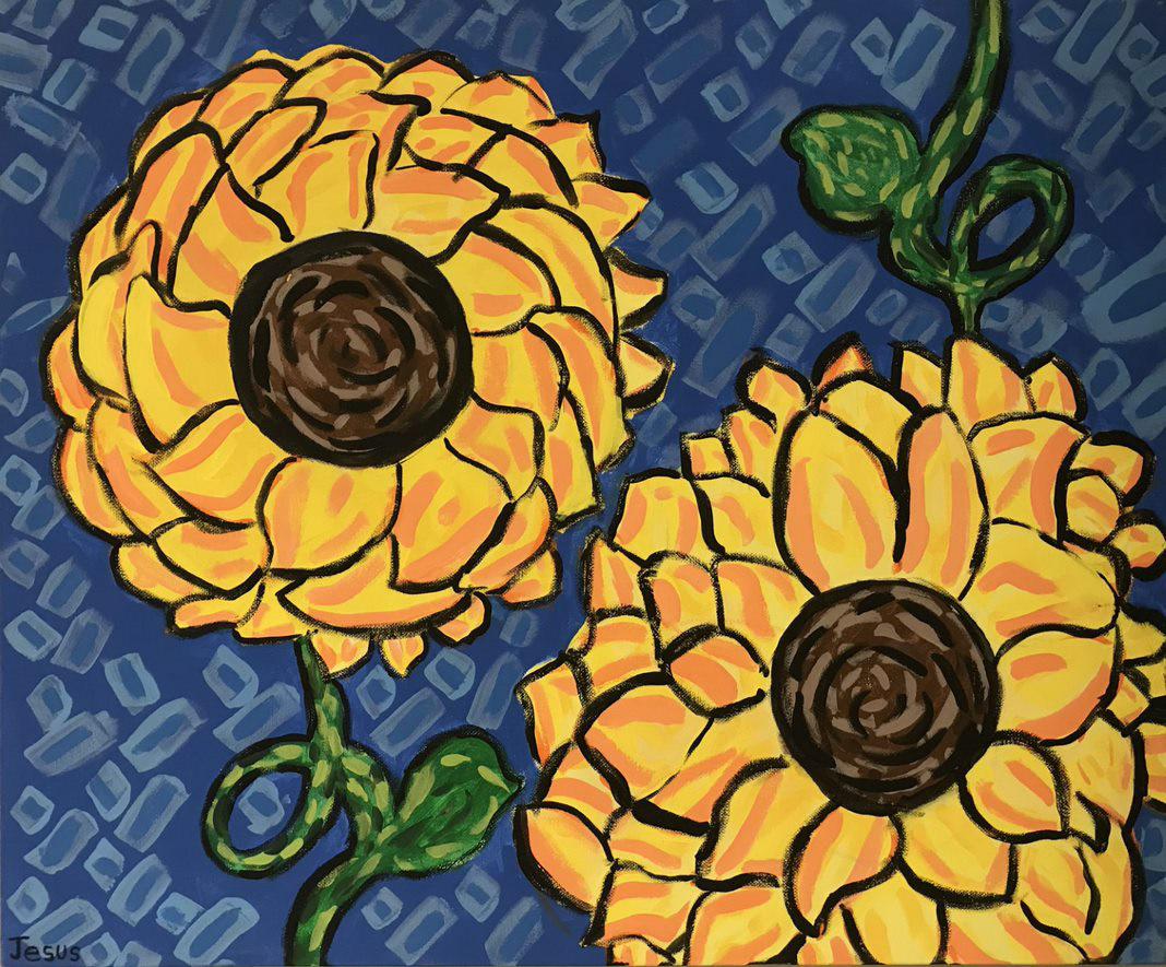
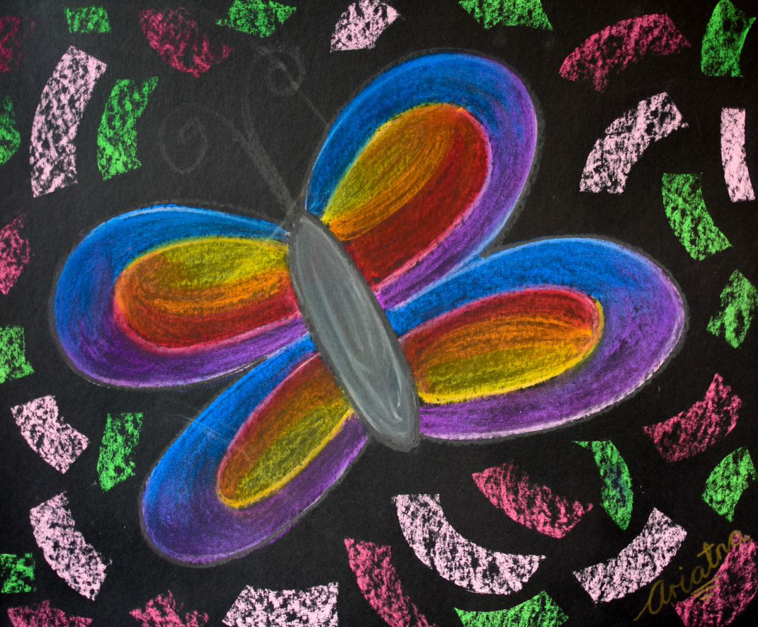
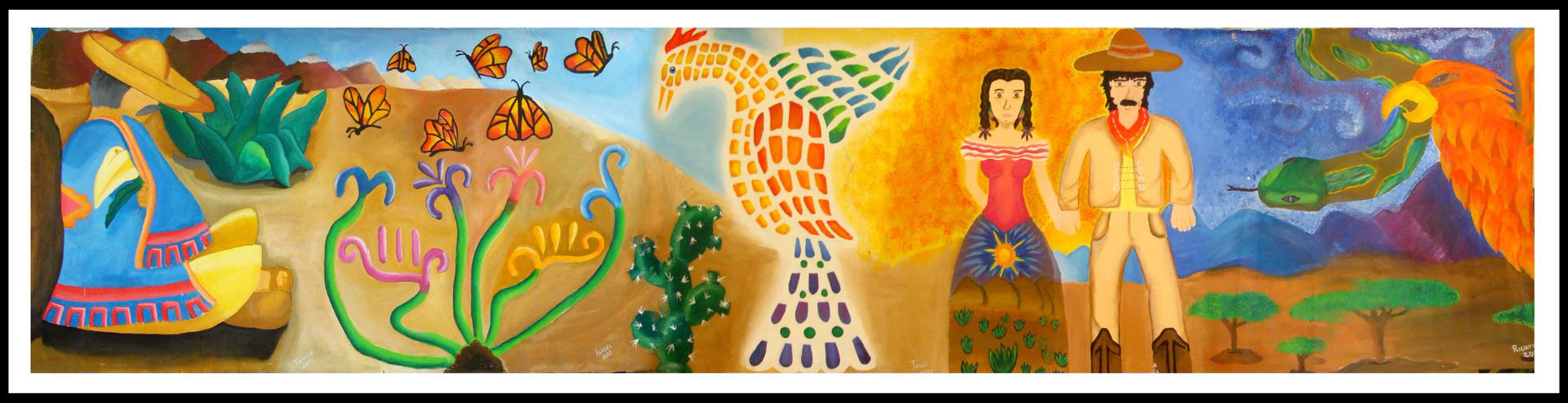


Sketch
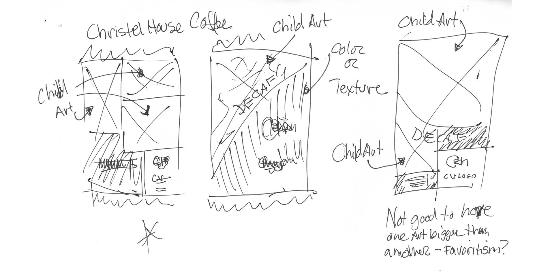
With the following sketch shared with stakeholders, we quickly determined that we only wanted one or two child artworks within each package. Additionally, we also identified that we should avoid dramatic size discrepancies to minimize the appearance of favoritism.
Concept 1
- Rotating child artwork dominates the packaging
- Single art on package, this was determined that it is too limiting, since CH had a huge cache of available art elements to include; there would be many-to-many art available to be able to showcase art in a positive light.
- CH branding secondary
- CV branding tertiary
- Single art on package, this was determined that it is too limiting, since CH had a huge cache of available art elements to include; there would be many-to-many art available to be able to showcase art in a positive light.
- CH branding secondary
- CV branding tertiary
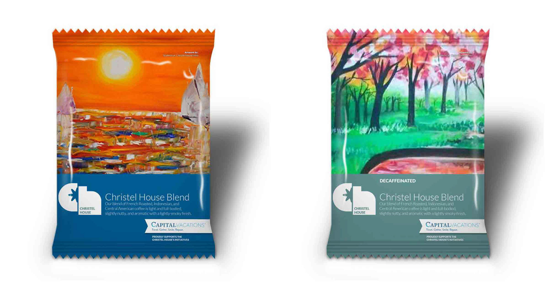
Concept 2
Iteration of Concept 1, with logo position exploration
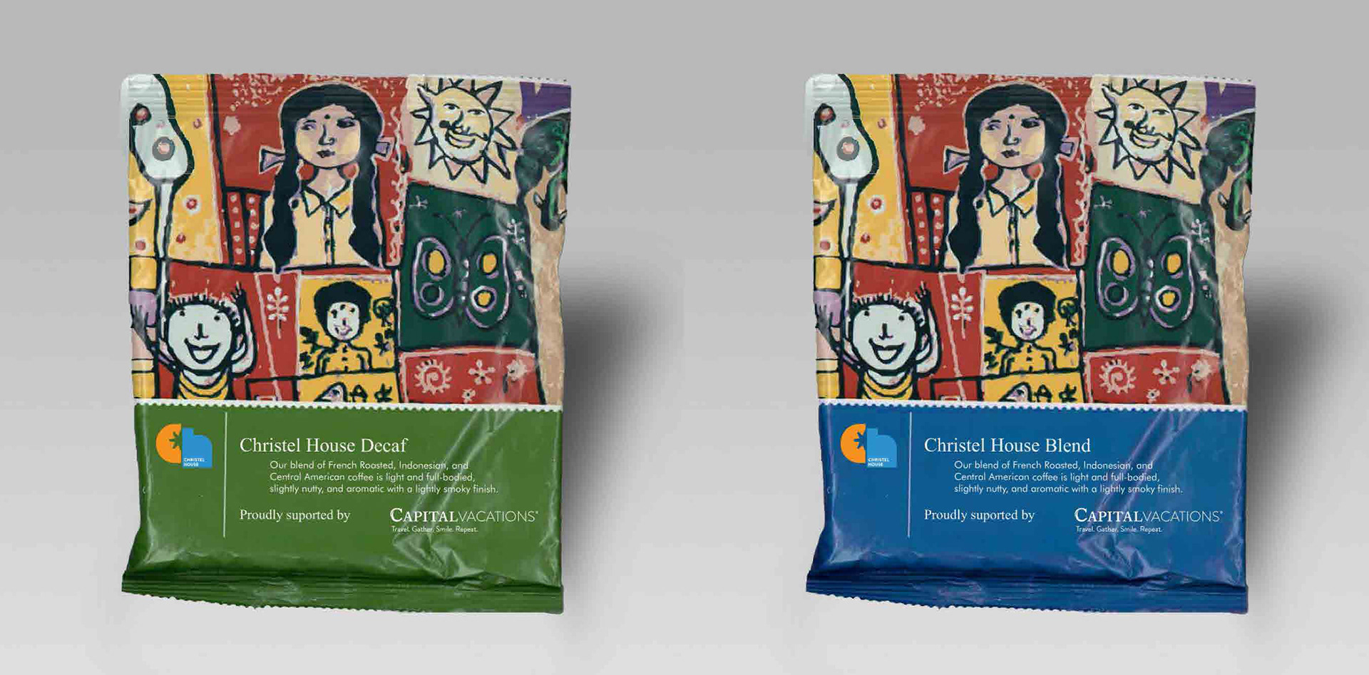
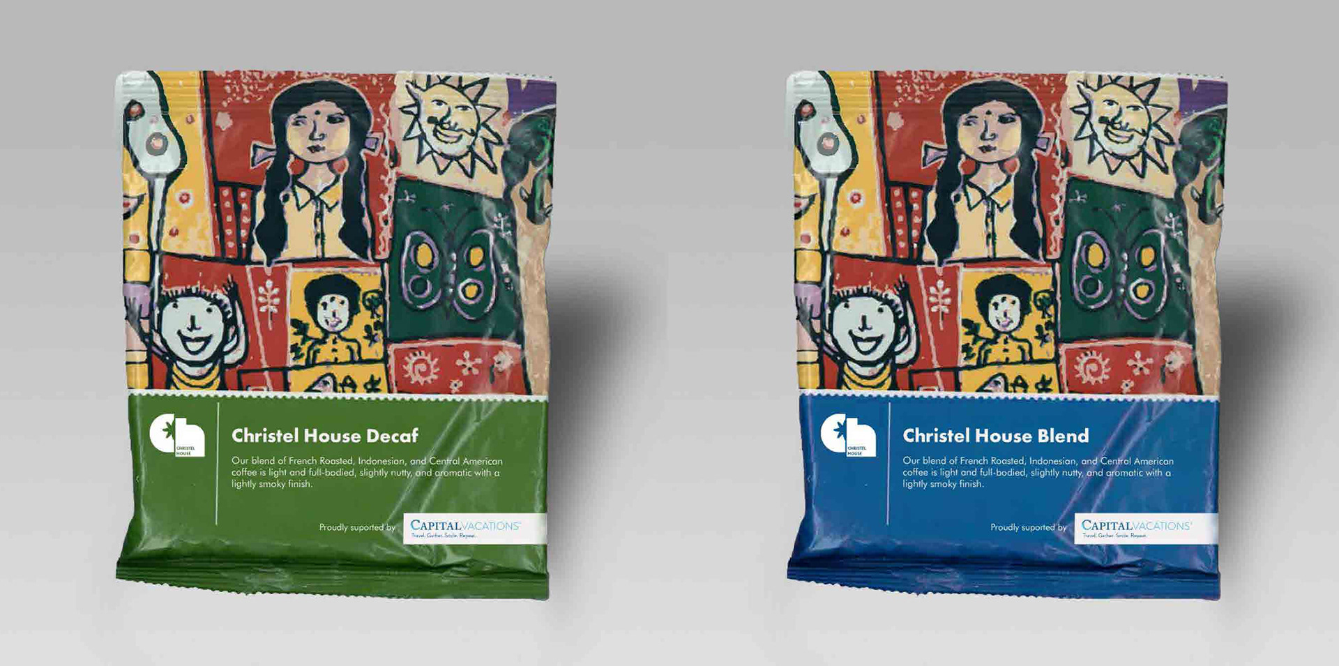
Concept 3: Feedback Received
- Client wanted more child artwork on the package
- I felt there was a strong need to showcase a better solution for both primary brands (CH and CH).
- I needed to write a mission statement for CH.
- I felt there was a strong need to showcase a better solution for both primary brands (CH and CH).
- I needed to write a mission statement for CH.
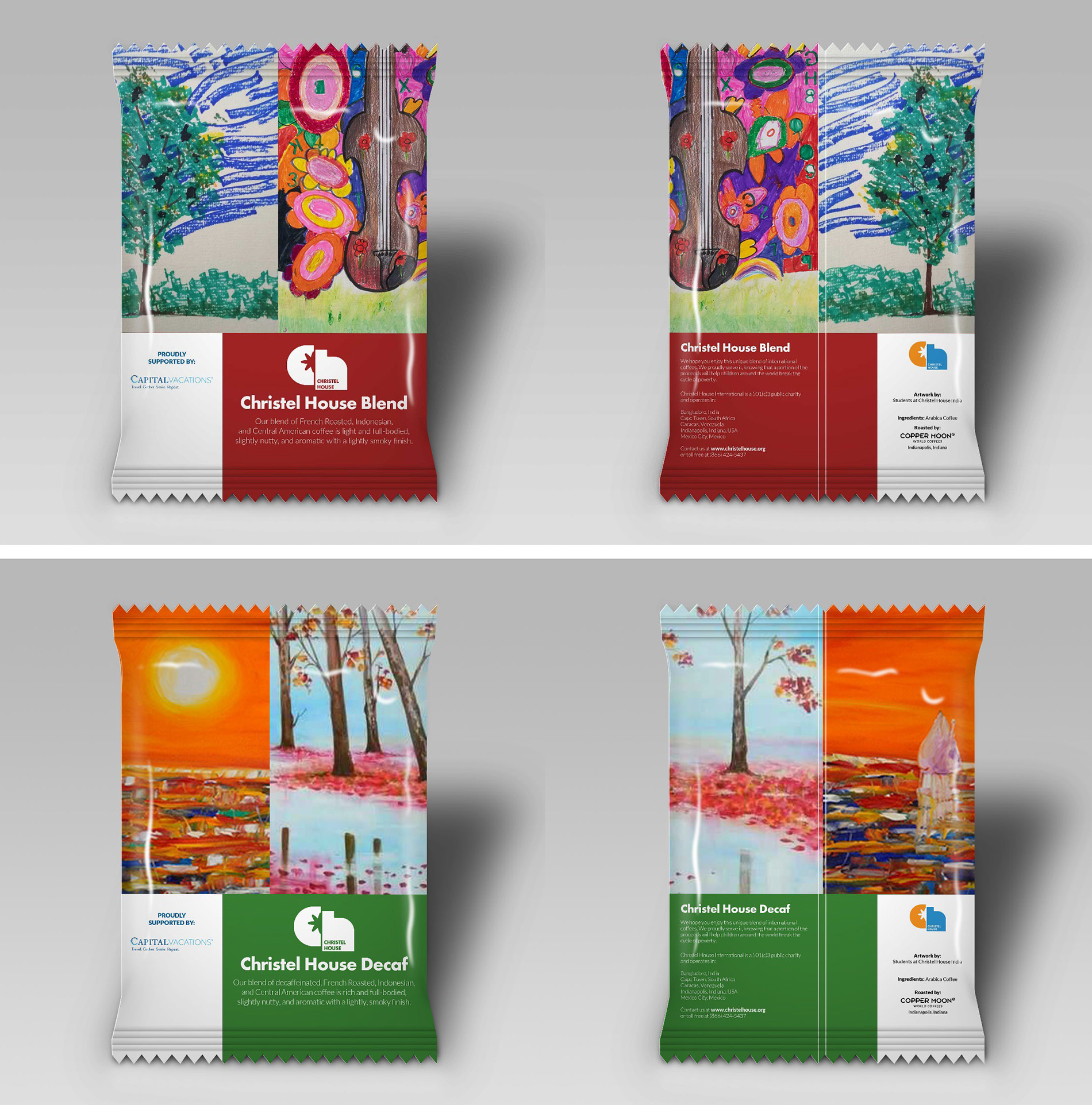
Prepress Consideration
Successful packaging production depends on close collaboration with the selected print vendor from the outset of the project. Before finalizing artwork, it is essential to obtain the vendor's approved dieline and print template to ensure all design elements conform to the package structure, bleed, safe areas, and production specifications. Maintaining consistent communication throughout the prepress and proofing process helps identify potential issues early, verify color accuracy, and confirm material and finishing requirements. This collaborative approach minimizes costly revisions, prevents unexpected production challenges, and ensures the final packaging is reproduced with the highest possible quality.
Successful packaging production depends on close collaboration with the selected print vendor from the outset of the project. Before finalizing artwork, it is essential to obtain the vendor's approved dieline and print template to ensure all design elements conform to the package structure, bleed, safe areas, and production specifications. Maintaining consistent communication throughout the prepress and proofing process helps identify potential issues early, verify color accuracy, and confirm material and finishing requirements. This collaborative approach minimizes costly revisions, prevents unexpected production challenges, and ensures the final packaging is reproduced with the highest possible quality.
07. Results
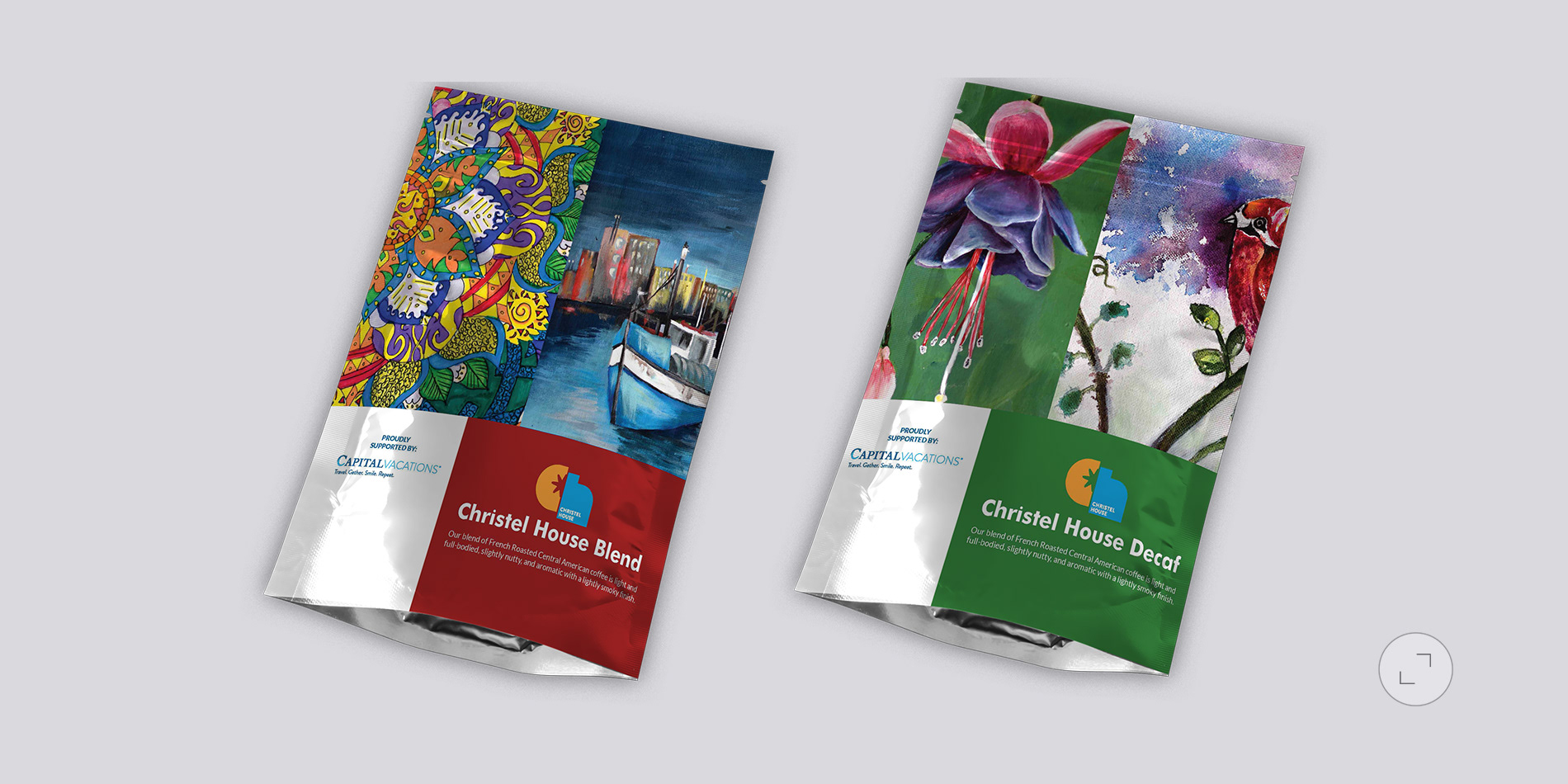
The final design solution combined warm hospitality-inspired visuals with a modern, clean packaging architecture that reflected the premium nature of the coffee program.
Key design elements included
- A refined color palette inspired by travel, relaxation, and resort destinations.
- Premium typography that reinforced quality and sophistication.
- Clear brand hierarchy emphasizing the Capital Vacations identity.
- Dedicated storytelling panels highlighting the partnership with Christel House and the positive impact of supporting educational opportunities worldwide.
- Flexible packaging templates that could easily adapt to multiple coffee varieties and future product extensions.|
- Sustainable production considerations that aligned with both organizations' commitment to creating positive community impact.
- Premium typography that reinforced quality and sophistication.
- Clear brand hierarchy emphasizing the Capital Vacations identity.
- Dedicated storytelling panels highlighting the partnership with Christel House and the positive impact of supporting educational opportunities worldwide.
- Flexible packaging templates that could easily adapt to multiple coffee varieties and future product extensions.|
- Sustainable production considerations that aligned with both organizations' commitment to creating positive community impact.
The resulting packaging transformed a standard guest amenity into a brand storytelling vehicle that connected hospitality, travel, and philanthropy in a single experience.
- Delivered a unified coffee packaging system capable of supporting deployment across the Capital Vacations resort portfolio.
- Strengthened brand consistency at guest touchpoints throughout the customer journey.
- Increased visibility of Capital Vacations' charitable partnership initiatives through everyday guest interactions.
- Enhanced the perceived value of in-room amenities by introducing a more premium presentation.
- Created a scalable packaging platform that supports future product line expansion and promotional opportunities.
- Successfully aligned a hospitality product with the organization's broader mission of creating meaningful experiences while supporting communities through strategic partnerships.
- Strengthened brand consistency at guest touchpoints throughout the customer journey.
- Increased visibility of Capital Vacations' charitable partnership initiatives through everyday guest interactions.
- Enhanced the perceived value of in-room amenities by introducing a more premium presentation.
- Created a scalable packaging platform that supports future product line expansion and promotional opportunities.
- Successfully aligned a hospitality product with the organization's broader mission of creating meaningful experiences while supporting communities through strategic partnerships.
Summary
The project demonstrates how thoughtful package design can extend beyond product presentation to communicate brand values, strengthen guest engagement, and support a larger social purpose.