• Simple is better than complex
• Include NJ State Seal
• Solid colors preferred
• No complex gradients
• No textures
• Reflective stripping for vehicle safety
After meeting with the stakeholders, we discussed exactly what is needed on the vehicles. Since the design brief called l for simplicity, I was able to gain consensus to paired down graphical elements to what is shown here.
Before even starting a design obtain an accurate template of the vehicle(s) to be wrapped. Fortunately, the NJMVC had a relationship with the vehicle manufacturer, so we were able to request the CAD isometric schematics. It’s crucial to create the designs on an accurate template to be able to create a design that is as accurate to scale as possible. These are large vehicles 44 feet and 38 feet in length, so we had to get it right.
Additionally, it is also crucial to discuss with the person or team who will be completing the wrap as they will guide you to avoid many common pitfalls that. If you haven't completed a vehicle wrap in the past having an early discussion will be a HUGE aid during your conception and production phase.
Computer-aided design (CAD) drawings from vehicle manufacture provided as PDF files
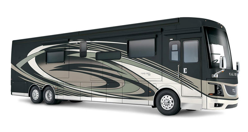
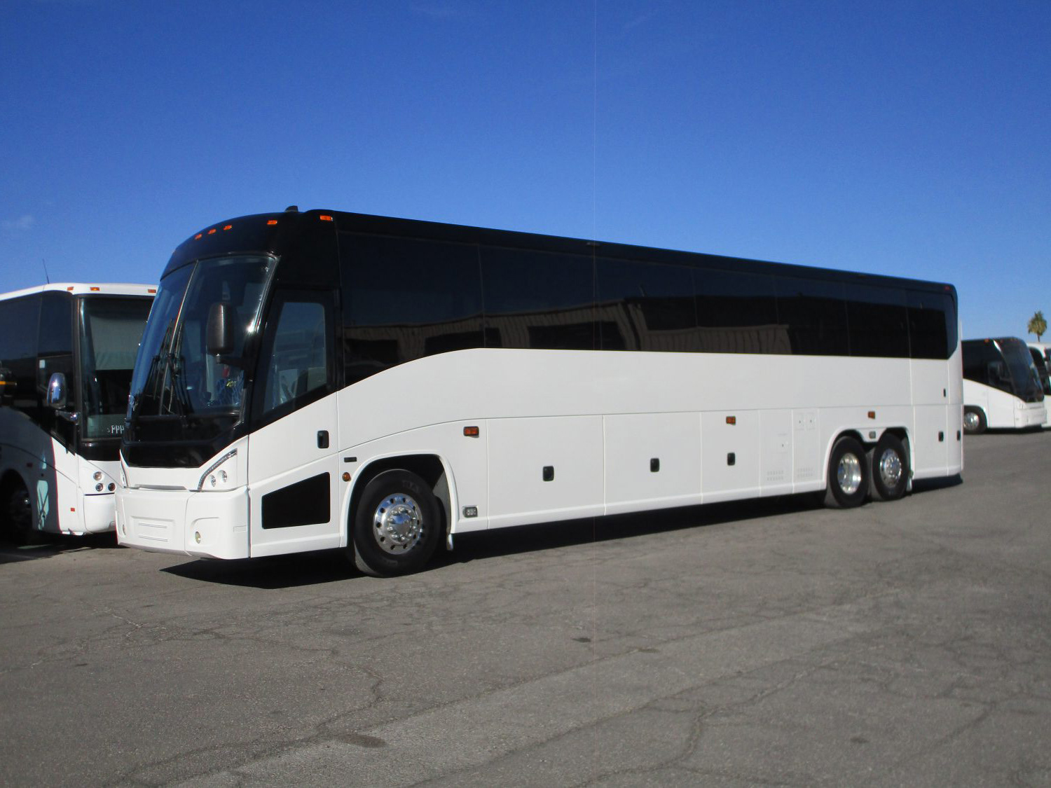
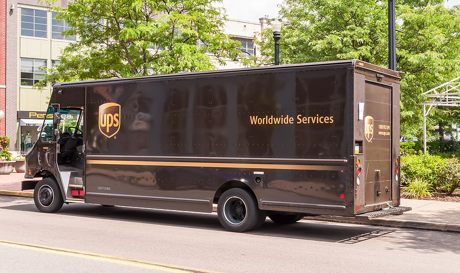
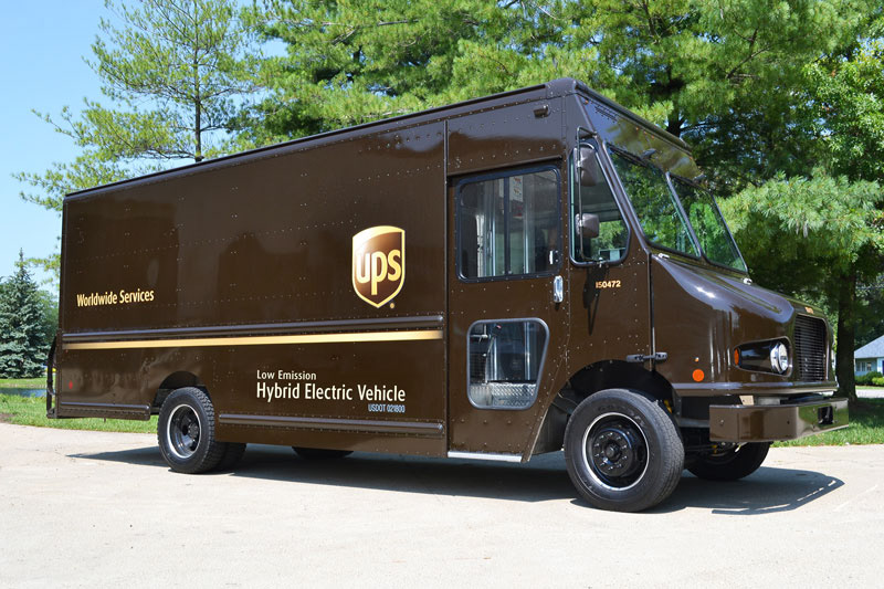
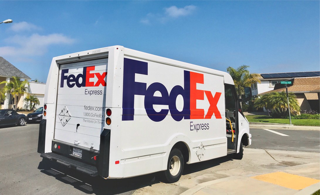
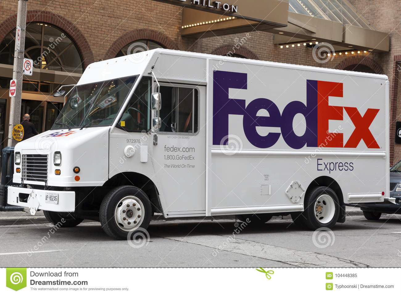
My visual solution needed to account for the different sized vehicles and the only way to do this is to design together. Mobile Unit 1 (MU1) larger of the two vehicles Mobile Unit 2 (MU2) appear to me to be the size and scale of a mobile home, motor coach, or bus; similar to examples shown below.

FedEx logo showing arrow shape in negative space
Unlike two-dimensional design work such as print or photography, a 3D object can be viewed from any angle and needs to be a factor in all design considerations. As in the UPS vehicle, shown above, the designer consciously positioned the UPS shield logo opposite the tagline, reverse position on the opposite side of the vehicle so the shield logo is always towards the front of the vehicle for maximum visibility. In contrast, the FedEx logo contains a negative space arrow and when the logo is viewed on the driver side of the vehicle the arrow points in the reverse direction, a negative connotation by graphic standards; and I recall this being a point of contention in the design community.
At the end of the day, this is a motor vehicle and part of the design consideration was how this will appear when moving? How about in a static state? When these vehicles are being used as mobile agencies (static) the sides of the vehicles open up to allow for greater interior space.
Challenge 4: Surface Details
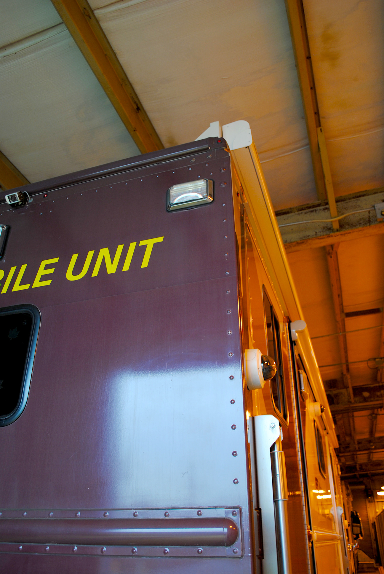
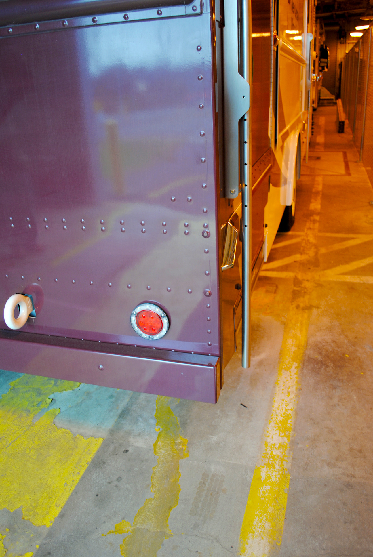
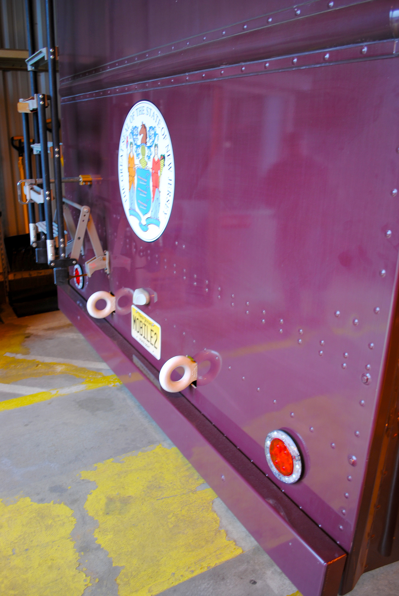
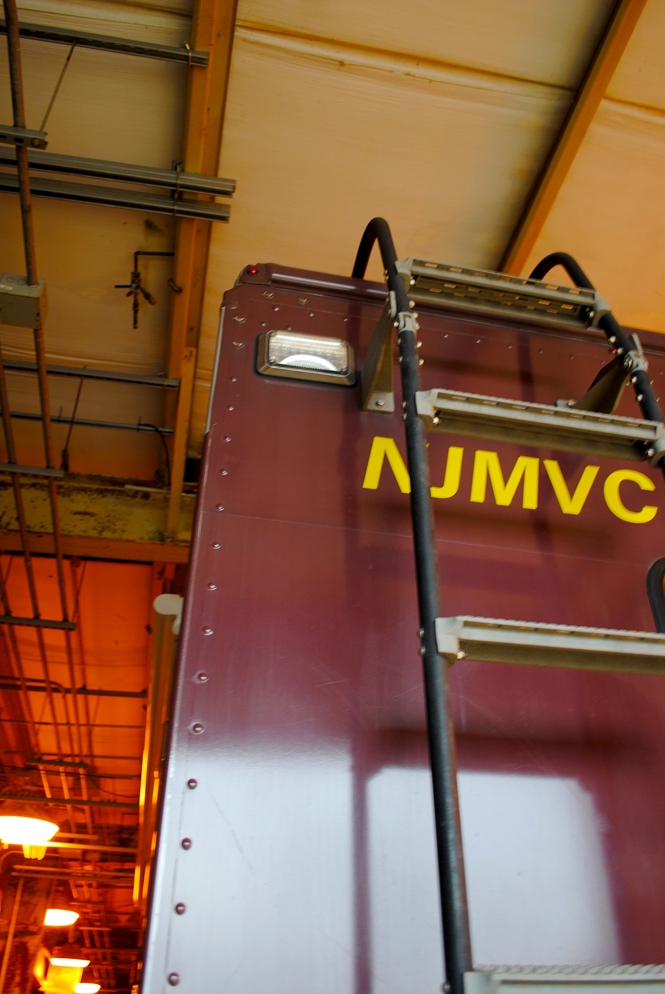
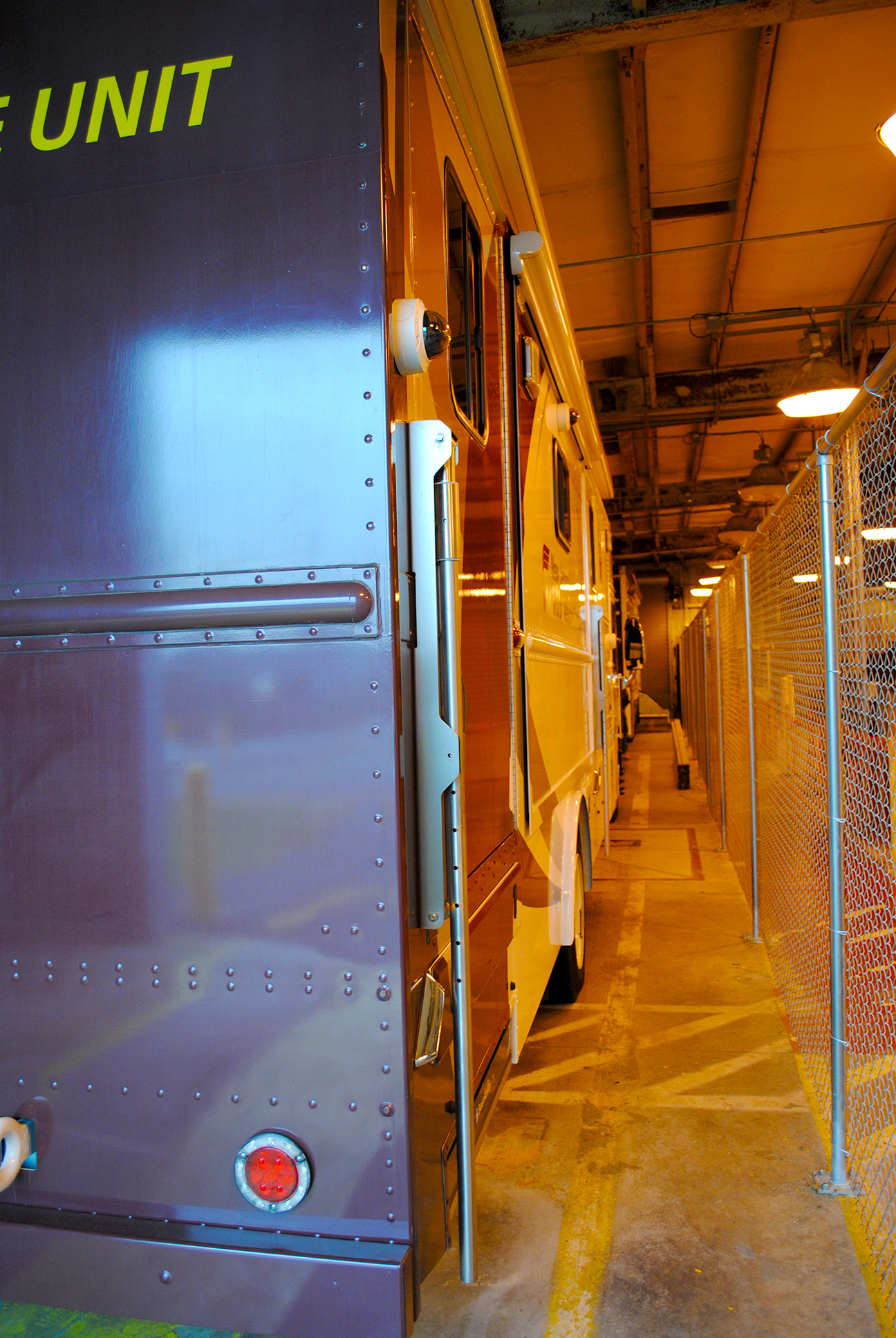
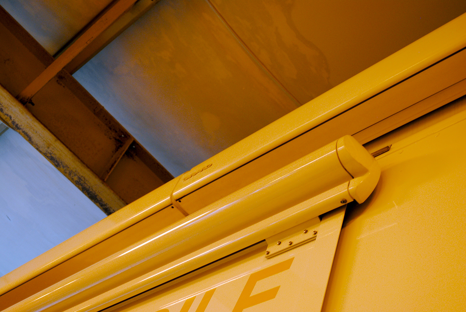
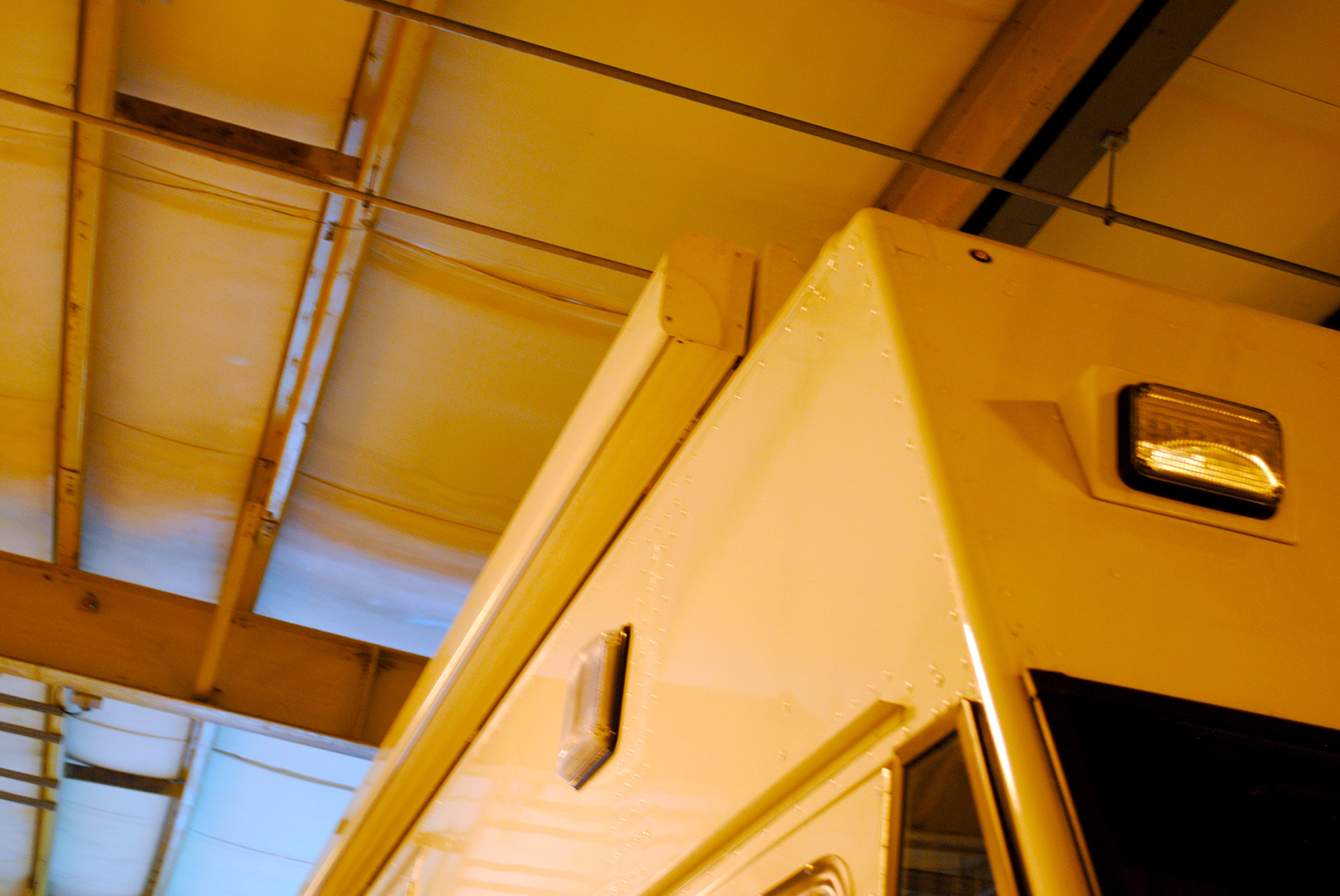
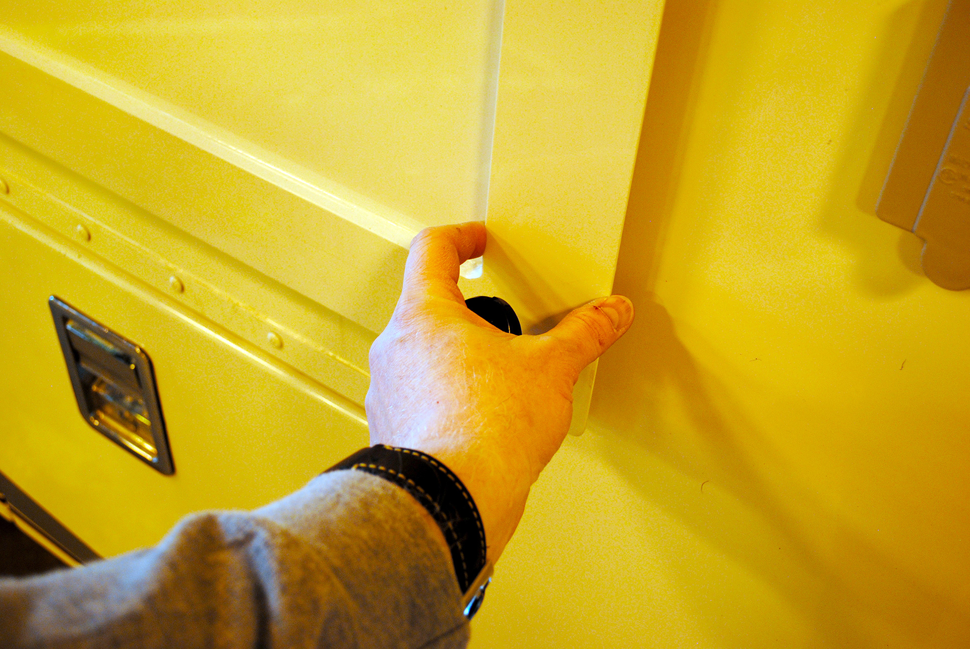
Additional elements of design are the surface detail of each vehicle, windows, doors, vents, screens, ports, ladders, bumpers, grills, lights, flashers, and antenna. All need to be factored into the design.
Process
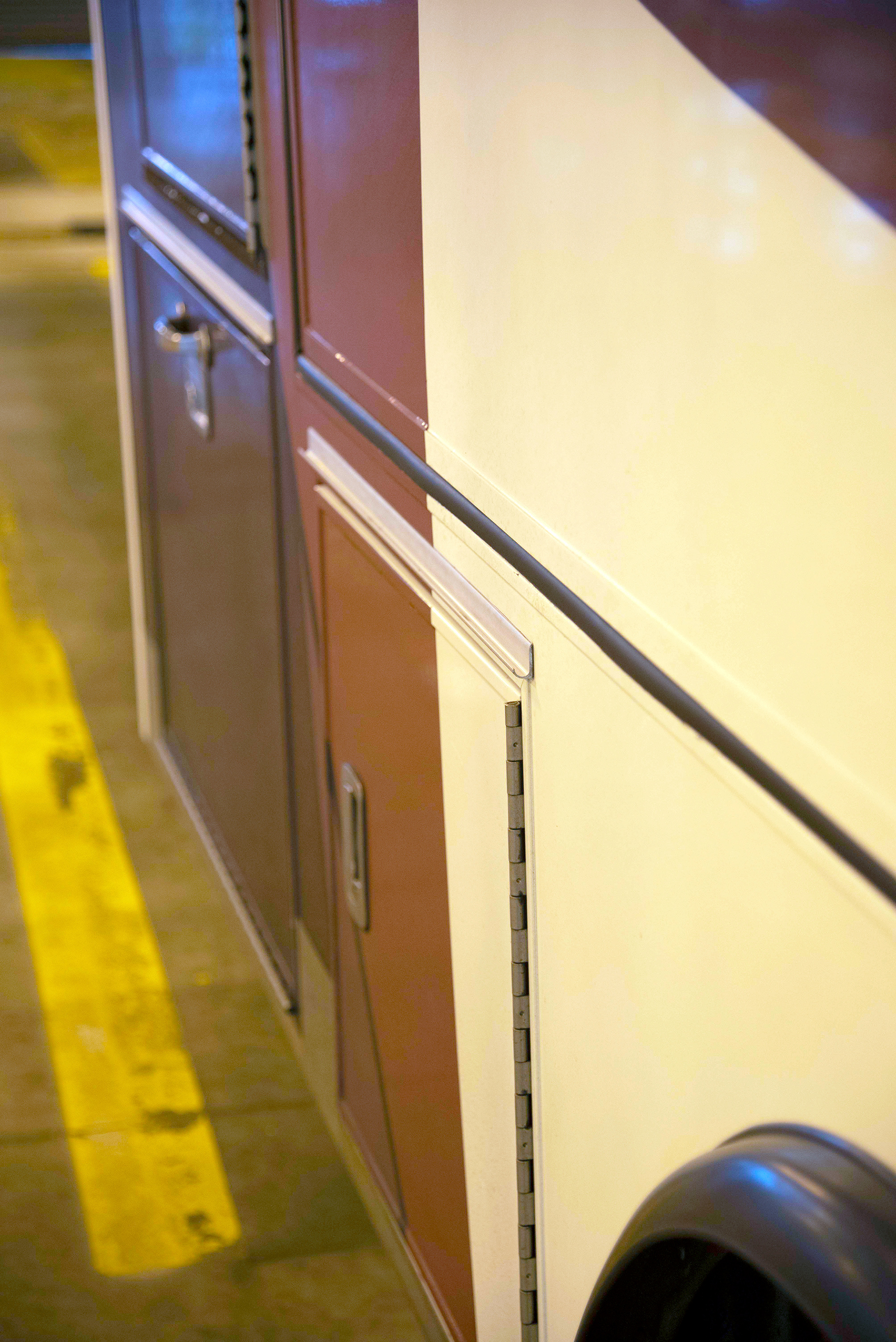
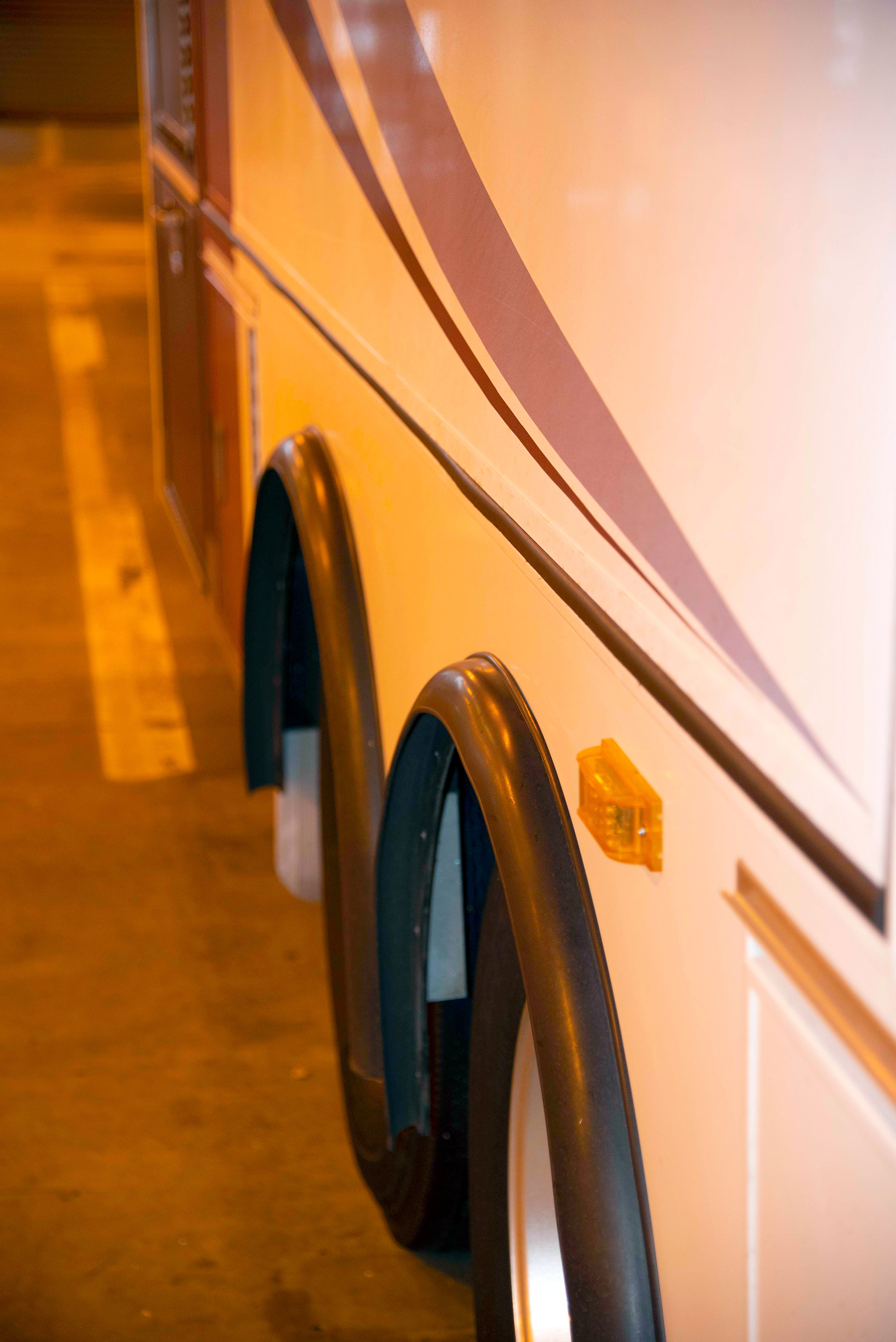
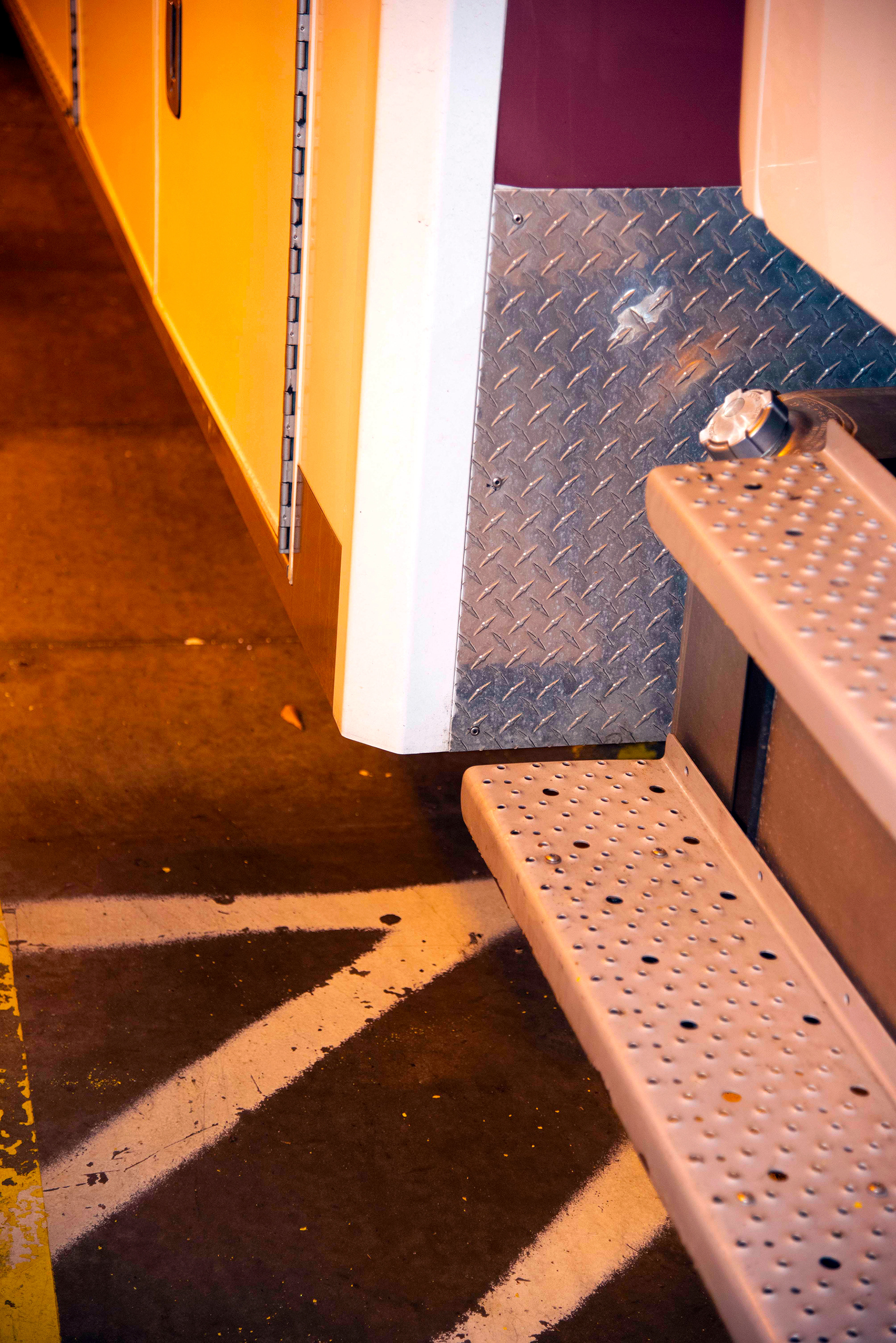
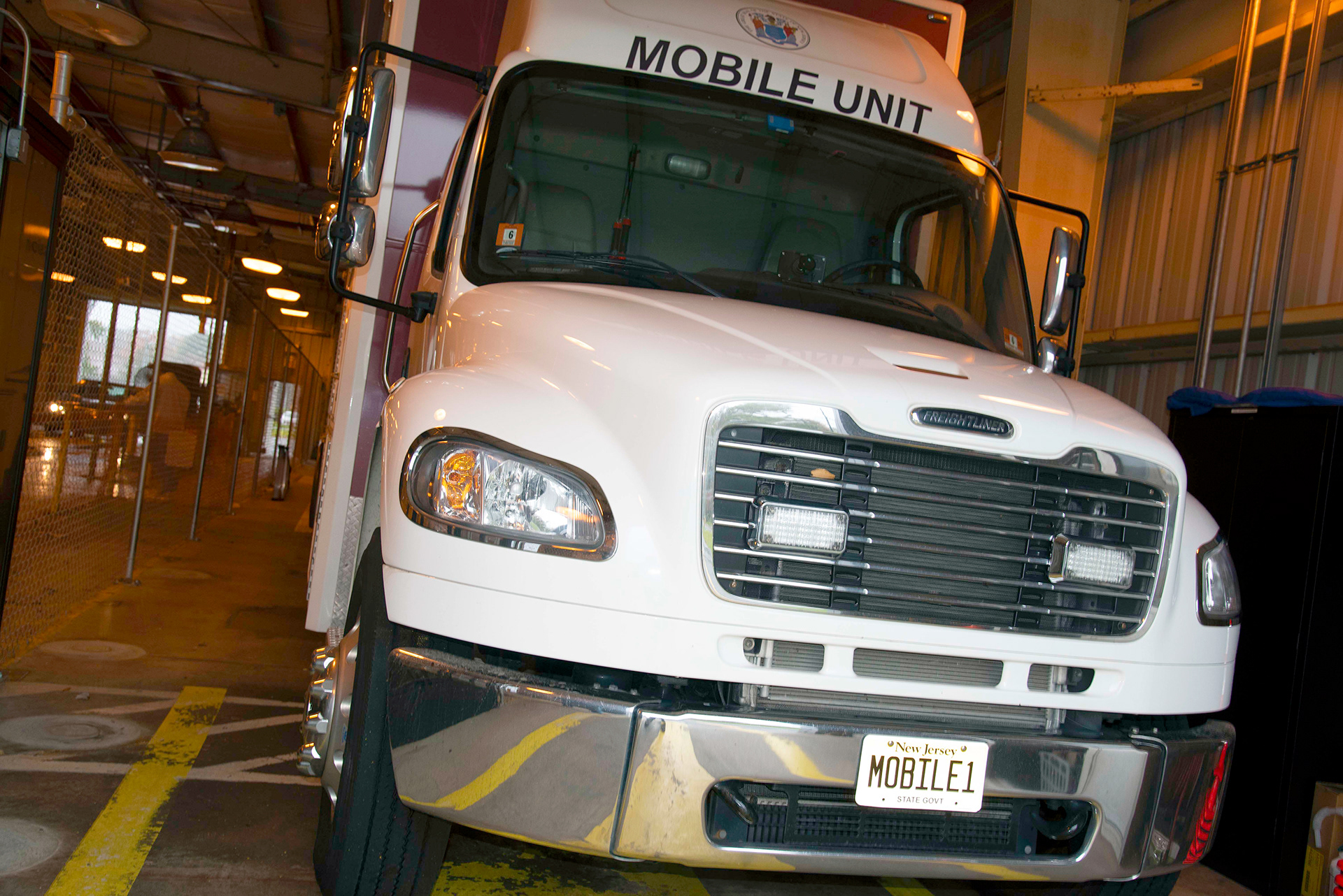
A vehicle inspection is critical to assess the scope of the project before any design work is initiated. Having eyes on the vehicle to check the number of flat panels, obstructions like door handles, vents, and complex curves, since complex curves are their own challenge for the person wrapping the vehicle.
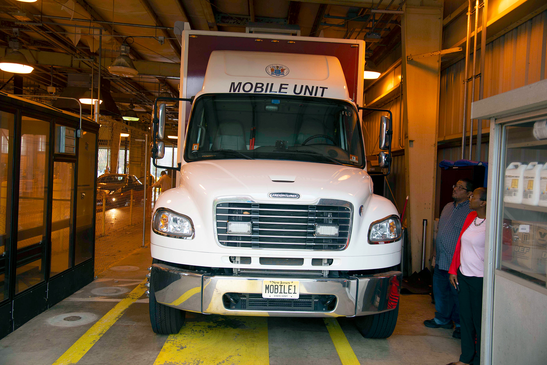
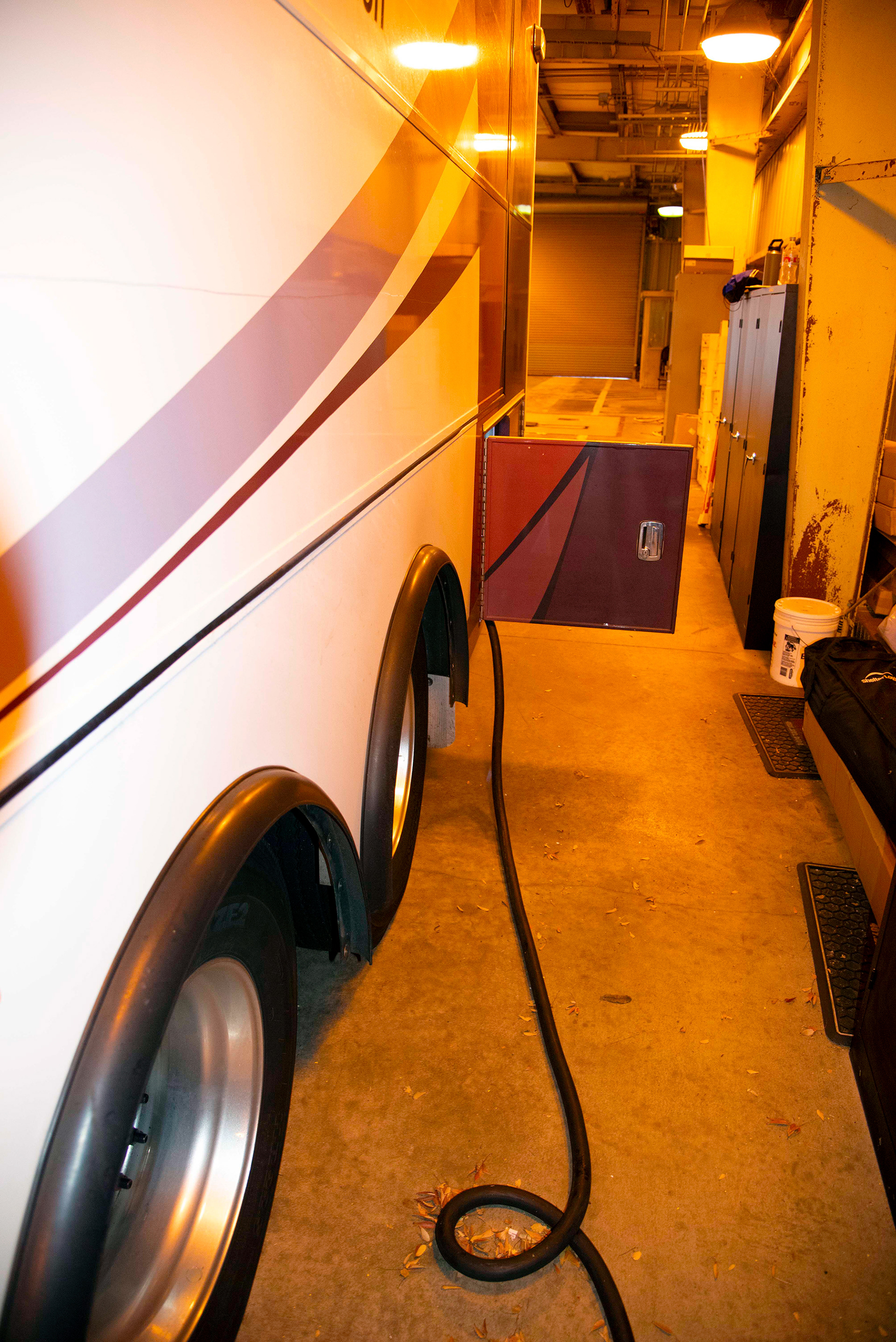
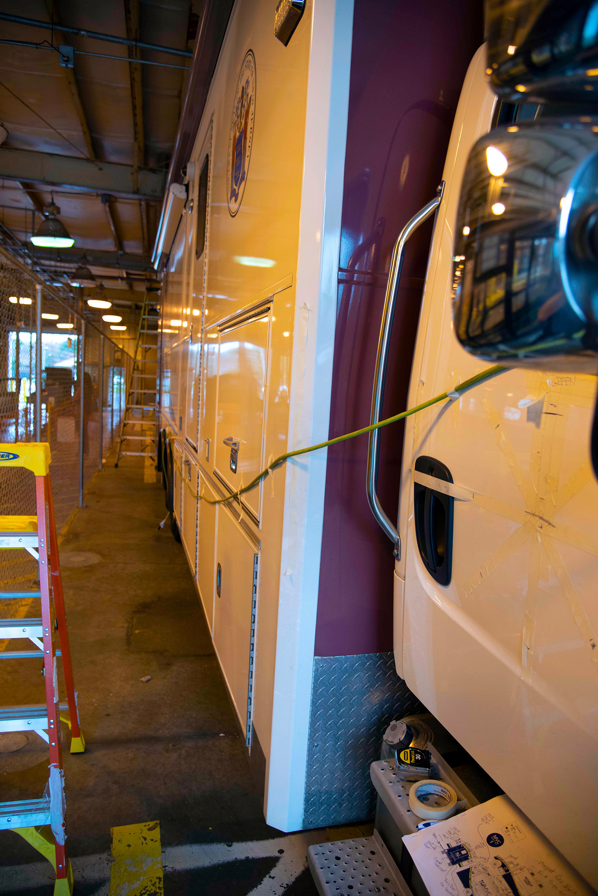
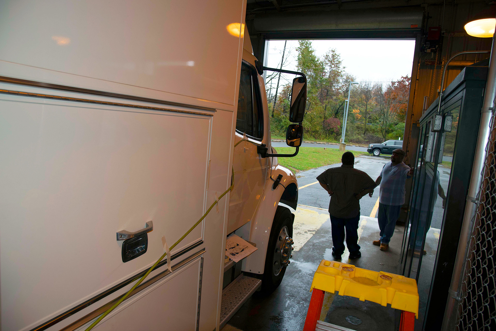
I completed a full photoshoot of the vehicles, to gauge the size and the complexities of the surface that needs to be wrapped. NOTE the photos taken below were not taken with ideal light conditions, so I am aware of the photos are of poor quality. However, the usefulness I received from taking these photos was invaluable to recall the surface details. Notable also that the previous NJMVC vehicle wrap branding is in place within photos, noting the red/brownish colors and OLD logo. These are only a small collection of photos taken during the photo shoot.





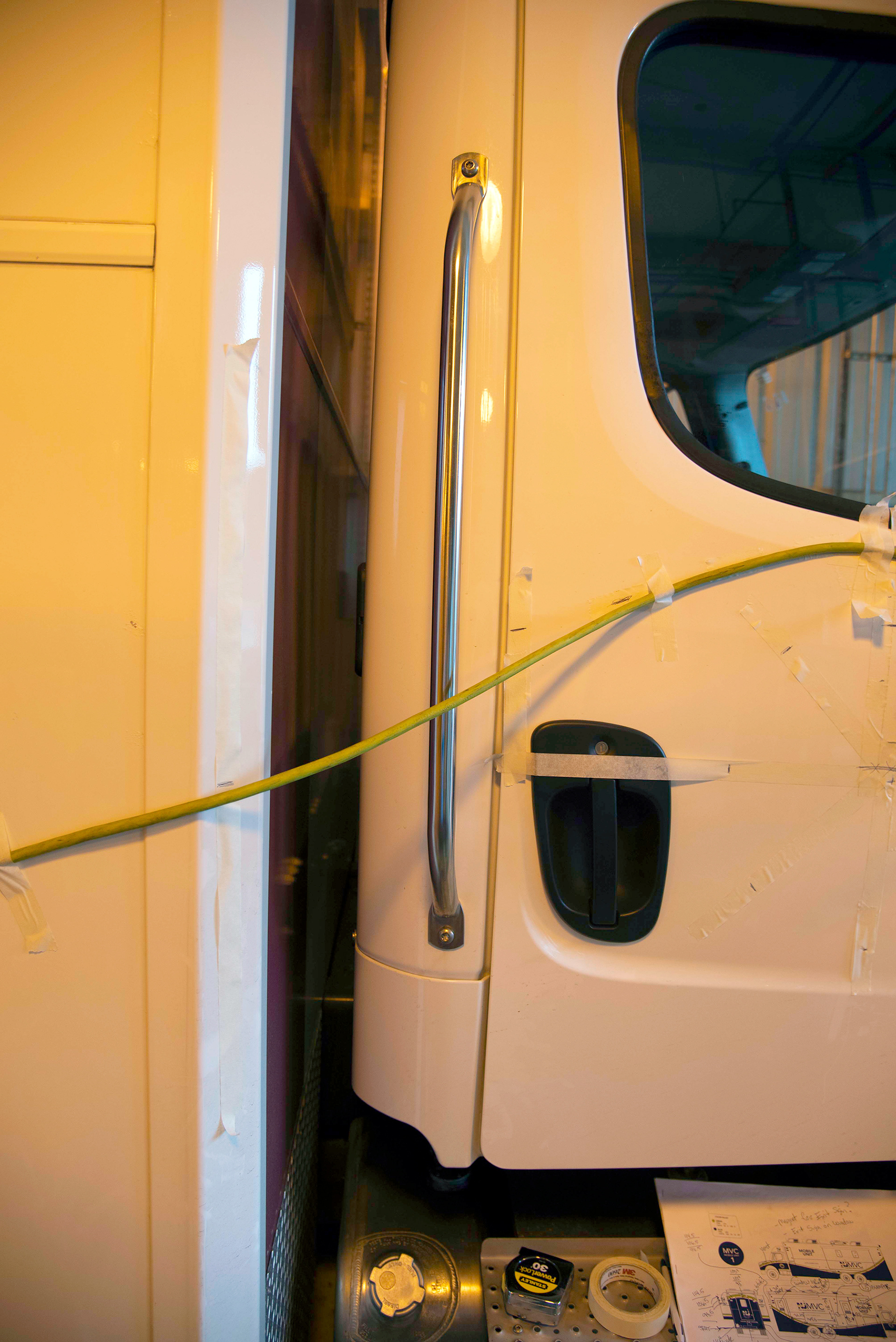
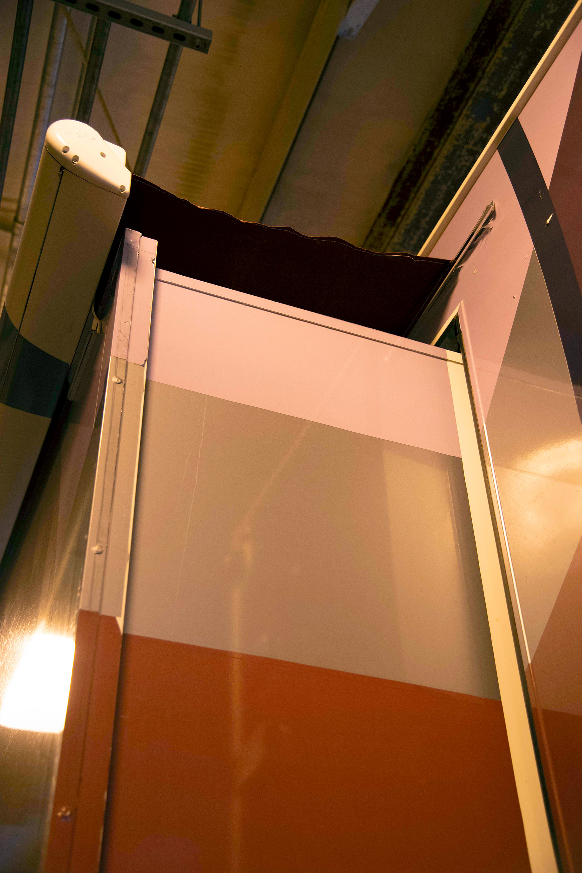
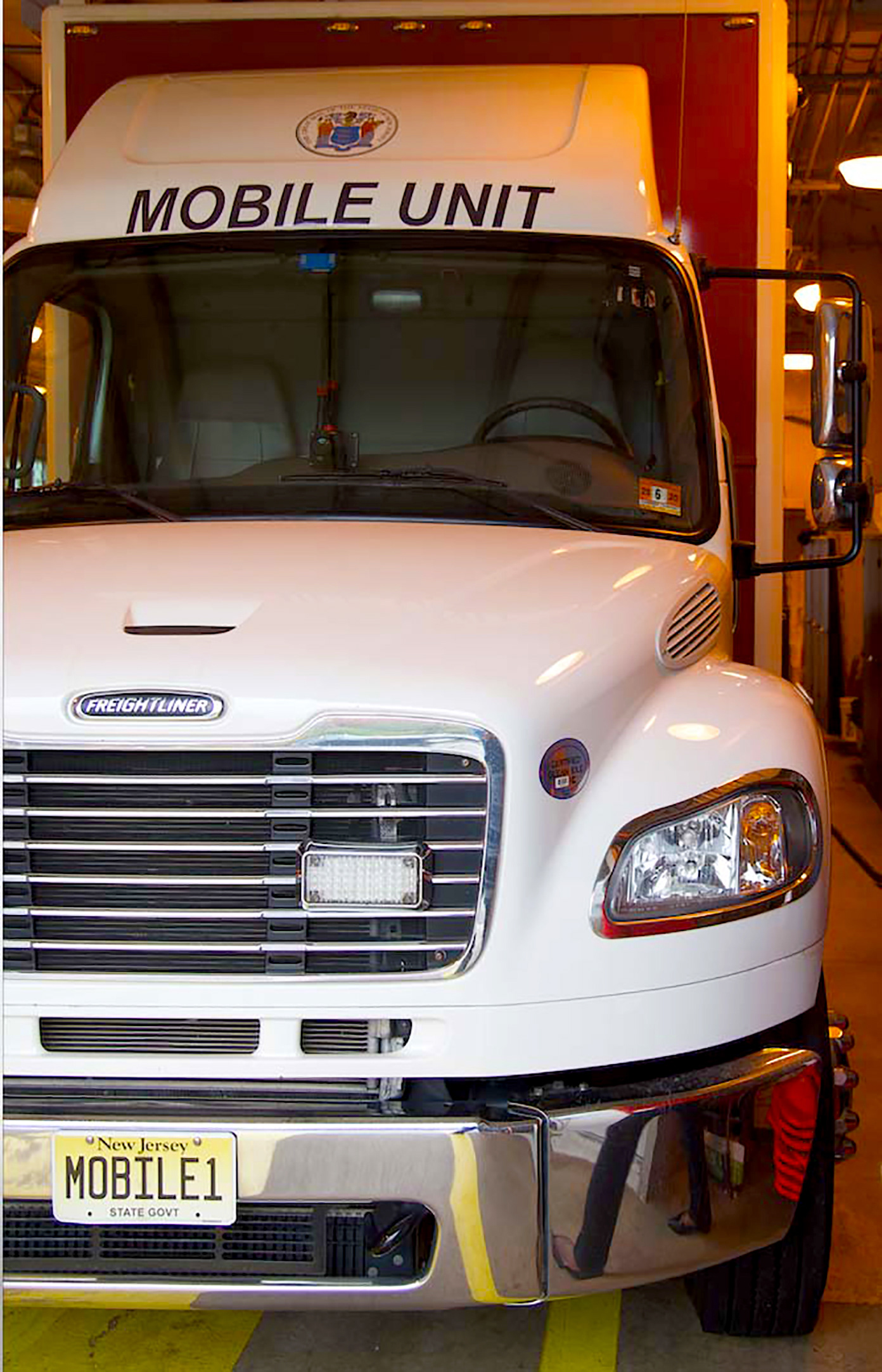


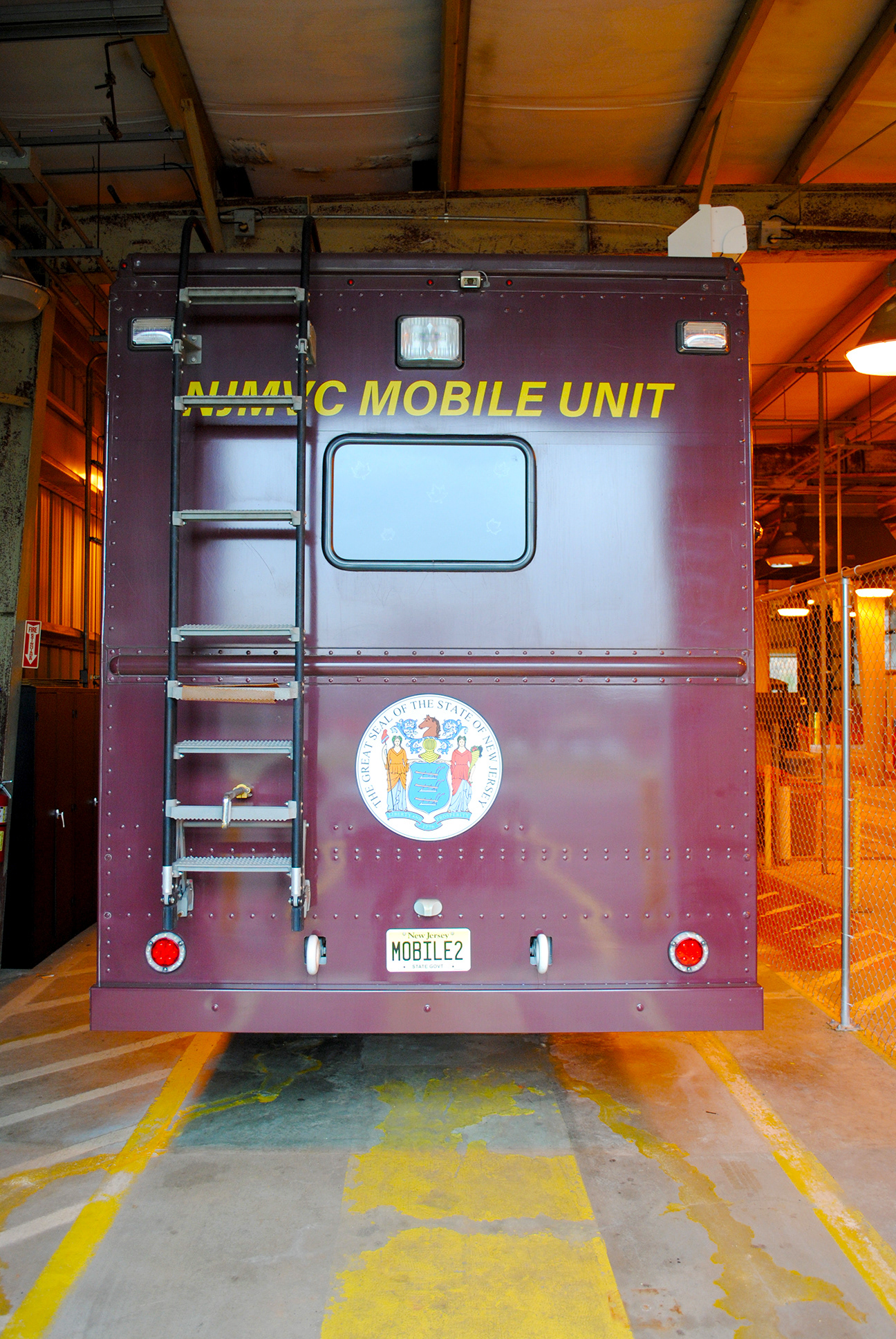


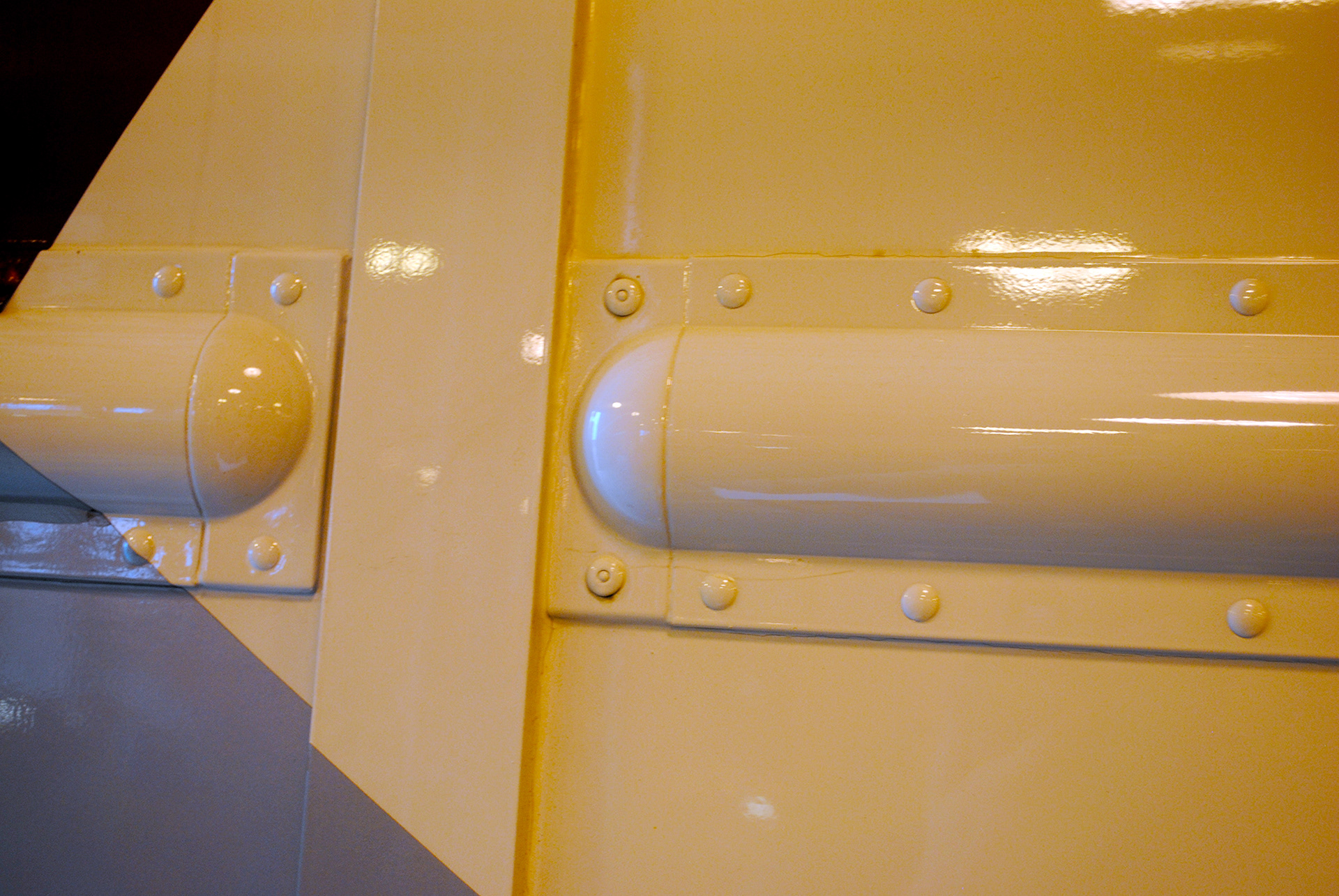
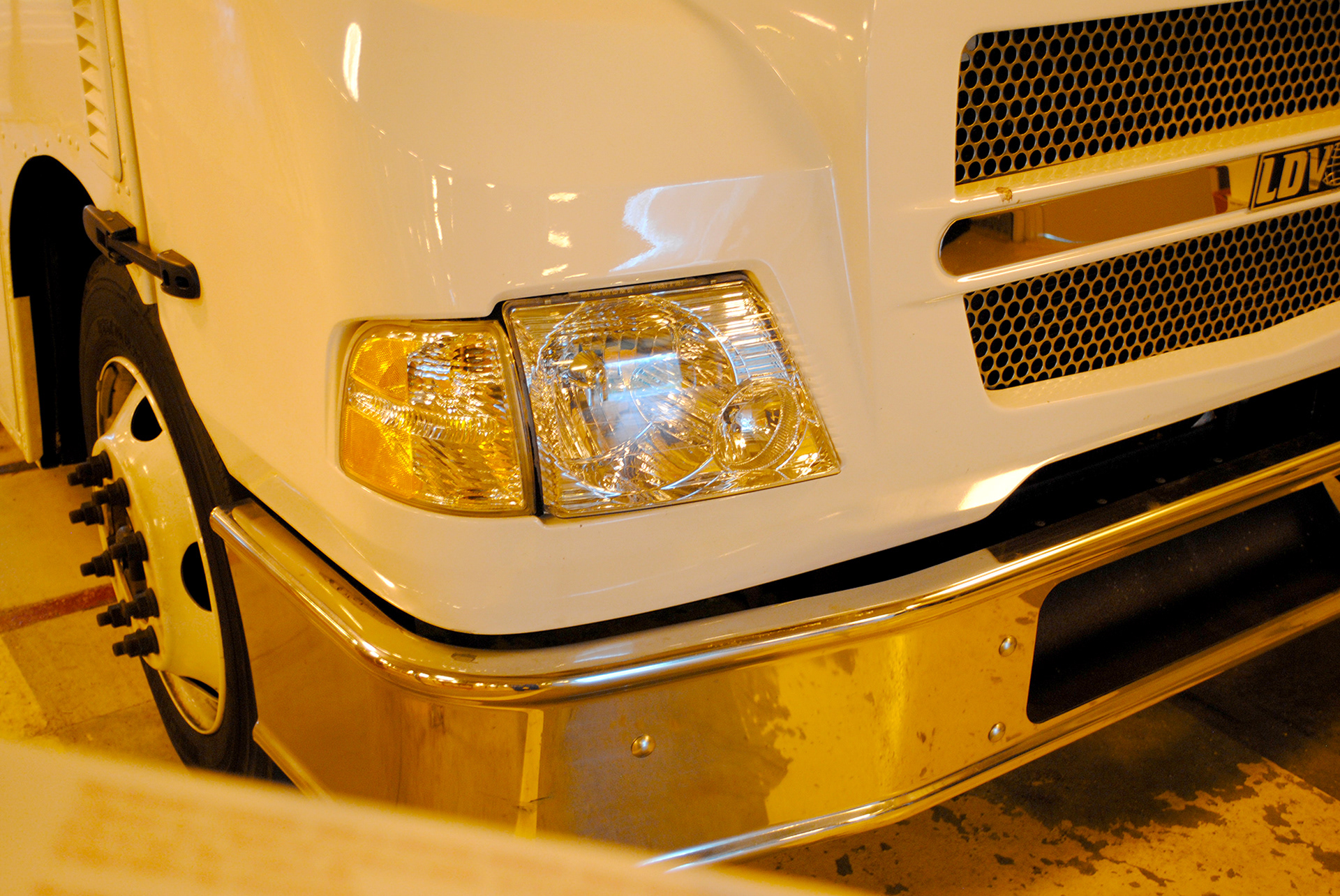


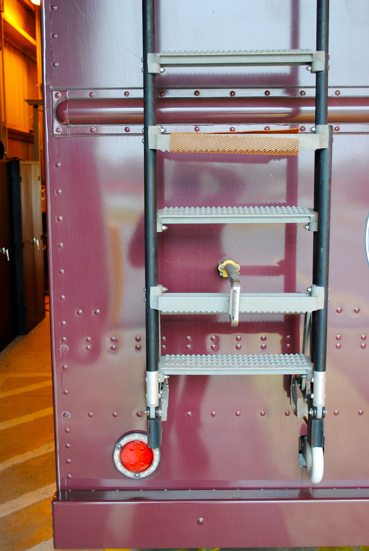


Seeking inspiration, I turn to the work of others to see what is doable and learn to see if what may apply to my use. I find the use of Pinterest.com as my method for quick Mood Boards, screen capture is shown below.
SOURCE: https://pin.it/5GpP9Wh
Concept sketch 1, yes there are times when I sketch via pen and paper. Feedback received on this sketch was that it was too heavy on the green. Per the MVC style guide, Blue tends to be the dominant color.
Concept sketch 2, feedback received on this sketch was that it was too busy. While circles are a design element of MVC this use of a blob-like pattern was too far of exploration for most of the stakeholders, as per consensus. Plus the large circular patterns were seen as not part of the creative brief, but as all creative know, we have to bend the rules and experiment before fully knowing what is to be considered.
Concept sketch 3, feedback received on this sketch was a potential for further study.
Concept Sketch 4, feedback received on this sketch was a potential for further study, the additional white or negative strip between the green and blue strip appealed to many of the stakeholders, per consensus.
SPOILER ALERT: This is the drawing that was eventually selected for the final wrap.
Concept 1, here is a derivative of the sketch concept using a bolder blue color and green strips. The white between the green stripes could be reflective material
Concept 2, I very quickly realized that MU1 (Mobile Unit 1) was more complex in surface details than MU2, as such I chose to focus on MU1 for this concept, knowing that the design can more easily be applied to the vehicle with less surface detail. Doing this allowed for a bit of short-cutting the design time roughly in half allowing for a quicker turn-around of iterations.
Concept 3, was received very well, and multiple requests for revisions were made. Most requested more green to be added to the design.
Concept 4, most of the stakeholders gravitated to this iteration, so I proceeded to final with this concept
Don't take my word as to the positive outcome of the mobile unit's track record listen to a few random customer testimonials.
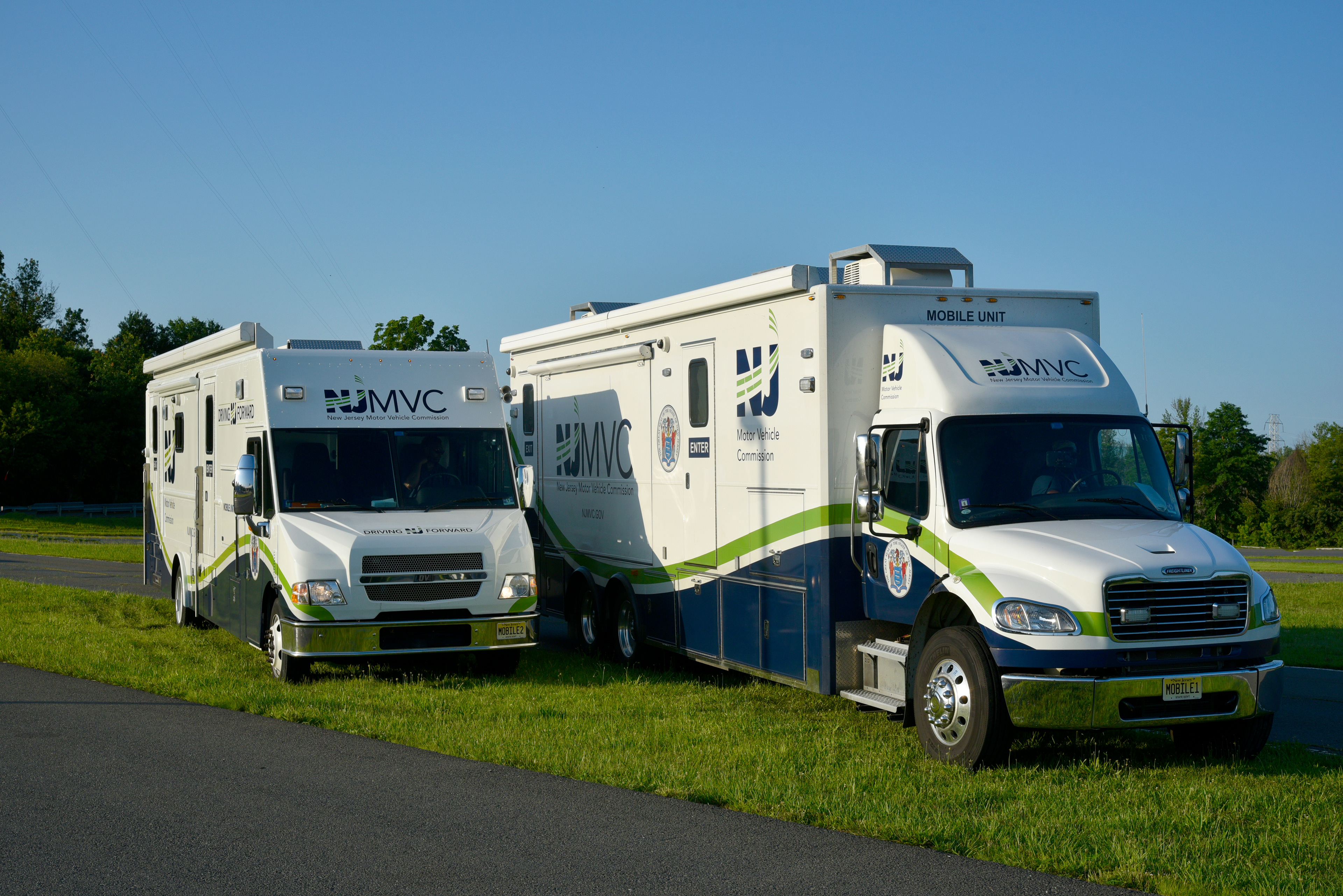
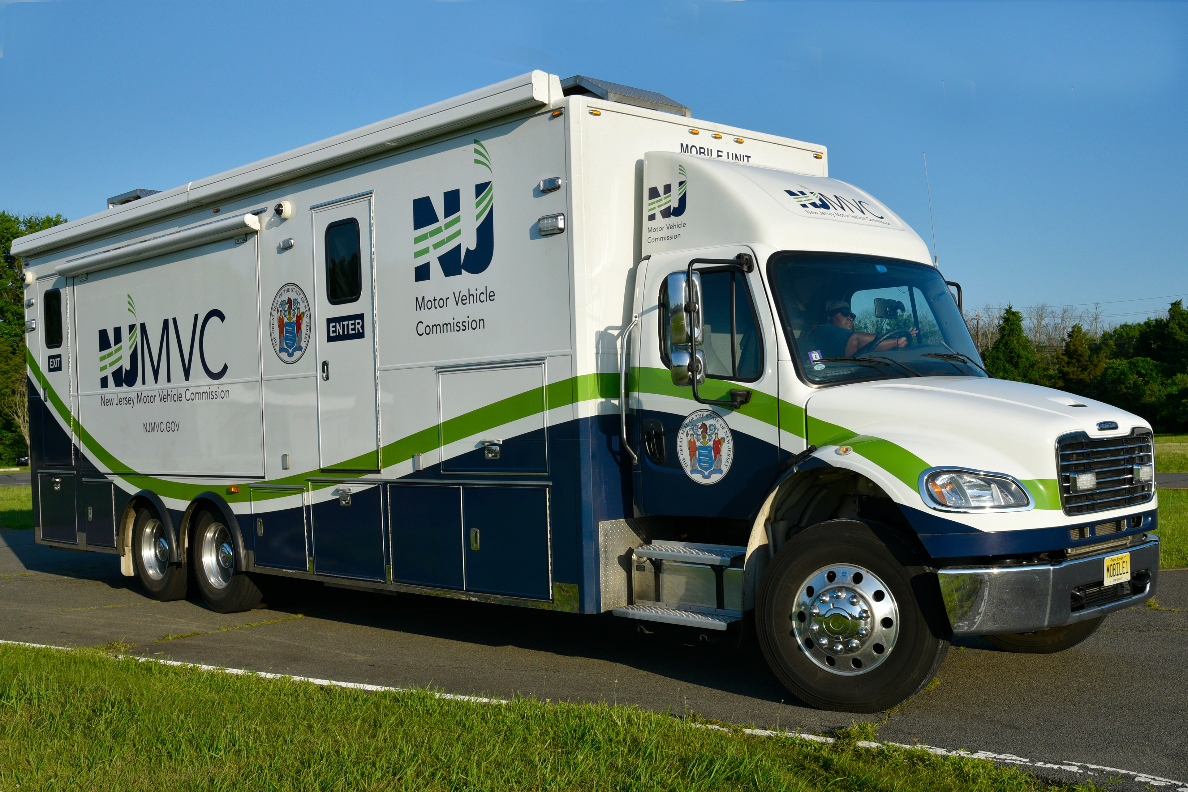
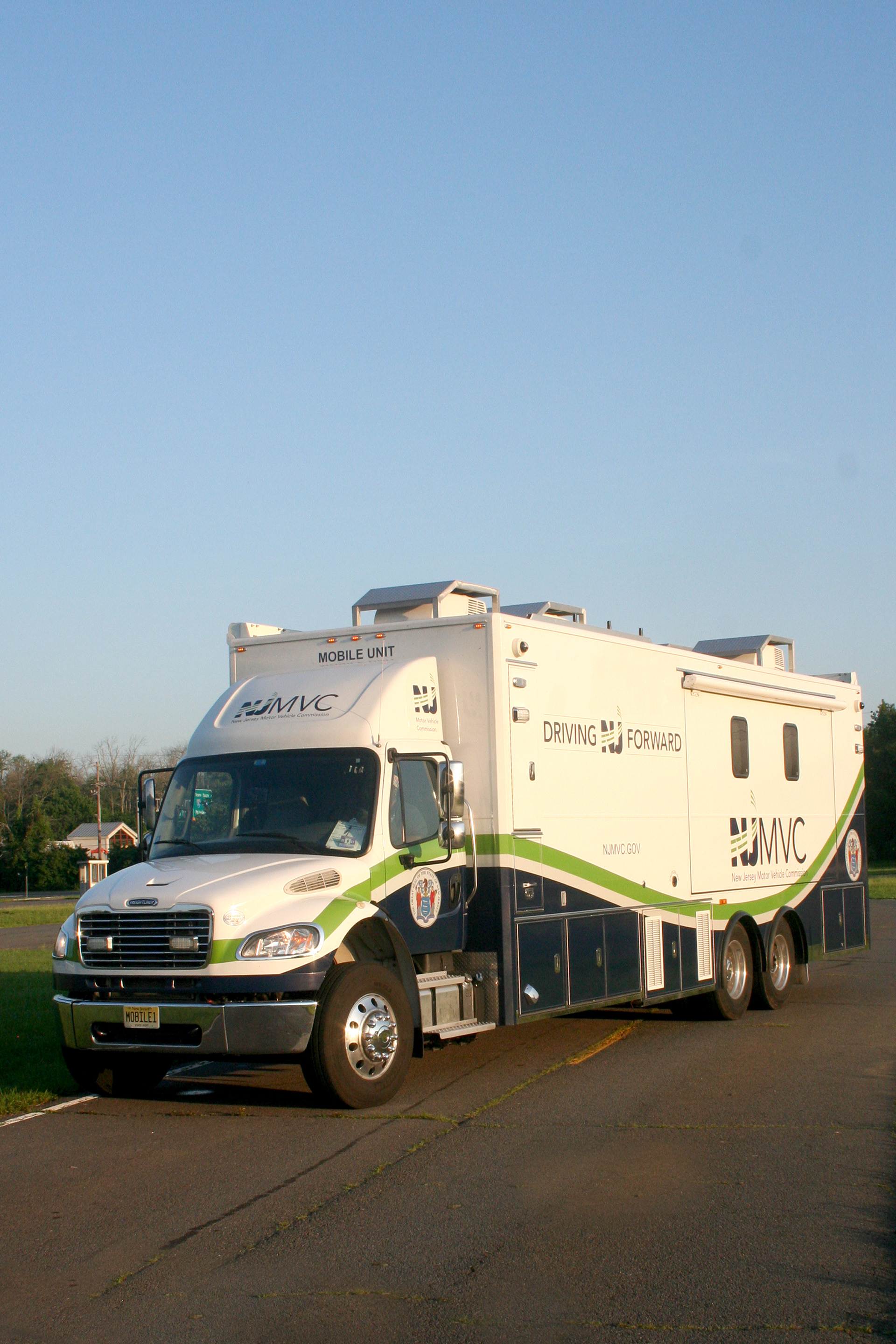
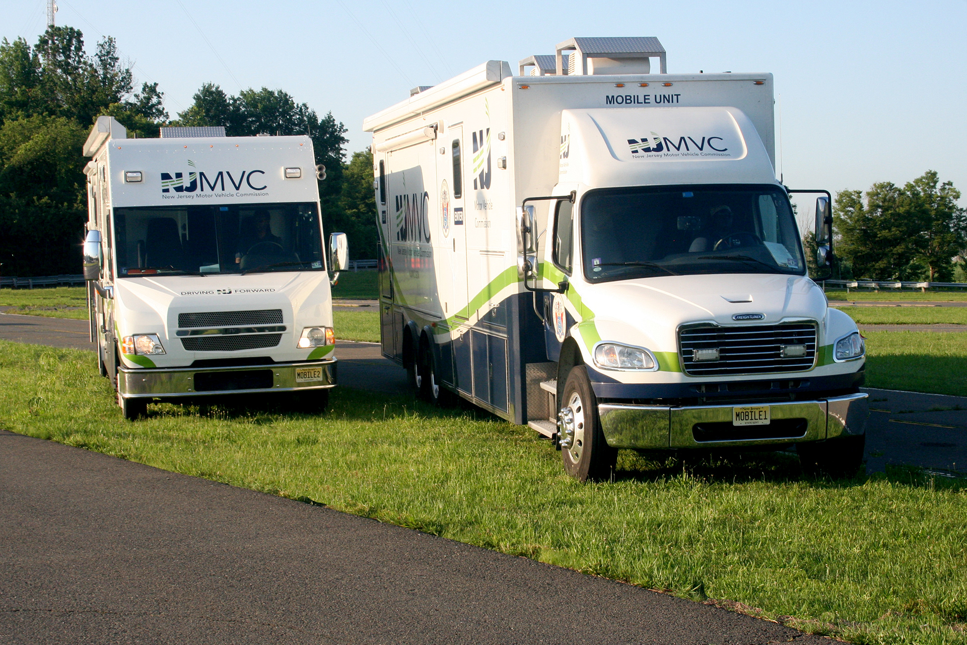
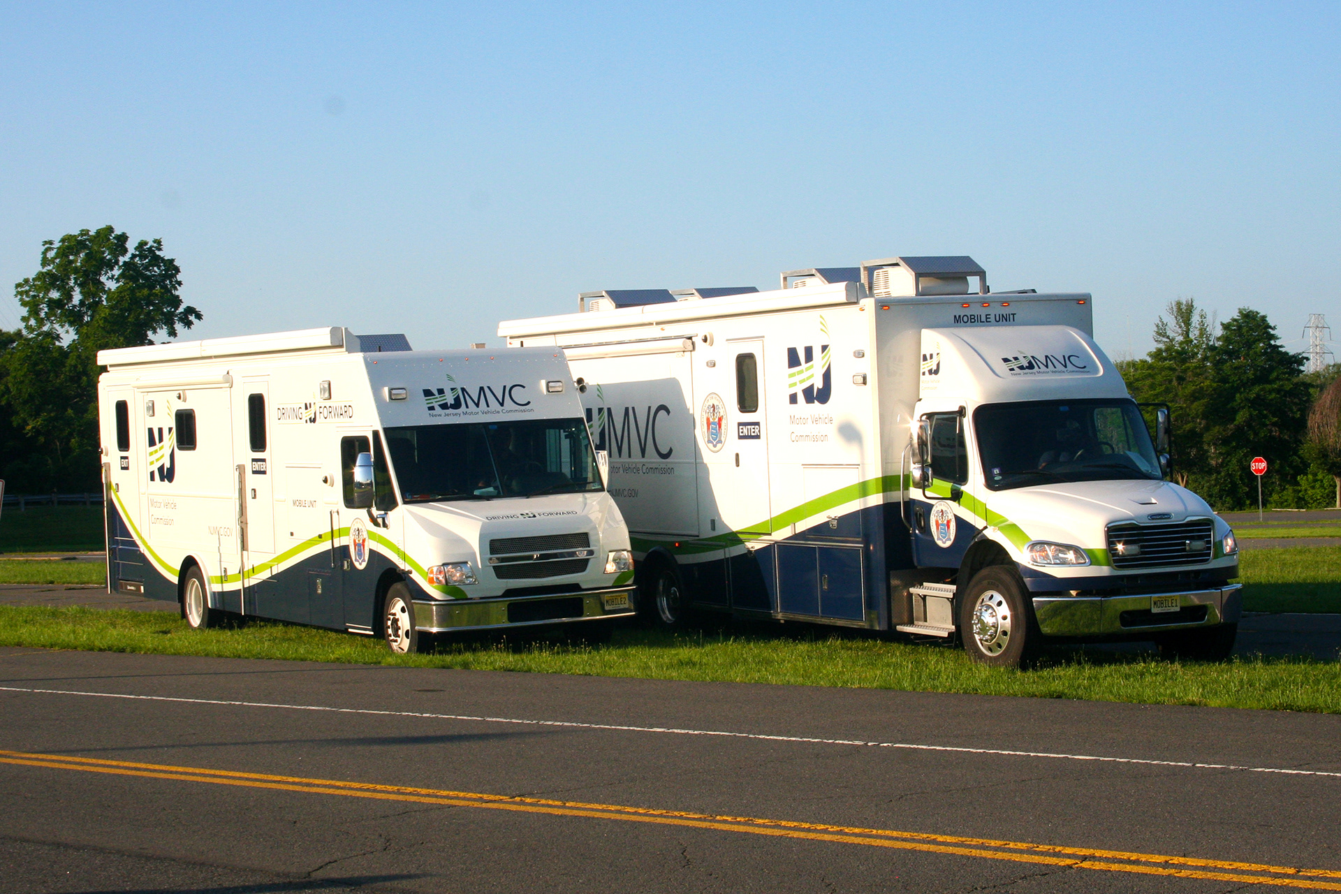
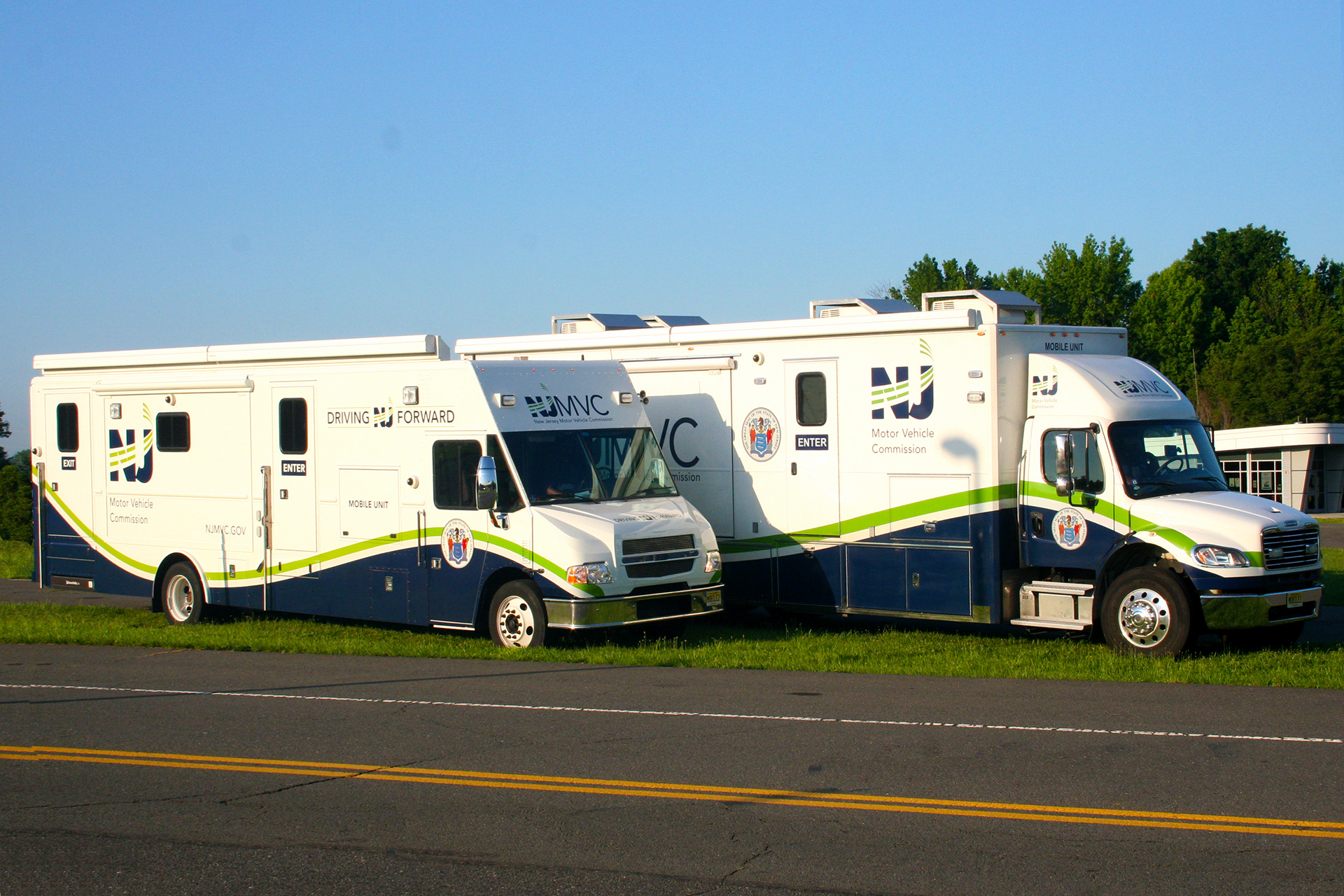
Final mobile unit 1 (MU1) photo
Final mobile unit 2 (MU2) photo
