
Capital Vacations is an independent timeshare resort management company that partners with owners and developers to keep properties running like a well-oiled (and beautifully maintained) machine. Depending on each resort’s agreement, services can range from core operations to the fine-grain details—think HR management, security, and everything in between. The goal? Smooth operations and unforgettable stays for owners and their guests.
My Role
Taking charge of the transformative redesign process, I assumed a multifaceted role encompassing strategic planning, creative direction, and seamless execution.
Strategic Redesign
I led the charge in conceptualizing and executing the comprehensive redesign strategy for Club Connection Magazine, ensuring alignment with the brand's refreshed image and the refined audience profile.
Content and Visual Overhaul
Spearheading the content strategy and visual revamp, I redefined the magazine's tone, imagery, and layout, infusing it with modern aesthetics and captivating narratives.
Audience-Centric Approach: With a keen understanding of the redefined audience's preferences, I tailored the magazine's content and design elements to cater directly to their interests, fostering deeper engagement.
Collaborative Implementation: Collaborating closely with a cross-functional team of stakeholders, writers, managers, and vendors, I orchestrated the seamless execution of the redesign, maintaining brand fidelity and quality throughout.
Creative Brief
Objective
Enhancing Travel Experiences and Customer Engagement through engaging content and expanded services. Redesign the existing by updating, and updating the layout to modern standards while aligning to brand standards.
As the lead creative force behind Club Connection Magazine, I spearheaded a strategic redesign in response to Capital Vacations' rebranding efforts and the evolving preferences of our audience. This initiative aimed to realign the magazine's content, design, and overall appeal to better resonate with the updated brand identity and the expectations of the new target audience.
Execution and Impact
The 2021 redesign of Club Connection Magazine under my leadership marked a pivotal turning point for Capital Vacations. The revamped magazine resonated powerfully with the redefined audience, resulting in increased reader engagement, positive feedback, and a notable impact on the brand's perception.
The strategic realignment of content and design elements effectively showcased Capital Vacations as a forward-thinking travel authority while solidifying the magazine's position as a go-to resource for the latest in travel experiences.
Conclusion
As the driving force behind the 2021 redesign of the Club Connection magazine, my efforts contributed significantly to Capital Vacations' ability to adapt and innovate in a rapidly evolving landscape. The redesign's success underscored our commitment to delivering exceptional travel experiences through captivating and audience-focused content, further cementing our position as a leader in the travel industry.
Review Existing Design
The redesign starts by ingesting the existing design and understanding the roots and reasons for how things were communicated visually.
The Canvas
Embarked on an exploration of colors, textures, and narratives, seeking to encapsulate the essence of modern travel while honoring the legacy of Capital Vacations.
Design Concepts
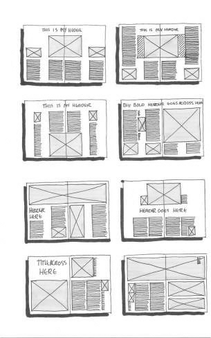
It all starts with a sketch, pen/paper, pencil/paper, or some hybrid tool such as a tablet or computer.
These quick drawings are sometimes called thumbnails, or a wireframe. Regardless of the name, this sketch is a critical component of design exploration. In my method, I block the space with literal blocks that represent photography and text content. These are some of my earliest sketches and bear little resemblance to the final layout, however, the blank canvas is a scary place for ANY creative, and putting something on paper that is tangible and potentially actionable is the ultimate in this early concept phase.
I did not share these early sketches with my stakeholders as I felt they were too low-fidelity and did not have enough design ideation to allow the stakeholders to respond accurately. However early sketches can be shared with stakeholders, if the stakeholders are not visually savvy they may not fully understand the nature of the sketch and will immediately reject it, and this is neither helpful nor productive in the very early phase of design and concepting.
Understanding the Palette
Delving into the rebranding efforts and audience research, unearthed the hues that would breathe life into the magazine. The palette was transformed—vibrant, yet sophisticated, reflecting the diversity of travel experiences our audience craved.
Individual Articles, and what they will look like
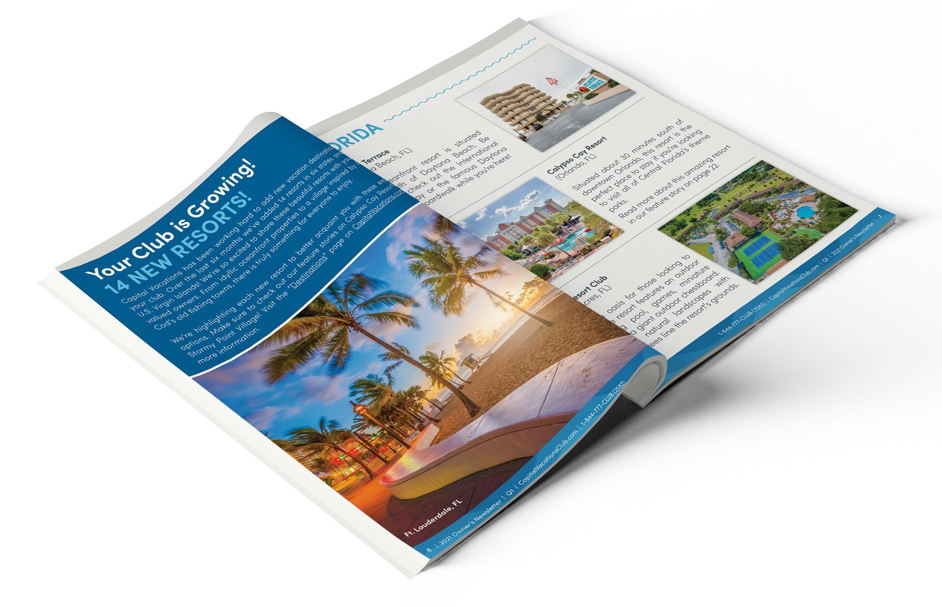
Needed to identify the article types to be written within the magazine, and build concepts to that end. Each article type has its own look due to the content (narrative) that is presented. For example, an article that features a particular resort would need to showcase photography to draw attention to the resort to promote the written narrative.
The Basics
Identify the basis of the layout and build cohesion to each. Examples of some of the most needed elements include:
• Title heads
• Subheads 1-5
• Body text
• Introductory Paragraph (intro, kicker, or stand-first)
• Bylines
• Pull-quotes
• Captions for images
• Folio
• Call-outs
• Bullet levels 1-5
• Subheads 1-5
• Body text
• Introductory Paragraph (intro, kicker, or stand-first)
• Bylines
• Pull-quotes
• Captions for images
• Folio
• Call-outs
• Bullet levels 1-5
Crafting the Narrative
Content became our storyteller, weaving intricate tales of wanderlust and discovery. Meticulously curated articles that transcended travel guides, evoking emotions and igniting a passion for exploration. Working closely with our communication director and helping craft the narrative was useful during the actual layout phase.
From Concept to Creation
Design metamorphosed into an art form—an amalgamation of minimalist elegance and dynamic layouts. The pages echoed the rhythm of the reimagined brand identity, striking a harmonious balance between aesthetics and functionality.
Mood board
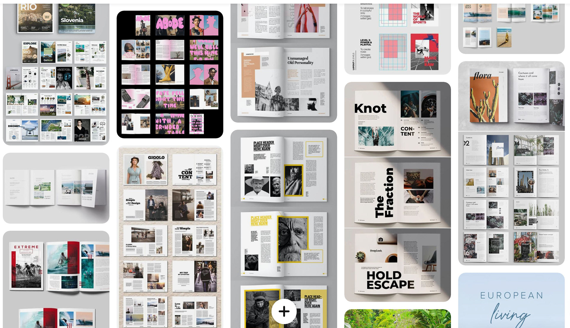
The next useful tool is a mood board. This can take many forms, but here I am using a Pinterest as a mood board to gather visuals from existing found visuals. I search various sources, including a Google search, and I us Pinterest to aggregate concepts.
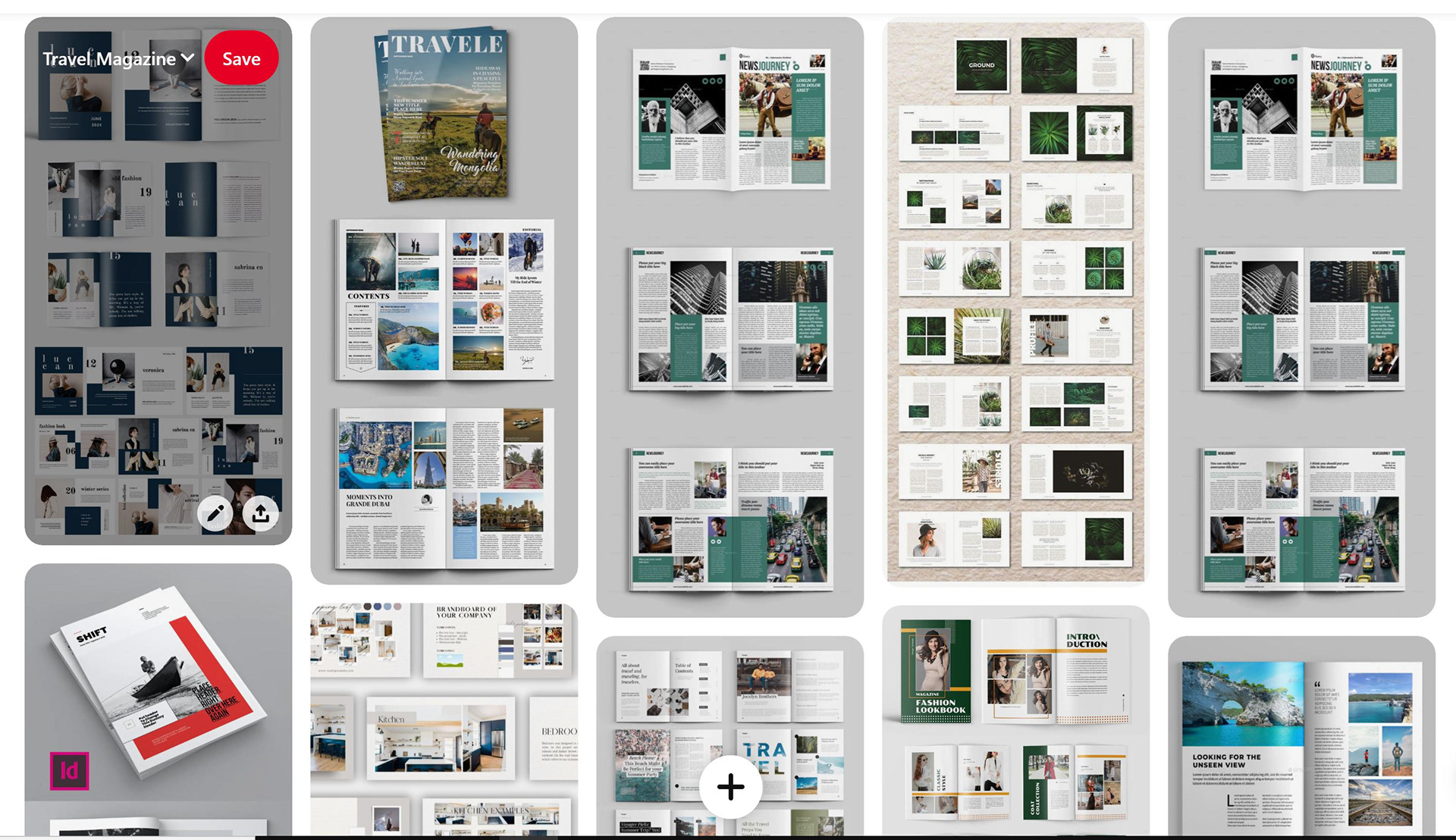
Template file purchased online, that was shared with stakeholders as a possible solution. this was not rejected but required additional concepts to get closer to brand standards.
High fidelity Sketch
I next begin to assemble a high-fidelity sketch that I share with stakeholders. This high-fidelity concept may not contain content but will have the known art element, such as logos, color pallet, placeholder titles, and branding elements in place so that when shared with stakeholders this will translate clearer for and more of a final version that they can react to.
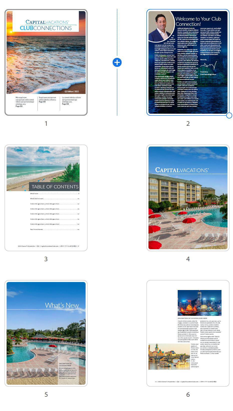
First draft concept, gaining stakeholder approval to proceed in this direction. Note placeholder text is used instead of the actual content of headlines. This allows design-centric concepts to be produced and focus on details upon further exploration.
A Symphony in Collaboration
The process wasn’t solitary but collaborative—a symphony by a team of visionary artists. The Director of Communication and Director of the Brand team penned tales of adventure that always linked to the brand story. VPs and the Director of Inventory provided invaluable knowledge of the current status. Resort managers provided the details of the day-to-day operations. Photographers captured fleeting moments, and lastly, I orchestrated and visually wove the stories into a cohesive masterpiece.
Testing the Boundaries
Iterating and refining, pushed the boundaries of conventional design, experimenting with innovative layouts and immersive visuals. Sought not just to inform but to inspire, taking our readers on a captivating visual journey.
The Unveiling of the Concept
As the final strokes were added, the transformed Club Connection Magazine emerged—a testament to creativity and adaptability. It wasn’t just a magazine; it was an experience—an invitation to explore the world through a new lens.
Impact and Continual Evolution
The redesigned Club Connection Magazine wasn’t just a singular event—it signified a commitment to continual evolution. It echoed our dedication to providing our audience with not just information, but with an odyssey of discovery, inspiration, and limitless possibilities.
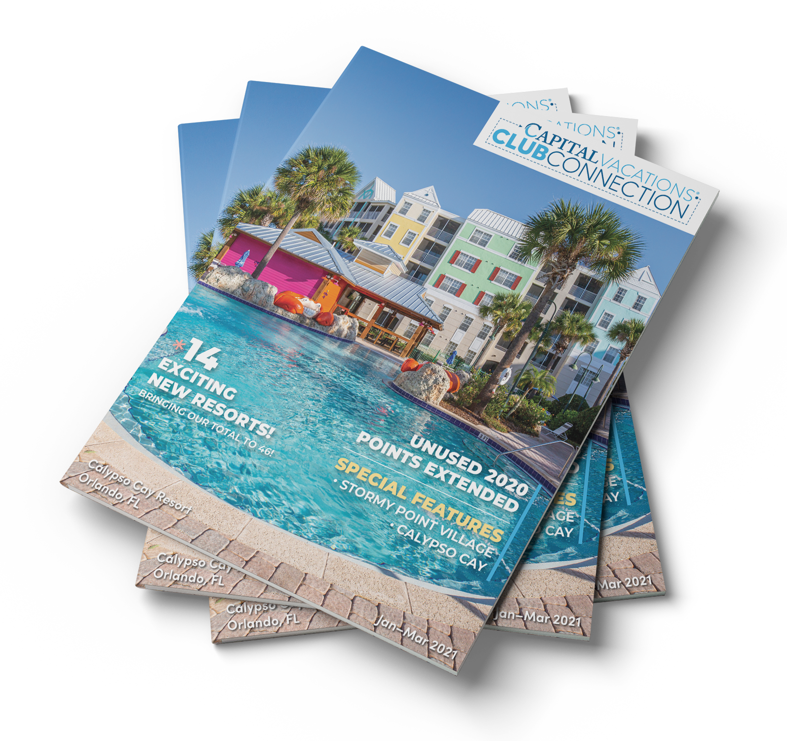
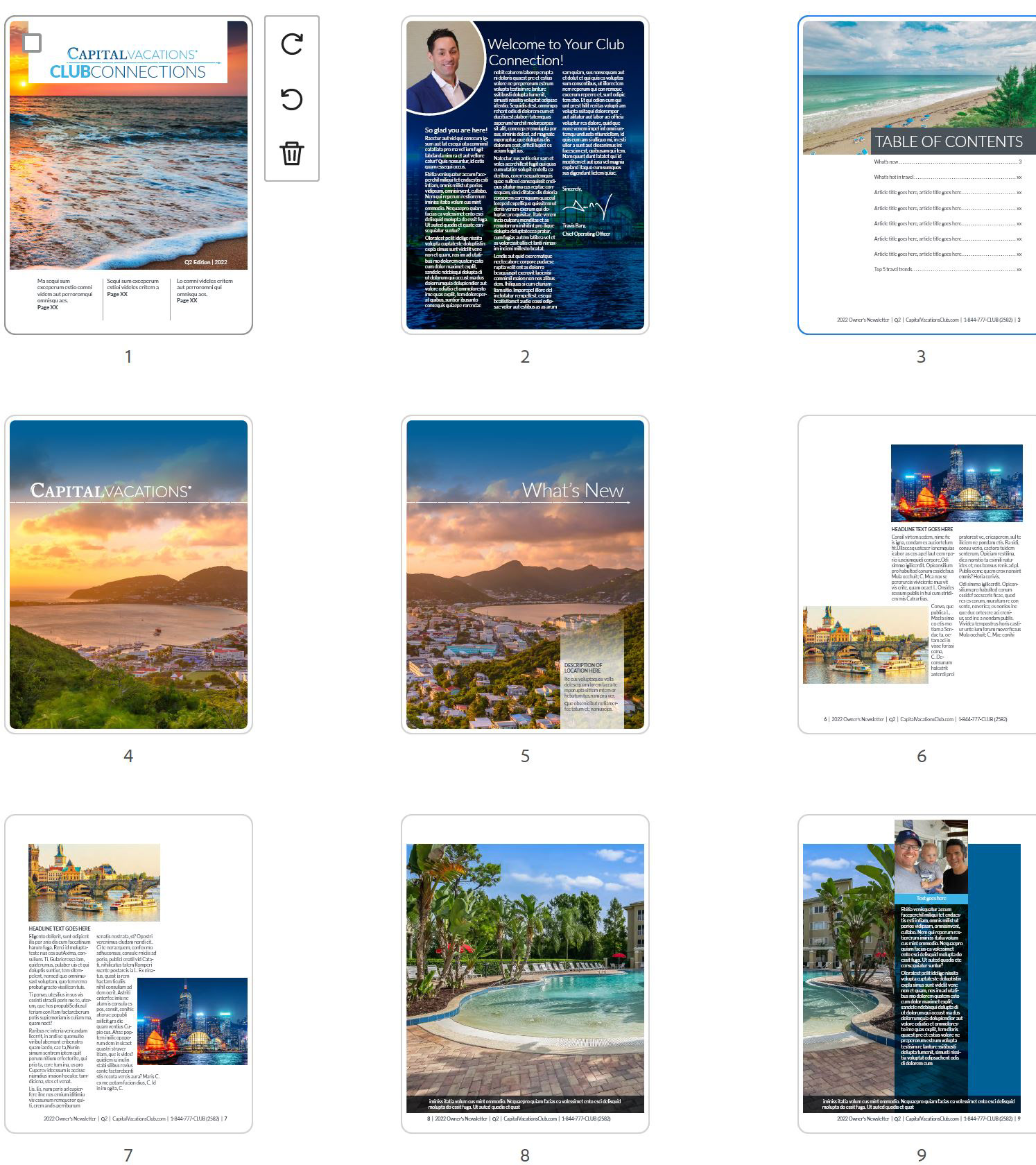
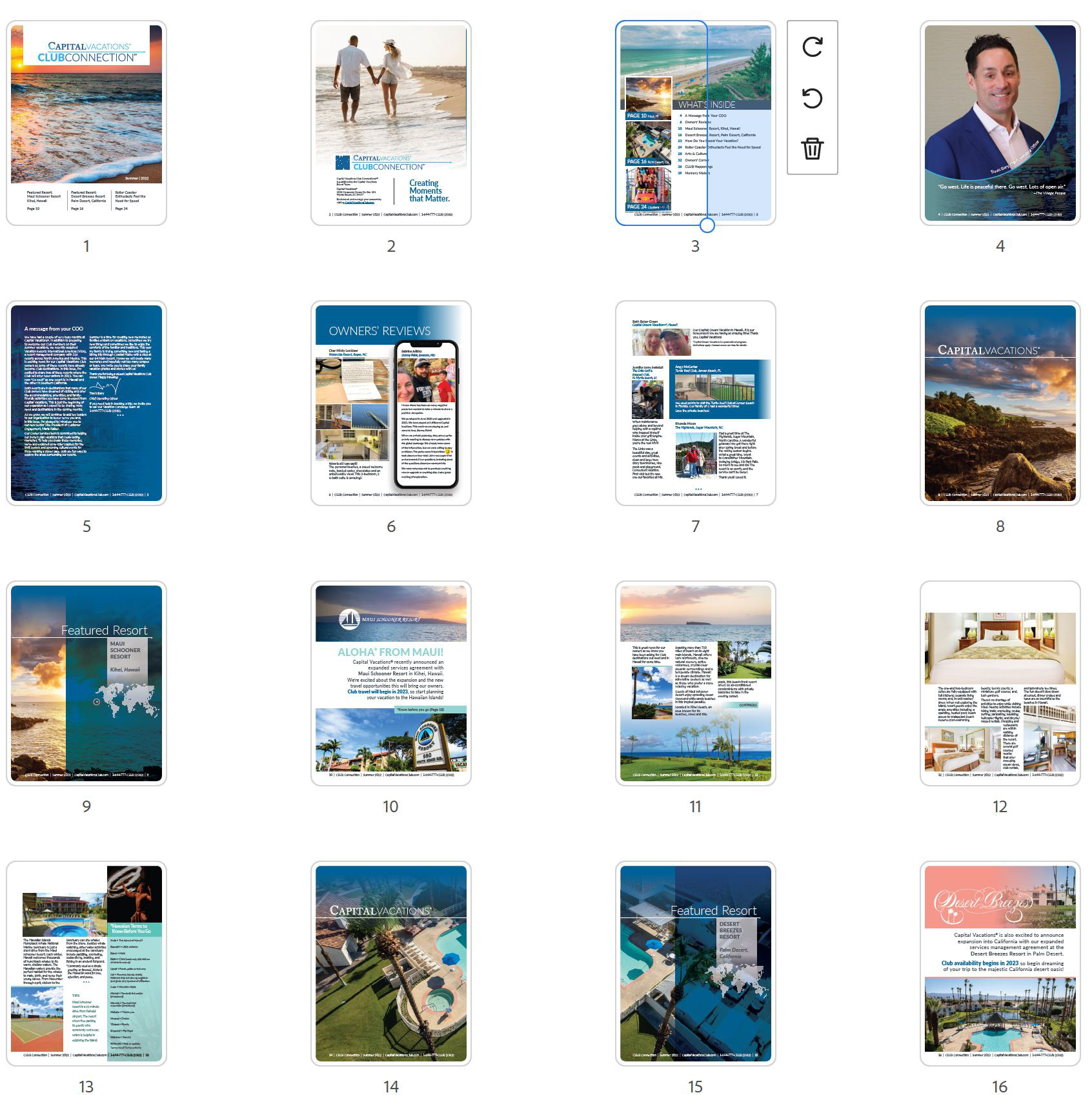
Other Issues: Note how in later issues refinements were made to the layouts.
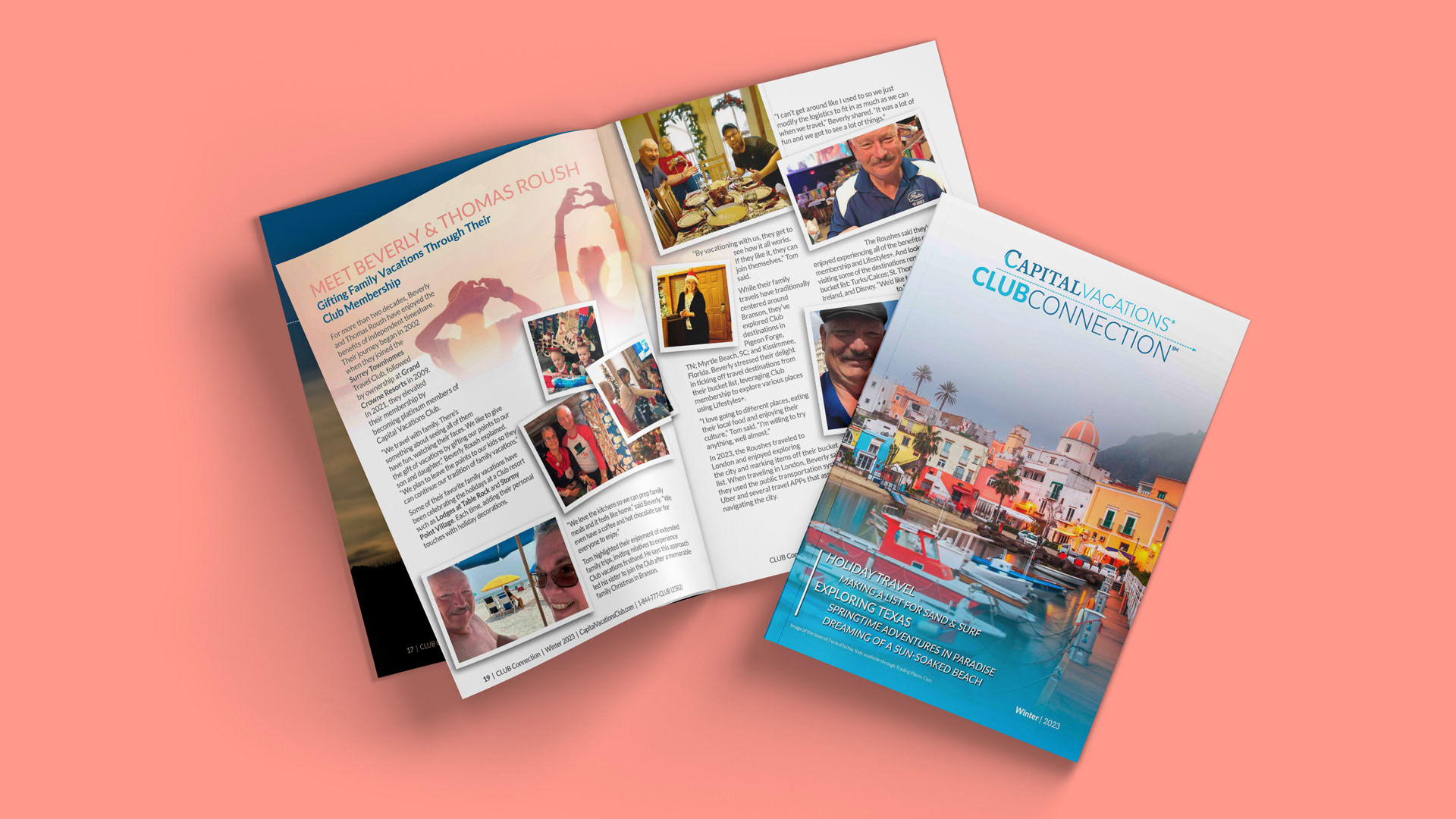
Example of Fall/Winter 2023 Club Connection Magazine