
Creative Brief
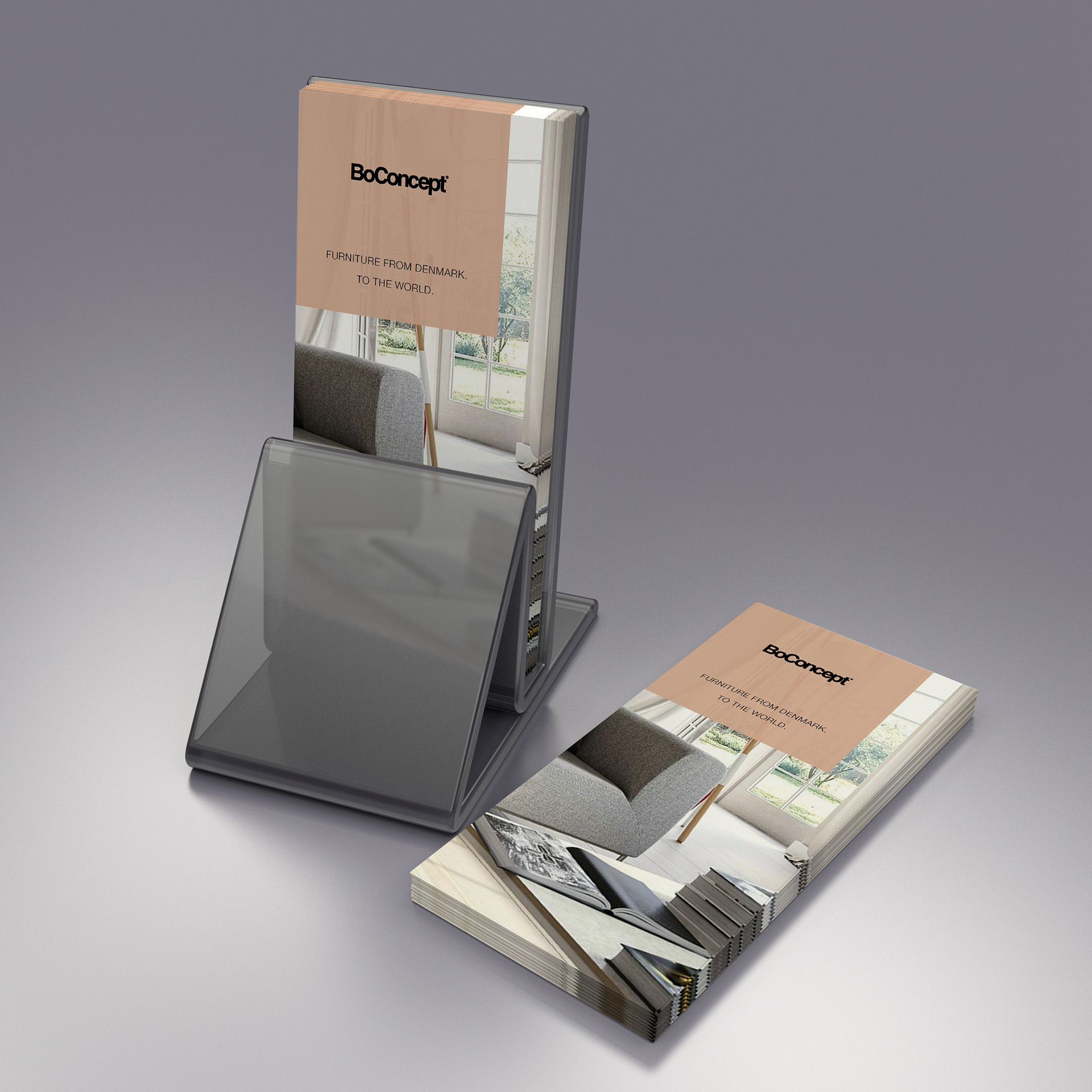
BoConcept a high-end Scandinavia furniture retail store needed a tri-fold brochure to be used as a component of their marketing, uses to include adding to mailers/invoices, rack/counter holders, and in-store tabletop decoration/marketing.
The look of the brochure is to follow the brand explicitly and contain the same written language as the website for a cohesive appeal. My contribution here author the content of the brochure based on the company's existing branding/marketing and to utilize the same look and feel for a very cohesive component of the company’s marketing plan. The brochure was received well by the client with a few minor updates/alterations. This brochure was then integrated into their overall corporate style guide as an example for future projects.
So how do you build a brochure for an existing brand, all the while keeping true to the SIMPLICITY of the company’s design guidelines?
Author the script
To get a better sense of my role in the creation of this brochure here is some insight into the evolution of my design thinking. Started by collecting the client’s content, in MS Word format and drafted a rough script. In this case, the process of script creation was straightforward as the client was fine with repurposing the content elements from their website. Crafting the right nuggets of goodness to showcase the client’s business in the best possible light in a small, self-contained snippet (AKA: this brochure). Creating any brochure is much like crafting a rack card since most of the content will be obscured, the primary statement NEEDS to be able to tell the story.
To get a better sense of my role in the creation of this brochure here is some insight into the evolution of my design thinking. Started by collecting the client’s content, in MS Word format and drafted a rough script. In this case, the process of script creation was straightforward as the client was fine with repurposing the content elements from their website. Crafting the right nuggets of goodness to showcase the client’s business in the best possible light in a small, self-contained snippet (AKA: this brochure). Creating any brochure is much like crafting a rack card since most of the content will be obscured, the primary statement NEEDS to be able to tell the story.
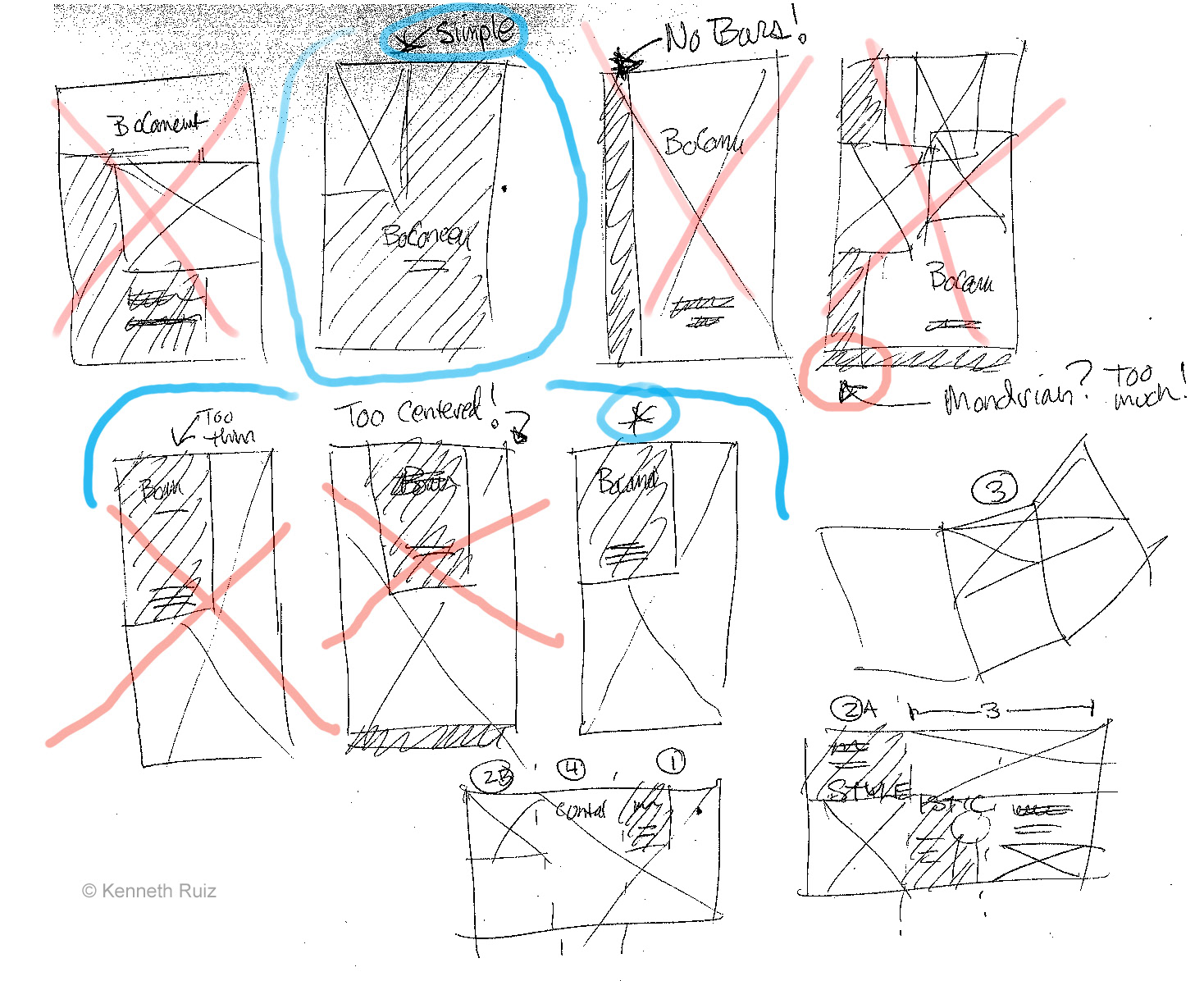
This script development process took its own independent path, and while MS Word text script was in process, I was able to focus on the brochure design. I began by creating low-fidelity sketches based on the content, some of the sketches are shown below.
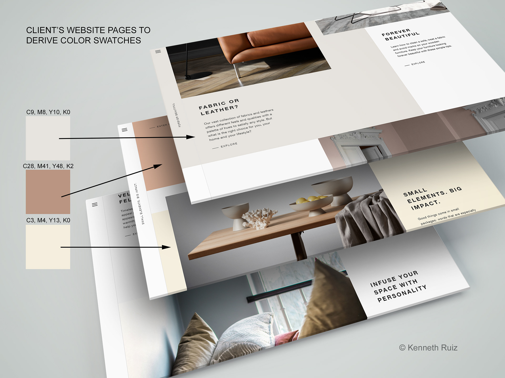
Color Inspiration from Client's Website
Colors and design inspiration was taken directly from the client's website. Notable is that the art elements (colored backgrounds and imagery) often is set to bleed off the edge of the website page, so this was added to the design concept to be able to maintain brand consistency.
Colors and design inspiration was taken directly from the client's website. Notable is that the art elements (colored backgrounds and imagery) often is set to bleed off the edge of the website page, so this was added to the design concept to be able to maintain brand consistency.
Refined sketch higher fidelity (tighten up concept) to block out where elements will appear. This is still a quick sketch just to ideate before proceeding to the layout. Shared with the client as needed to gain approval. Diagram of panel assignment and color swatches added to better communicate with the client how the folds will appear and impact the artwork/content.

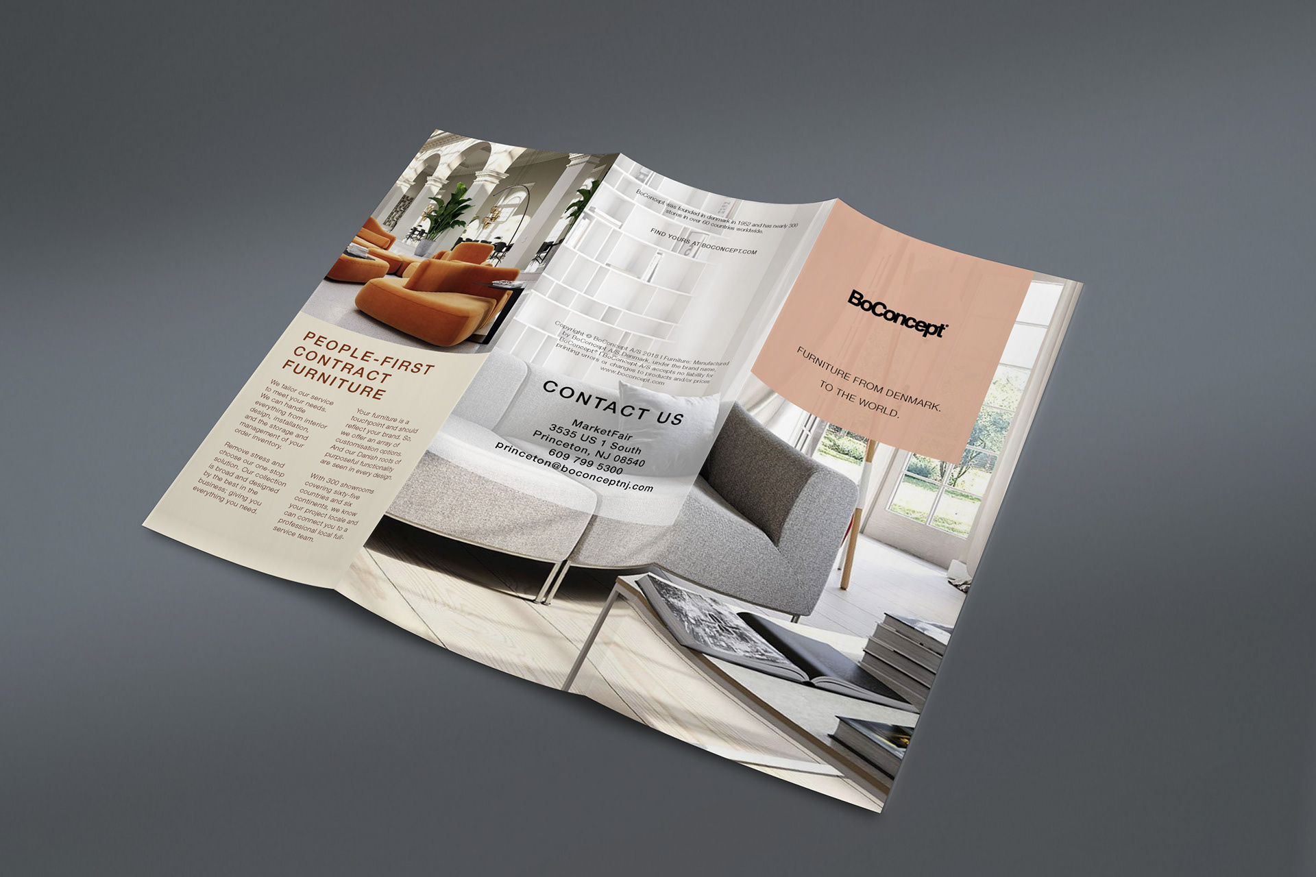
Final Version of the Outside Layout.
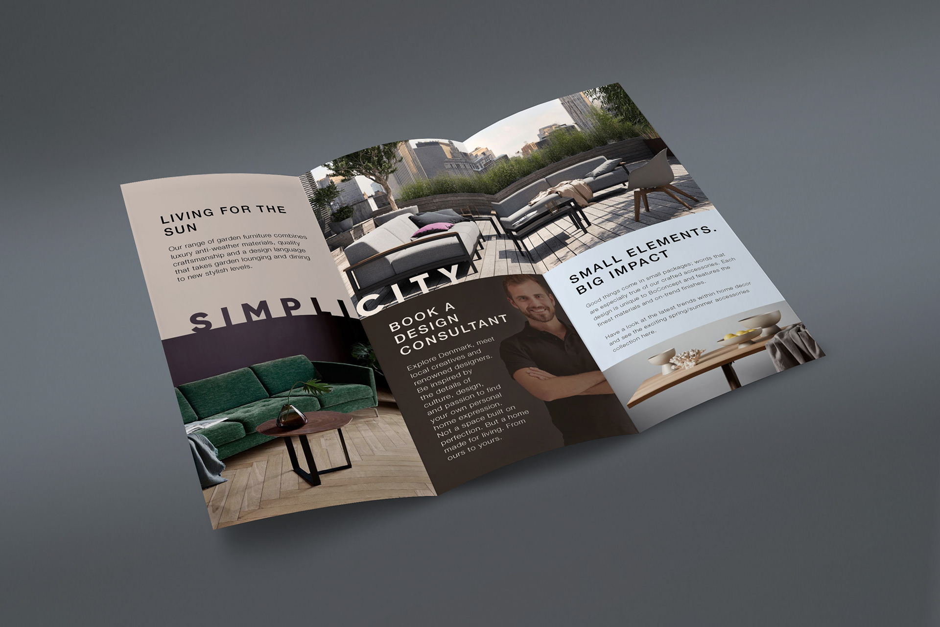
Final Version of the Inside Layout.
Brochure in holder for table top display.