Goal/Introduction
Remain brand specific to the Abbot brand guidelines. However since the complete band guidelines could not be obtained for this project we were asked to utilize the annual report as a style guide of sorts and align this somewhat to mimic the brand, so we had flexibility here.
Finished Cover and Table of Contents (TOC) of Module one of binder contents
My Role
As with all things it starts with a discovery and learning what the client is looking for. The client's creative brief was straight forward they were looking for a housing unit that could contain 4-7 individual modules of various lengths (pages). Illustrations would be used, along with charts, infographics, and photography. Learning that the use of the binder was intended for internal training, so there was no great emphasis to remain brand-specific, but the trick is to understand what the client NOT is saying. I extrapolated that the client was targeting a recollection of the annual report. Knowing this I could begin. Most of the illustrations were completed by me with assistance from a junior team member.
Challenges
After having the initial client discover I was able to get my thoughts in order and put my rough thoughts on paper.
The research was also a component of this, but to be perfectly honest I am not super certain which came first. So, I proceeded to gather past year's annual reports, which were used as a jump point tool.
It always starts with a sketch! GASP yes this is hand-drawn on paper
Alternate sketch concepts, here I used my tablet software to create for quick ideation.

Thumbnails of 2018 Annual Report

Thumbnails of 2019 Annual Report
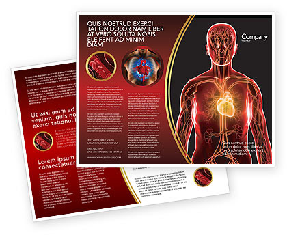
Mood board concept
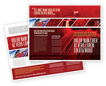
Mood board concept

Mood board cover concept

Mood board cover concept
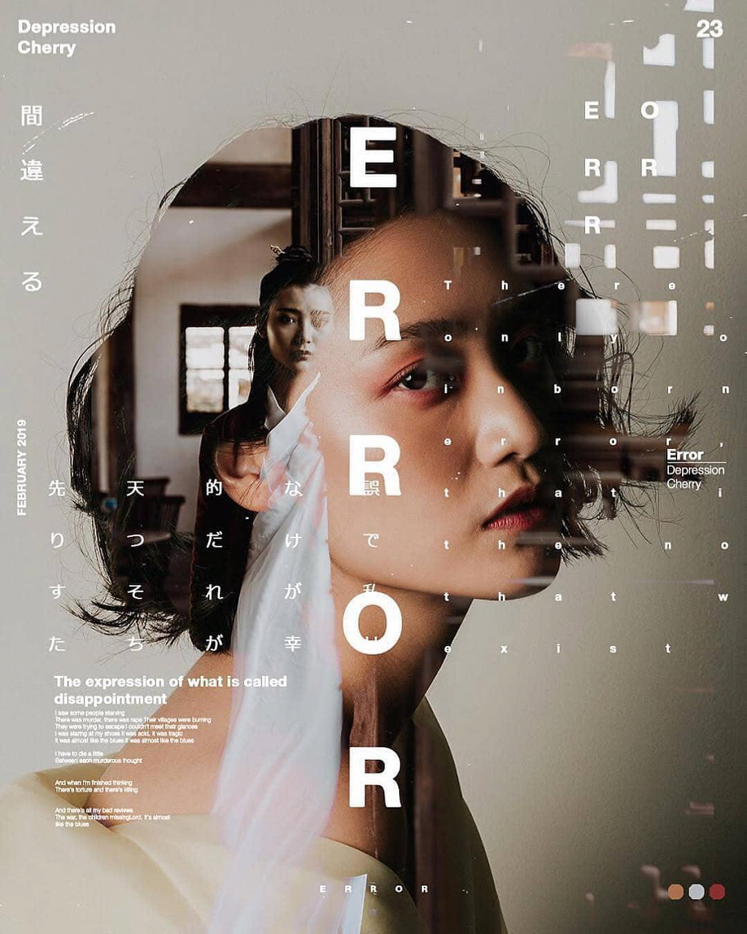
Mood board cover concept

Mood board concept
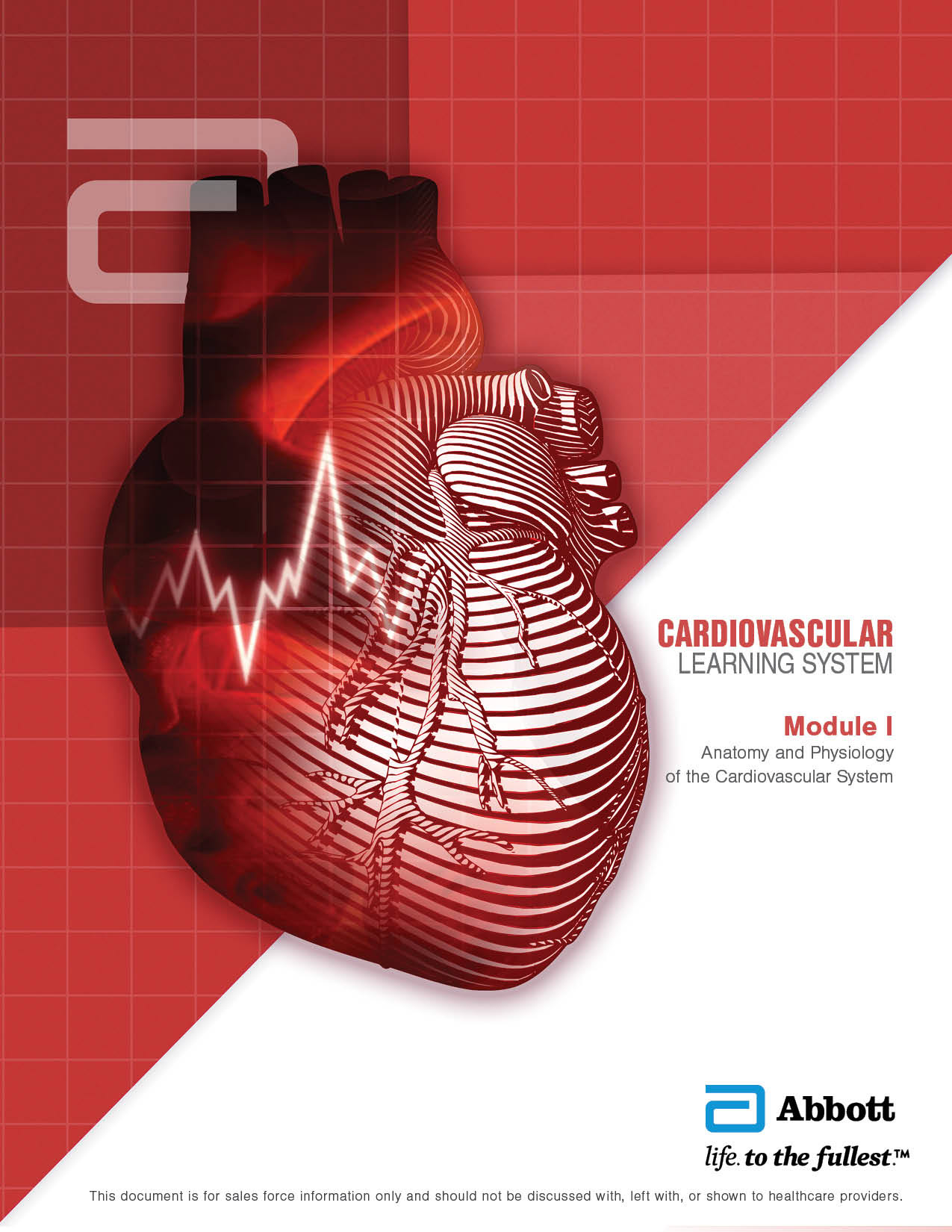
Cover (flat)
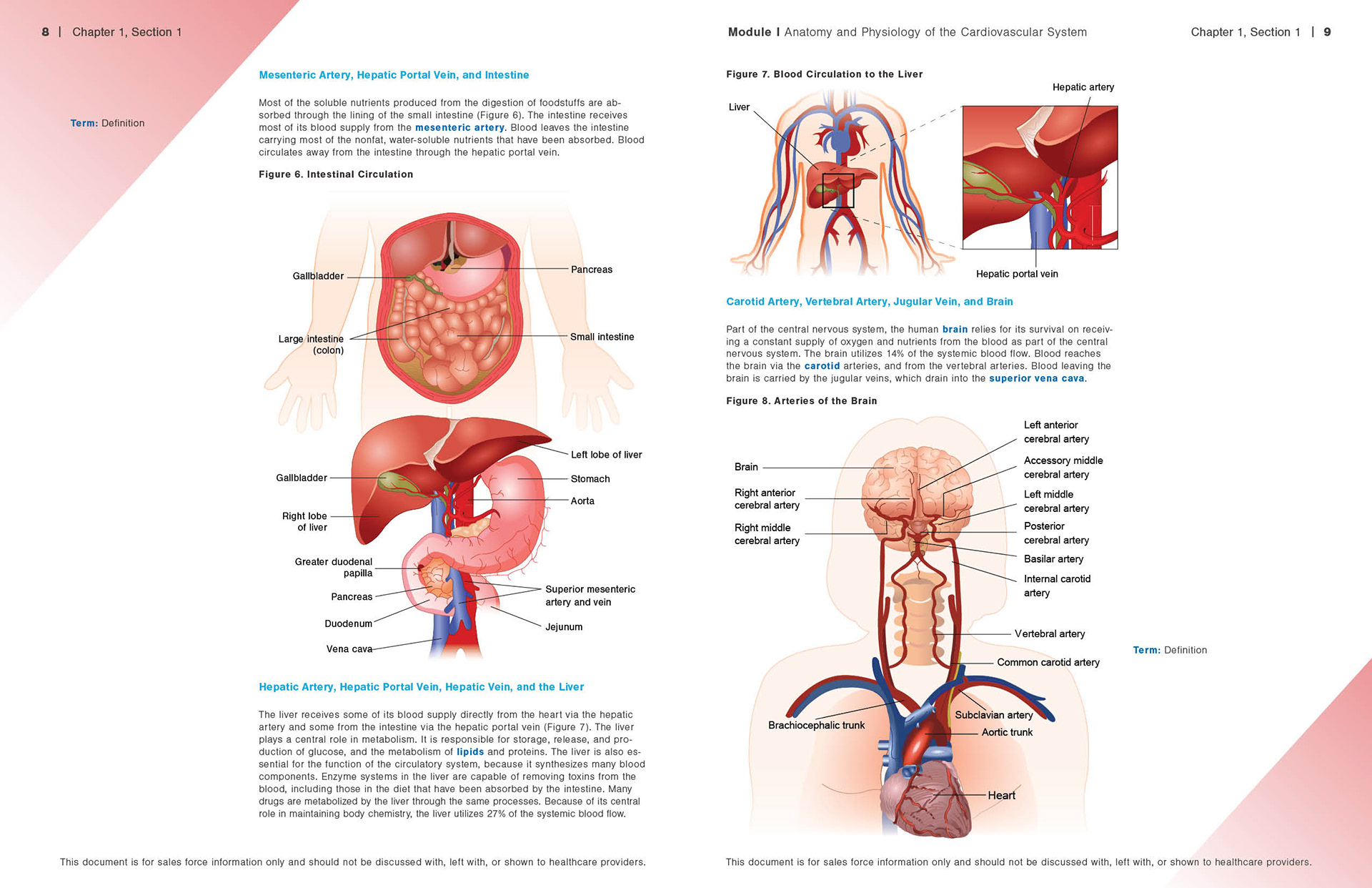
Sample spread (flat)

Sample spread (flat)
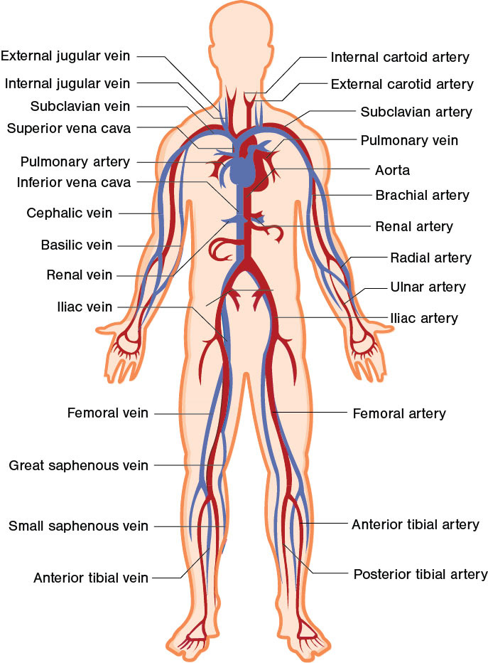
Sample Illustration

Sample Illustration
A sales training binder (housing unit) comprised of four print modules and optical media to distribute the video library relating to the topics. I also had the opportunity to design the HTML interface for the CDR (not shown). Most of the illustrations were completed by myself with assistance from a junior team member.
Feedback was obtained via input from the SME (Subject Matter Expert) typically the internal medical writer who was assigned to the module to learn how to correctly curate and edit the medical illustration to accurately depict the topic of the illustration. All illustrations were created in Adobe Illustration, all photographs were edited in Adobe Photoshop. This project was so successful that it was used to model future projects structures at Tricore Interactive Additionally the client was exuberant about the results which lead to 15% more business during the same year.
